Innovative Archive:
Now I Know
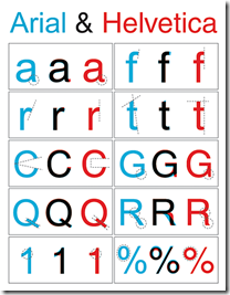
23 Sep 2009The differences between Arial and Helvetica fonts. (source)
Branding
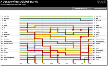
22 Sep 2009A comparison of how brands are ranked over time. I’d question the methodology and meaning of these surveys, but the graphic is well designed and curiously interesting to play with. Spotted at Infectious Greed.
Company Political Contributions
18 Sep 2009Click on a logo to sort all companies in that sector by party contributions, then click again for pop-up details. I love this both because I like the object oriented use of the logos, and the data results are very interesting to browse this way.
Job Voyager
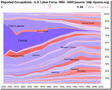
18 Sep 2009Along the lines of the baby name voyager and meme map, here you can type in an occupation and compare employment from 1850-2000. (try “economist”) Spotted over at Infectious Greed.
Metal Tree
In: Culture Humor Innovative
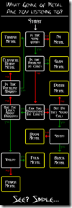
17 Sep 2009I need to make one of these for house music. Spotted at DataViz.
Economic Recovery Dashboard (9/15/09 update)
In: Employment Finance Innovative Interactive Reference Updated regularly US Economy
15 Sep 2009Here is this month’s update of one of my favorite presentations of economic indicators, from Russell Investments. Includes trending, useful popups, drill down links to historical data, and good descriptions of each indicator. It’s really everything an economic dashboard should look like. (ok, maybe they could animate it over time.)
Bank Robberies
In: Culture Innovative
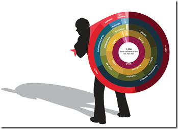
15 Sep 2009An interesting presentation of some bank robbery stats. Of course, the eye isn’t really that good at comparing arc lengths – but if you’re only trying to make broad statistical points these types of charts aren’t too bad.
GDP Dots
13 Sep 2009A novel way of presenting GDP (and I’ve seen a lot of them). It’s a sorted time-line-chart with scaling. Nicely done. Spotted over at Visualizing Economics. Originally by Joe Swainson.
News Dots
10 Sep 2009Recent news items illustrated as a giant interactive network map. “Subjects-represented by the circles below-are connected to one another if they appear together in at least two stories, and the size of the dot is proportional to the total number of times the subject is mentioned.” The nice part is you can drill down to the actual news articles on the right. Updated daily by Slate.
Best Movies of All Time
In: Culture Innovative Maps
10 Sep 2009A clever metro-style map of the top 250 movies of all time (as voted by IMDB users), organized by movie type. Spotted at Dataviz.
European Economic Weather Map (updated Aug 09)
In: Emerging Markets Global Economy Innovative Interactive Maps Source: FT Updated regularly
21 Aug 2009I’ve been tempted to steal this design many times. it’s a nice way to present mostly qualitative information for a large number of countries – and people understand it intuitively.
Calories in Caffeine Delivery Vehicles
In: Culture Food Innovative
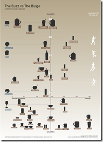
21 Aug 2009Fantastic chart from Information is Beautiful. Caffeine on one axis, calories on the other.
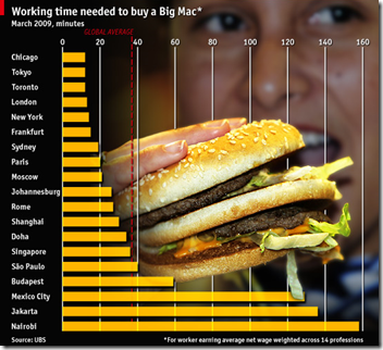
Variation on the Big Max index
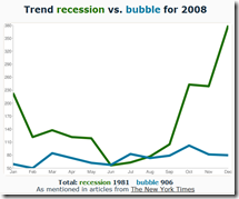
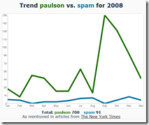
20 Aug 2009Fun with NYT Trends
18 Aug 2009Enter any two words into this tool and see a quick comparison graph of mentions in the New York Times. Unfortunately it only goes through 2008 at the moment.
What is Chart Porn?
An addictive collection of beautiful charts, graphs, maps, and interactive data visualization toys -- on topics from around the world.
Categories
- Bailout (118)
- Chartporn Related (3)
- Commentary (21)
- Culture (669)
- Emerging Markets (66)
- Employment (245)
- Environment/weather (133)
- Finance (298)
- Food (92)
- Global Economy (373)
- Graphic Design (bad) (26)
- Graphic Design (general) (183)
- Graphic Tools (23)
- History (158)
- Housing (162)
- Humor (204)
- Innovative (183)
- Interactive (545)
- Internet/tech (97)
- Maps (578)
- News Media (34)
- Politics (329)
- Reference (97)
- Science (331)
- Source: Economist (101)
- Source: FT (92)
- Source: NYT (147)
- Source: Ritholtz (76)
- Source: USA Today (27)
- Source: Washington Post (90)
- Source: WSJ (135)
- Sports (58)
- Stock Market (74)
- Uncategorized (2)
- Updated regularly (76)
- US Economy (553)
- Video (22)
- Aram Korevaar: This chart is now being used as a projection in which countries such as China see themselves as in a [...]
- David: Welcome back Chart Porn! [...]
- J S: Thanks for the great story. Miss reading this blog. Hope to see you more active again. [...]
- jake: I lived in a DC row house for 6 years, and I'm writing this comment from my tiny 1 bedroom apartment [...]
- ronny pettersen: Hilarious and unfortunately accurate... ;-) [...]

