Innovative Archive:
The Average Flag
In: Innovative Maps
19 Nov 2009Bonus points for trying something new: flags of the world with their colors weighted by population. (via)
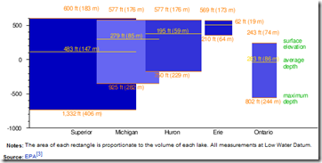
Great Lakes Infographic
16 Nov 2009Combines relative elevation, depth, and volume. I’m not so sure they needed to be overlapping (maybe vertically staked would have been better?), but it’s still a nice graphic. (from wikipedia’s Great Lakes page, via Kelso’s corner)
Asian Pentagon/Spoke
9 Nov 2009I like the idea of using spokes for different series, though it could be confusing. I have no idea why they included the same data as pie charts, unless just as an example of how much clearer bar-charts are. (via)
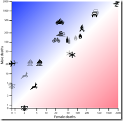
Death Rates
In: Culture Innovative Science
2 Nov 2009Movie Charts
In: Culture Innovative
2 Nov 2009Tracks of plot, character, and events in several movies, with xkcd‘s usual wry humor on top. Thanks to Jonathon Marcus for pointing it out.
Since I hadn’t seen Primer, I looked it up on Wikipedia and they found the below timeline description of how time travel works in the movie:
Visualizing Size
In: Innovative Science
30 Oct 2009A very cool and well designed zoomable comparison of relative microscopic sizes. I particularly like the variable scale in the corner. (via FlowingData and Information Aesthetics)
Fun with Weekly Data
In: Graphic Design (general) Innovative Reference US Economy
29 Oct 2009This is a bit old (the data ends in July ’08), but I like this animated approach to displaying high frequency data over time. Something like this might be interesting to do for cross-country financial data-series.
Impressively, Jon Peltier came up with a way to do this in excel (and check out his blog for other really cool excel chart tricks and solutions)
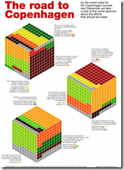
World Opinions on Climate Change
29 Oct 2009An interesting use of 3d cubes to display polling results. The polling questions are also much better constructed than the usual “do you think climate change is happening?”
Health Care Demographics
25 Oct 2009The content is interesting, but I’m posting it just as much for being a good example of “many smalls” design, in this case small maps. (via)
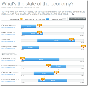
Economic Recovery Dashboard (Oct 09 ver)
24 Oct 2009October update of one of my favorite summaries of economic indicators. If you normally find this stuff confusing you should check it out — click on any of the “historical details” to see what each indicator means and why it’s important.
Stimulate Those Jobs
In: Bailout Employment Innovative Interactive Maps Source: USA Today US Economy
16 Oct 2009A funky little interactive map from USA Today. Click on a state on the map and the appropriate little dot on the sorted chart on the right will highlight to show you it’s ranking. When you change the indicator using the drop down box at the top (jobs created/total funds awarded/total funds received/unemployment rate) the dots in the chart all bounce around and resort themselves.
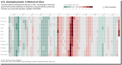
Historical Unemployment
2 Oct 2009A nice change from the usual line chart, from the WSJ.
60 Years of Communism
2 Oct 2009This one of those infographics that provides a lot of information – but also prompts a lot of questions; such as “How many of these changes took place in the last 20 years after they opened up?”, and “How would the United States look on these same indicators?”. (via)
Reality vs Perception
In: Culture Innovative
30 Sep 2009I read once that emotions result from how well reality corresponds to reality. I guess that explains why so many people get worked up about the issues illustrated below. There is some more discussion of this at Sociological Images and Information is Beautiful. It’s originally by Susanna Hertrich.
International Housing Indicators
In: Global Economy Housing Innovative Interactive Source: Economist Updated regularly
28 Sep 2009The Economist just released a nice new tool for looking at several housing indicators across major countries. They plan to expand and update it as more information becomes available.
What is Chart Porn?
An addictive collection of beautiful charts, graphs, maps, and interactive data visualization toys -- on topics from around the world.
Categories
- Bailout (118)
- Chartporn Related (3)
- Commentary (21)
- Culture (669)
- Emerging Markets (66)
- Employment (245)
- Environment/weather (133)
- Finance (298)
- Food (92)
- Global Economy (373)
- Graphic Design (bad) (26)
- Graphic Design (general) (183)
- Graphic Tools (23)
- History (158)
- Housing (162)
- Humor (204)
- Innovative (183)
- Interactive (545)
- Internet/tech (97)
- Maps (578)
- News Media (34)
- Politics (329)
- Reference (97)
- Science (331)
- Source: Economist (101)
- Source: FT (92)
- Source: NYT (147)
- Source: Ritholtz (76)
- Source: USA Today (27)
- Source: Washington Post (90)
- Source: WSJ (135)
- Sports (58)
- Stock Market (74)
- Uncategorized (2)
- Updated regularly (76)
- US Economy (553)
- Video (22)
- Aram Korevaar: This chart is now being used as a projection in which countries such as China see themselves as in a [...]
- David: Welcome back Chart Porn! [...]
- J S: Thanks for the great story. Miss reading this blog. Hope to see you more active again. [...]
- jake: I lived in a DC row house for 6 years, and I'm writing this comment from my tiny 1 bedroom apartment [...]
- ronny pettersen: Hilarious and unfortunately accurate... ;-) [...]


