Innovative Archive:
The Female Sex Drive
25 Feb 2010More great work from okCupid in the same article “The Case for an Old Woman“. I’m posting it separately because of the great charts.
First up, a map of “Ideally, how often would you have sex?”. (Move the slider to change the age) 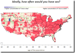
Is contraception morally wrong: 
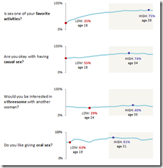
Sparklines of preferences:
Boilerplate
15 Feb 2010Time Travel in TV and Movies
In: Culture Innovative
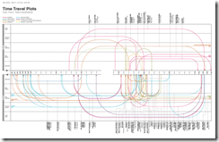
15 Feb 2010The content is a bit pointless, but the post on Information is Beautiful goes into interesting detail on the processes and choices that go into making one of these data dense designs.
Art and Culture Timelines
In: Culture Innovative
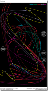
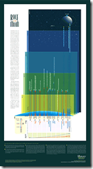
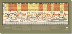
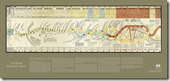
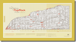
5 Feb 2010Some beautiful and fascinating hand drawn/painted timelines from artist Ward Shelley on a wide variety of topics. Interesting write-up on motivation and methods from the artist. (via)
The evolution of the Avant Garde art scene: 
Rock genres: 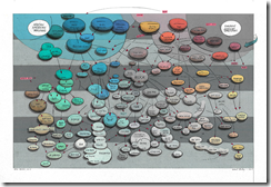
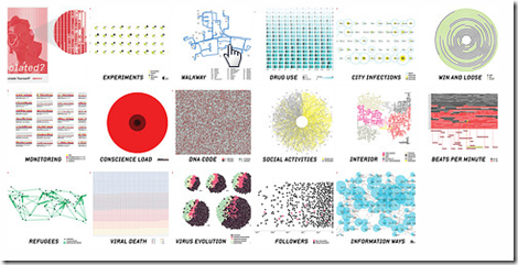
Data Fiction
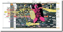
5 Feb 2010Something a little different today: A fictional story told through data visualizations. The link below goes to the flickr version, while a larger presentation appears on designer Kim Asendorf’s website. I definitely love the idea and the execution — of course, visualizations are probably a little easier to create when you get to make up the data. 🙂
India Macro Indicators
22 Jan 2010I’d like to see something like this (a little less cluttered) for the world. (via)
Bing Destination Maps
20 Jan 2010Sending directions to a party? Want to embed a funky map somewhere? Bing now offers “Destination maps” that look like a choice of four stylistic hand drawings. The production interface is a little clunky, and the result doesn’t appear to allow for quick access to directions, but I think the result is pretty cool. Apparently this is only one of Bing’s new “Map Apps” (click on the button at the bottom of that page)
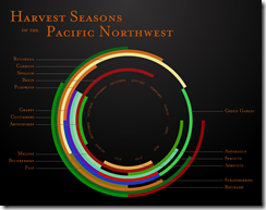
Harvest Timeline
In: Culture Food Innovative
19 Jan 2010I like these. They should be on the front door of every supermarket. (via)
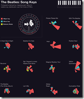
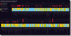
The Comprehensive Beatles
In: Culture Innovative
19 Jan 2010Michael Deal has produced an impressive assortment of diagrams and charts examining the Beatles’ music and careers.
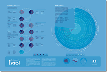
History Shots
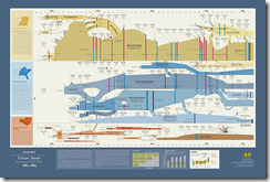
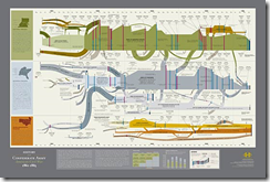
12 Jan 2010History Shots has a number of beautiful classically designed infographics that are very much worth browsing (and/or putting up on your wall).
Conquest of Everest: the expeditions leading up to the successful 1953 assault.
Auto Charts
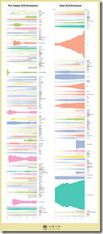
12 Jan 2010The UNEP GEO Data Portal has recently automated some chart production with a custom Illustrator script, for cross-country comparison purposes. The below example is for total CO2 emissions vs per capita. While I really like the waveform-type display aesthetically, I’m not sure of it’s analytical value compared to a bar chart.
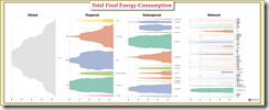
It works a little better here (Total Final Energy Consumption):
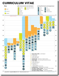
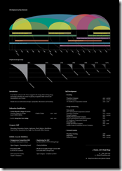
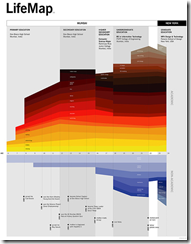
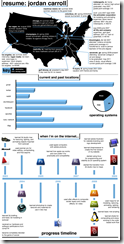
Infographic Resumes
8 Jan 2010Cool Infographics has culled together 16 examples of using infographics as resumes/life timelines. Below are a few of the nicer looking ones, but I recommend reading Randy’s whole article.
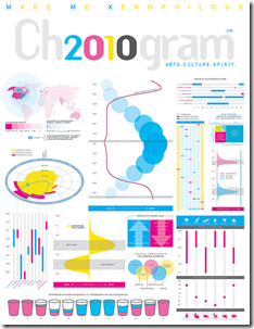
2010: A Formal Display of the Obvious
7 Jan 2010An entertaining compendium of visualizations about the upcoming year, created for Chronogram Magazine. The magazine write-up included a wonderful self-denigrating statement from designer Jason Cring: “Cring believes infographic purists like information design guru Edward Tufte would be appalled. ‘Tufte’s very opinionated about the right and wrong ways to present information. He would not approve of any of this, I’m quite sure.'”
Causality
In: Culture Humor Innovative
28 Dec 2009I think the TSA should be sent this chart – or maybe Fox.
Thanks to Jonathan for sending me the link.
Colorful Rankings
23 Nov 2009I’m just posting this because I know eventually I will use the design for a silly powerpoint or diagram.
What is Chart Porn?
An addictive collection of beautiful charts, graphs, maps, and interactive data visualization toys -- on topics from around the world.
Categories
- Bailout (118)
- Chartporn Related (3)
- Commentary (21)
- Culture (669)
- Emerging Markets (66)
- Employment (245)
- Environment/weather (133)
- Finance (298)
- Food (92)
- Global Economy (373)
- Graphic Design (bad) (26)
- Graphic Design (general) (183)
- Graphic Tools (23)
- History (158)
- Housing (162)
- Humor (204)
- Innovative (183)
- Interactive (545)
- Internet/tech (97)
- Maps (578)
- News Media (34)
- Politics (329)
- Reference (97)
- Science (331)
- Source: Economist (101)
- Source: FT (92)
- Source: NYT (147)
- Source: Ritholtz (76)
- Source: USA Today (27)
- Source: Washington Post (90)
- Source: WSJ (135)
- Sports (58)
- Stock Market (74)
- Uncategorized (2)
- Updated regularly (76)
- US Economy (553)
- Video (22)
- Aram Korevaar: This chart is now being used as a projection in which countries such as China see themselves as in a [...]
- David: Welcome back Chart Porn! [...]
- J S: Thanks for the great story. Miss reading this blog. Hope to see you more active again. [...]
- jake: I lived in a DC row house for 6 years, and I'm writing this comment from my tiny 1 bedroom apartment [...]
- ronny pettersen: Hilarious and unfortunately accurate... ;-) [...]

