Innovative Archive:
Life Flowchart: Love-Limbo-Trouble-Denial
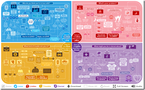
23 Dec 2010Sony pictures sponsored these awesome flowcharts to promote the upcoming movie “How Do You Know”. The best part is you don’t see the whole chart at once – you make your choices, and it reveals just those results (why is this the first time I’ve seen this done!? It’s so simple.). Created by Jetset Studios.
Relationship Death
In: Culture Innovative
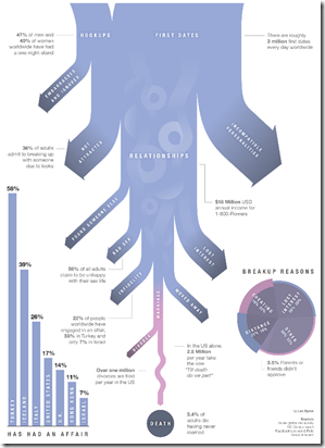
16 Dec 2010Ok, the content of this chart is nothing new – and the intent is basically linkbait. But the design is fairly intriguing: it’s an exploding map to a badly overlapped radial chart, with categories. It both works and doesn’t work. I love it and hate it at the same time. Bravo!
Formula 1
In: Innovative Sports
30 Nov 2010Stunningly beautiful graphics on Formula 1 tracks and races, by Luis Chumpitaz. He even managed to make bilingual diagrams looks good. (Thanks to William Navarro for the link.)
Hipmunk: Visual Airline Reservations
22 Oct 2010Some airlines (Southwest and Jetblue) have made choosing flights an almost pleasant experience by clearly presenting available flights and costs — most other airlines still suck. Hipmunk is a new flight search tool which applies some simple design techniques to aggregate options clearly. I also love that they have a “sort by agony” option which combines price, duration, and layovers. (via FlowingData)
Gay Sex vs Straight Sex
12 Oct 2010OkTrends has analyzed it’s database of user behavior to examine several rumors about homosexual behavior, compared to heterosexuals. Not surprisingly, none of them are true. The whole article is fascinating.
Poverty and Food
4 Oct 2010An interesting radial variation on a scatter plot, displaying multiple variable from 50 states. It’s . (via the promising new visualization site Visualizing.org)
Update: Economic Indicators Dashboard (July ‘10)
23 Jul 2010A great monthly status board for market and economic indicators. Click on anything – the popup details are great.
Plotweaver Graphing Software
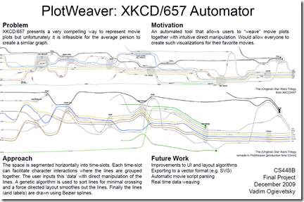
9 Jun 2010Stanford Student Vadim Ogievetsky is writing some software to allow the automated creation of timeline charts like XKCD’s “Interactions of Move Characters”. I didn’t dig too deep into this, but there’s lots of detail there is you’re interested. (via)
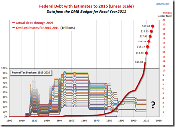
Federal Debt and Tax Brackets (1900-2015)
31 Mar 2010Dshort always has interesting medium/long-term analyses. I really like the representation of historic tax brackets in the bottom half of this one (based on data from taxfoundation.org)
Flags as Charts
30 Mar 2010Harsh, but innovative (even though it came out in 2005). Additional info on the campaign.
Health Care Reform: What When (Part II)
In: Innovative Politics
23 Mar 2010Ok, I’d like to think they were inspired by my earlier post — but probably not.
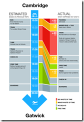
Public Transport Fail
In: Culture Innovative
22 Mar 2010I really like the design. What would be fabulous is if people could use existing online tools for transport schedules, but annotate them with their real experience. (via)
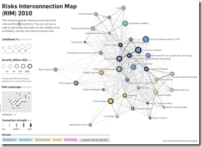
Risk Interconnection Map
In: Graphic Design (general) Innovative Interactive Maps Politics
21 Mar 2010From the World Economic Forum, based on this year’s Global Risk report. Thanks to Sean R. for passing it on!
Google Public Data Explorer
In: Employment Global Economy Graphic Design (general) Innovative Maps Reference Science
9 Mar 2010What is Chart Porn?
An addictive collection of beautiful charts, graphs, maps, and interactive data visualization toys -- on topics from around the world.
Categories
- Bailout (118)
- Chartporn Related (3)
- Commentary (21)
- Culture (669)
- Emerging Markets (66)
- Employment (245)
- Environment/weather (133)
- Finance (298)
- Food (92)
- Global Economy (373)
- Graphic Design (bad) (26)
- Graphic Design (general) (183)
- Graphic Tools (23)
- History (158)
- Housing (162)
- Humor (204)
- Innovative (183)
- Interactive (545)
- Internet/tech (97)
- Maps (578)
- News Media (34)
- Politics (329)
- Reference (97)
- Science (331)
- Source: Economist (101)
- Source: FT (92)
- Source: NYT (147)
- Source: Ritholtz (76)
- Source: USA Today (27)
- Source: Washington Post (90)
- Source: WSJ (135)
- Sports (58)
- Stock Market (74)
- Uncategorized (2)
- Updated regularly (76)
- US Economy (553)
- Video (22)
- Aram Korevaar: This chart is now being used as a projection in which countries such as China see themselves as in a [...]
- David: Welcome back Chart Porn! [...]
- J S: Thanks for the great story. Miss reading this blog. Hope to see you more active again. [...]
- jake: I lived in a DC row house for 6 years, and I'm writing this comment from my tiny 1 bedroom apartment [...]
- ronny pettersen: Hilarious and unfortunately accurate... ;-) [...]

