Innovative Archive:
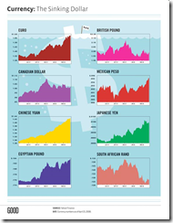
The Sinking Dollar
14 Jun 2009I generally like their simple designs, but would it kill Good to label their charts properly? (it’s national currency per dollar)
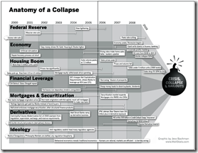
Anatomy of the Crash
In: Bailout Finance Innovative Reference Source: Ritholtz US Economy
10 Jun 2009(Sorry there haven’t been many updates lately – I’m on vacation in the Colorado mountains.) Here is a infographic from Barry Ritholtz’s book Bailout Nation that does a great job showing the different causes of the crash, and how they developed over time:
Death Odds, 1845-2006
31 May 2009A great animated chart showing the likelihood of dying at different ages over the years. I would think demographic data like this would be ripe for interesting visualizations. Nice job understandinguncertainty.org!
Two earlier posts/versions (one & two) don’t go back as far, but include the detailed explanation and some additional breakdown by risk factors.
ps – this data is for the UK.
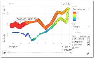
pps – the same site conducts a similar analysis of Charles Minard’s famous infographic of Napolean’s 1812 campaign (odds of dying as the campaign goes on), as well as a cool animated bubble heat map of the size and location of the army:
Visual Guide to the Federal Reserve
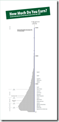
29 May 2009Rich or Poor?
27 May 2009I think a lot of us take for granted how good we have it. Here’s a nice look at how “rich” you are, by Catherine Mulbrandon at visualizingeconomics.com. It’s been around for a while (uses 2000 data), but I just found her website this week.
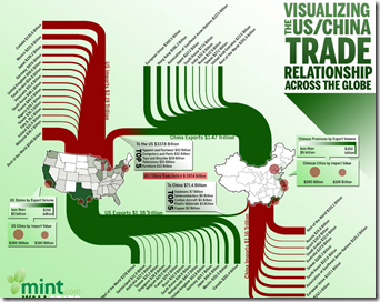
US China Trade
19 May 2009These info graphics are always pretty, but I sometimes wonder if a table isn’t just as good, or better. Perhaps if they added capital flows.
European Economic Forecast Map (5/13/09 update)
In: Emerging Markets Global Economy Innovative Maps Source: FT Updated regularly
15 May 2009Click on the timeline at the top to view past versions. Roll over country names to see real GDP growth 2007-10.
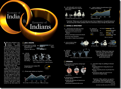
Indian Economy
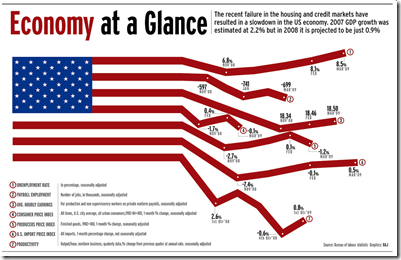
14 May 2009Economic Flag
In: Innovative US Economy
14 May 2009The title is a little odd considering they include March 09 data, but it’s still a clever presentation. Hmmm. actually now that I look at it the lines aren’t moving proportionally, which means this is mostly gimmickry. Too bad.
Google News Treemap
11 May 2009I could have sworn I posted this before, but it took Kelso’s post to remind me that I hadn’t. It’s a very nice interactive google-news aggregator:
The Seven Deadly Sins
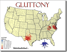
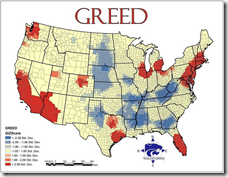
5 May 2009Greed was calculated by comparing average incomes with the total number of inhabitants living beneath the poverty line. Envy was calculated using the total number of thefts – robbery, burglary, larceny and stolen cars. Wrath was calculated by comparing the total number of violent crimes – murder, assault and rape – reported to the FBI per capita. Lust was calculated by compiling the number of sexually transmitted diseases – HIV, AIDS, syphilis, chlamydia and gonorrhea – reported per capita. Gluttony was calculated by counting the number of fast food restaurants per capita. Sloth was calculated by comparing expenditures on arts, entertainment and recreation with the rate of employment. And pride, lastly, is most important. The root of all sins, in this study, is the aggregate of all data. Vought and his Kansas colleagues combined all data from the six other sins and averaged it into an overview of all evil.
Related article with more details. (I couldn’t find the original study "The Spatial Distribution of the Seven Deadly Sins within Nevada” from Kansas State University)
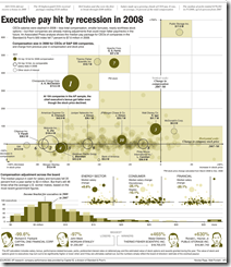
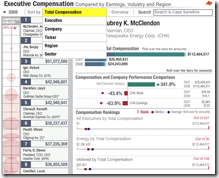
Execute Compensation
1 May 2009Data Density
In: Culture Employment Food Global Economy Housing Innovative Maps Science
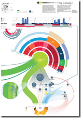
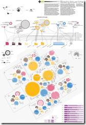
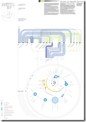
20 Apr 2009Visual Think Map recently turned me onto Design Density‘s Infographics – they include so much information it is almost hard to read them on a computer screen. truly “super-graphics” in Tufte’s meaning of the phrase.
Here’s a few examples on poverty related to housing, leisure, health care & food.
Financial Infographics
15 Apr 2009Some nice presentations from creditloan.com:
Why everyone hates AIG:
US Stimulus Package breakdown:
Corporate bailouts since 1970:
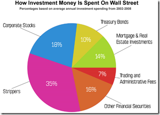
the USA’s credit rating (below left) and How investment money is spent on wall street (below right. and I knew it!)
Tax Day
In: Innovative US Economy
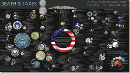
15 Apr 2009Classic infographic, updated with Obama’s 2009 budget request. Item circles are proportional in size to their spending totals.
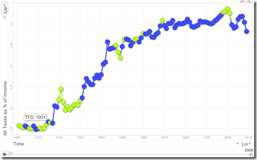
some random tax statistics (below left), and a motion bubble chart (below right) showing increase in tax burden since 1901 (note: you can change the axis to play with different stats; click on a bubble with “trails” on to draw the history)
What is Chart Porn?
An addictive collection of beautiful charts, graphs, maps, and interactive data visualization toys -- on topics from around the world.
Categories
- Bailout (118)
- Chartporn Related (3)
- Commentary (21)
- Culture (669)
- Emerging Markets (66)
- Employment (245)
- Environment/weather (133)
- Finance (298)
- Food (92)
- Global Economy (373)
- Graphic Design (bad) (26)
- Graphic Design (general) (183)
- Graphic Tools (23)
- History (158)
- Housing (162)
- Humor (204)
- Innovative (183)
- Interactive (545)
- Internet/tech (97)
- Maps (578)
- News Media (34)
- Politics (329)
- Reference (97)
- Science (331)
- Source: Economist (101)
- Source: FT (92)
- Source: NYT (147)
- Source: Ritholtz (76)
- Source: USA Today (27)
- Source: Washington Post (90)
- Source: WSJ (135)
- Sports (58)
- Stock Market (74)
- Uncategorized (2)
- Updated regularly (76)
- US Economy (553)
- Video (22)
- Aram Korevaar: This chart is now being used as a projection in which countries such as China see themselves as in a [...]
- David: Welcome back Chart Porn! [...]
- J S: Thanks for the great story. Miss reading this blog. Hope to see you more active again. [...]
- jake: I lived in a DC row house for 6 years, and I'm writing this comment from my tiny 1 bedroom apartment [...]
- ronny pettersen: Hilarious and unfortunately accurate... ;-) [...]

