Innovative Archive:
House-Like Self-Diagnosis
24 Jun 2009WSJ article on visible symptoms of many diseases. The accompanying graphic is aesthetically pleasing, but a little disappointing info wise.
50 Great Examples of Data Visualization
In: Innovative
23 Jun 2009Check out the list at WebdesignerDepot.com. (Thanks to Matthieu Cormier for the link)
and while we’re at it: 25+ Useful Infographics for Web Designers from the same blog. my two favorites below.
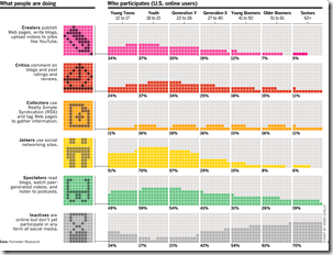
Different types of internet participants by age group:
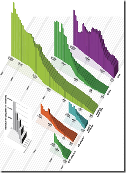
Changing costs of living on the bleeding edge of technology:
Hurricanes
22 Jun 2009Two part interactive toy from AP. The first one takes you on a cool animated walk through the 5 point Saffir-Simpson Hurricane scale, simulating the amount of damage along the way. The second maps out the path and category of every hurricane from 1851-2009.
ooops: Missed one, though it’s separate from the others… It includes a map of the empty homes in Florida (from foreclosures, amongst other causes) and animates the types of different types of damage a hurricane can cause (click along the top):
Non-Caveman Comfort Costs
In: Humor Innovative
22 Jun 2009A completely arbitrary list of modern comforts, showing how cheap many things are that we take for granted. (noticeably absent: heating, which has obviously done nothing but go up in price)
Weird Green Shoots
22 Jun 2009Not really a graphic (though there is a slideshow version), Kiplinger lists 10 Quirky Economic Indicators, from movie attendance to alligators and mosquitoes.
Food In, Calories Out
In: Food Innovative
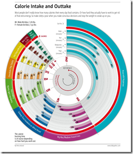
22 Jun 2009Colorful presentation of how much exercise you have to do after eating certain foods. Spotted by DataViz.
Ring Roads of the World
In: Innovative Maps
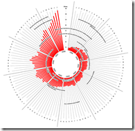
19 Jun 2009I wish I could find a larger version of this. seems to be lacking a scale too. Strangemaps noticed a few other problems – check out the comments.
A Creative Resume
In: Humor Innovative
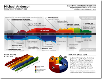
16 Jun 2009A little silly, and he should have put his salary on one of those axis, but it’s very well done, overall
Anatomy of a Mash-up
16 Jun 2009I like it when my passions cross-over.
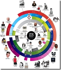
Here’s a map of Girl Talk’s “What it’s All About” mashup (from Wired):
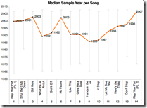
and here’s analysis of the samples in the whole album “Feed the Animals“:
Interestingly, the guy who pulled this together used Amazon’s Mechanical Turk to outsource much of the data collection – read the post for a description of how it works.
Perfect Landing
In: Bailout Employment Finance Housing Innovative Reference Source: WSJ
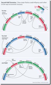
15 Jun 2009Ritholtz spotted this nice WSJ graphic on the importance of executing the Fed’s recession exit strategy just right. Related WSJ article.
Visual Guide to Social Security
14 Jun 2009Debt, Debt, Debt, and Then You Die
14 Jun 2009A playful and informative collection of stats about the debt that people accumulate throughout life.
from creditloan.com.
(by the way, anyone ever come across stats on what amount of debt default happens because of death?)
60 Years of Germany
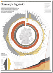
14 Jun 2009(Somebody has too much time on their hands.) A graphic history of the German economy and demographics. produced by Golden. Spotted by Infographics News.
Oil Prices 1999-2008
14 Jun 2009An interesting variation on the column chart. (hat-tip to Visualizing Economics for the find). Hopping through the comments and links brought up a good discussion of the design and alternatives.
What is Chart Porn?
An addictive collection of beautiful charts, graphs, maps, and interactive data visualization toys -- on topics from around the world.
Categories
- Bailout (118)
- Chartporn Related (3)
- Commentary (21)
- Culture (669)
- Emerging Markets (66)
- Employment (245)
- Environment/weather (133)
- Finance (298)
- Food (92)
- Global Economy (373)
- Graphic Design (bad) (26)
- Graphic Design (general) (183)
- Graphic Tools (23)
- History (158)
- Housing (162)
- Humor (204)
- Innovative (183)
- Interactive (545)
- Internet/tech (97)
- Maps (578)
- News Media (34)
- Politics (329)
- Reference (97)
- Science (331)
- Source: Economist (101)
- Source: FT (92)
- Source: NYT (147)
- Source: Ritholtz (76)
- Source: USA Today (27)
- Source: Washington Post (90)
- Source: WSJ (135)
- Sports (58)
- Stock Market (74)
- Uncategorized (2)
- Updated regularly (76)
- US Economy (553)
- Video (22)
- Aram Korevaar: This chart is now being used as a projection in which countries such as China see themselves as in a [...]
- David: Welcome back Chart Porn! [...]
- J S: Thanks for the great story. Miss reading this blog. Hope to see you more active again. [...]
- jake: I lived in a DC row house for 6 years, and I'm writing this comment from my tiny 1 bedroom apartment [...]
- ronny pettersen: Hilarious and unfortunately accurate... ;-) [...]

