Innovative Archive:
Meme Visualization
14 Jul 2009Similar in interaction to the Baby Name Wizard, this chart shows the frequency of top media quotes over time. Click on a single meme to zoom in and isolate it (or start typing in the box at the top and it will filter in real time – type “econ” for example).
Health Care Lobbying
In: Innovative Politics
14 Jul 2009A Teacher’s guide showing how much money Senators received from the health care industry. The interesting (appalling) part is the little bar graphs under each State comparing increases in health care premiums to increases in workers’ incomes.
Cheap Airlines
In: Innovative
8 Jul 2009CoolInfographics spotted this fascinating comparison of airline expenses. It focuses on European airlines, but it still helps explain why I was able to buy a ticket on Southwest today from coast to coast for only $90.
Who Says We Work Too Much?
In: Culture Innovative Science
8 Jul 2009A compendium of US Holidays, including lots of odd little facts. From Good.
Fancy Debt Clock
In: Finance Innovative Reference Updated regularly US Economy
8 Jul 2009Always depressing, this version of the debt clock includes running values of many different kinds of debt, GDP, trade deficits, unfunded liabilities, and other ways we are shooting ourselves in the foot every day. The “about” section is pretty bleak on source details (to put it mildly). Thanks to my friend Jenny Butler for the link.
Ok, enough war and money. Here are two (stunningly similar) infographics on what goes into all those fireworks. Have a nice holiday weekend everyone!
Space
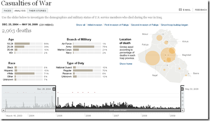
2 Jul 2009Casualties of War
In: Culture Graphic Design (general) Innovative Interactive Maps Politics Source: NYT
2 Jul 2009The breakdown by age, race, branch, and type of duty is fascinations, and the adjustable time scale is a nice touch.
Credit Card Hell
28 Jun 2009Anyone else think the recent “reforms” didn’t address the problem of many people’s credit cards, namely the usurious interest rates? Spotted over at Ritzholtz.
Who’s Lost
28 Jun 2009I don’t watch the show but if you’re a fan or just plain confused, here’s a well done interactive character org-chart:
Spotted on Infographics.
He’s Not So Bad
In: Culture Innovative
26 Jun 2009Excellent chart by the NYT plotting Michael Jackson’s top100 hits over the years, and comparing him to other top artists.
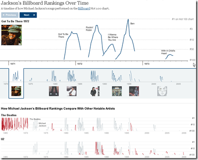
(thanks to FlowingData for spotting it)
Global Boiling
25 Jun 2009Have you taken the time to follow the detailed science behind the global warming debate? Me neither. But I’m starting to read the “Global Climate Change Impacts in the United States” report, which has a number of very effective data visualizations, in addition to laying out all the different climate change arguments. (Thanks to my friend Brad Johnson for pointing out the report.)
World Drug Report
25 Jun 2009Below is a chart from the UNODC’s 2009 World Drug Report. I focus a lot on media sources and blogs, but a lot of great information visualization is being done by NGOs/thinks tanks/etc.
What is Chart Porn?
An addictive collection of beautiful charts, graphs, maps, and interactive data visualization toys -- on topics from around the world.
Categories
- Bailout (118)
- Chartporn Related (3)
- Commentary (21)
- Culture (669)
- Emerging Markets (66)
- Employment (245)
- Environment/weather (133)
- Finance (298)
- Food (92)
- Global Economy (373)
- Graphic Design (bad) (26)
- Graphic Design (general) (183)
- Graphic Tools (23)
- History (158)
- Housing (162)
- Humor (204)
- Innovative (183)
- Interactive (545)
- Internet/tech (97)
- Maps (578)
- News Media (34)
- Politics (329)
- Reference (97)
- Science (331)
- Source: Economist (101)
- Source: FT (92)
- Source: NYT (147)
- Source: Ritholtz (76)
- Source: USA Today (27)
- Source: Washington Post (90)
- Source: WSJ (135)
- Sports (58)
- Stock Market (74)
- Uncategorized (2)
- Updated regularly (76)
- US Economy (553)
- Video (22)
- Aram Korevaar: This chart is now being used as a projection in which countries such as China see themselves as in a [...]
- David: Welcome back Chart Porn! [...]
- J S: Thanks for the great story. Miss reading this blog. Hope to see you more active again. [...]
- jake: I lived in a DC row house for 6 years, and I'm writing this comment from my tiny 1 bedroom apartment [...]
- ronny pettersen: Hilarious and unfortunately accurate... ;-) [...]


