Humor Archive:
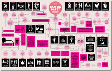
Can We Date?
20 Aug 2010A detailed flowchart on whether it is socially acceptable for two people to date. (via Flowingdata)
How Not to Take Ugly Portraits
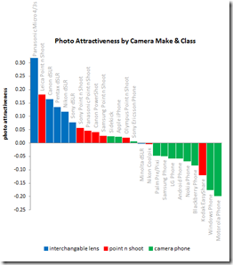
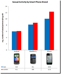
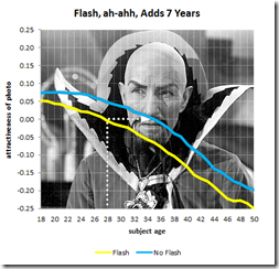
10 Aug 2010OkCupid is at it again. This time comparing user attractiveness to photo EXIF data. Findings? Panasonics will make you look better than Canons or Nikons. Iphone users have more sex. Using a flash adds 7 years to your appearance. Lower f-stops make you prettier. Taking pictures during the “golden hour” is not a myth. Have I mentioned that I love that blog?!?
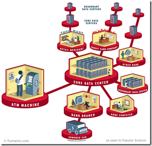
Where Your Money is Stored
2 Aug 2010There’s not a lot of surprising information here, but I’m posting it anyway to reward the graphic designer for including the horns and pitchfork in the “Credit Card Company” section, and the holdup man in the “Bank Branch”. Well done! (via)
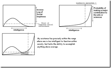
The Truth About Most Artists/Scientists
In: Employment Humor Science
25 Jul 2010I think you could make a nice series of charts like this about most careers.
(note: I couldn’t figure out which version of this was the original. I first saw it here)
Patio Shade
In: Humor
16 Jul 2010Infographomania
23 Jun 2010Another self-loathing infographic (that I am in complete agreement with). You might have noticed that Chartporn doesn’t post every infographic out there. I try to filter out the more boilerplate ones – I read all the crap, so you don’t have to.
Flowchart: Should you Get the New [x]?
16 Jun 2010Highly accurate. (via)
Unemployment: Dream vs Reality
In: Employment Humor
4 Jun 2010What is Chart Porn?
An addictive collection of beautiful charts, graphs, maps, and interactive data visualization toys -- on topics from around the world.
Categories
- Bailout (118)
- Chartporn Related (3)
- Commentary (21)
- Culture (669)
- Emerging Markets (66)
- Employment (245)
- Environment/weather (133)
- Finance (298)
- Food (92)
- Global Economy (373)
- Graphic Design (bad) (26)
- Graphic Design (general) (183)
- Graphic Tools (23)
- History (158)
- Housing (162)
- Humor (204)
- Innovative (183)
- Interactive (545)
- Internet/tech (97)
- Maps (578)
- News Media (34)
- Politics (329)
- Reference (97)
- Science (331)
- Source: Economist (101)
- Source: FT (92)
- Source: NYT (147)
- Source: Ritholtz (76)
- Source: USA Today (27)
- Source: Washington Post (90)
- Source: WSJ (135)
- Sports (58)
- Stock Market (74)
- Uncategorized (2)
- Updated regularly (76)
- US Economy (553)
- Video (22)
- Aram Korevaar: This chart is now being used as a projection in which countries such as China see themselves as in a [...]
- David: Welcome back Chart Porn! [...]
- J S: Thanks for the great story. Miss reading this blog. Hope to see you more active again. [...]
- jake: I lived in a DC row house for 6 years, and I'm writing this comment from my tiny 1 bedroom apartment [...]
- ronny pettersen: Hilarious and unfortunately accurate... ;-) [...]

