Humor Archive:
Non-Caveman Comfort Costs
In: Humor Innovative
22 Jun 2009A completely arbitrary list of modern comforts, showing how cheap many things are that we take for granted. (noticeably absent: heating, which has obviously done nothing but go up in price)
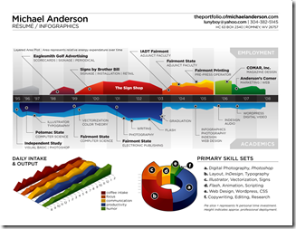
A Creative Resume
In: Humor Innovative
16 Jun 2009A little silly, and he should have put his salary on one of those axis, but it’s very well done, overall
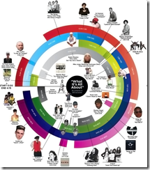
Anatomy of a Mash-up
16 Jun 2009I like it when my passions cross-over.
Here’s a map of Girl Talk’s “What it’s All About” mashup (from Wired):
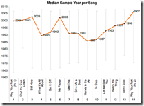
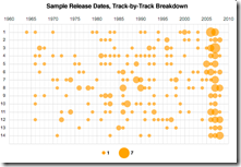
and here’s analysis of the samples in the whole album “Feed the Animals“:
Interestingly, the guy who pulled this together used Amazon’s Mechanical Turk to outsource much of the data collection – read the post for a description of how it works.
Debt, Debt, Debt, and Then You Die
14 Jun 2009A playful and informative collection of stats about the debt that people accumulate throughout life.
from creditloan.com.
(by the way, anyone ever come across stats on what amount of debt default happens because of death?)
The Seven Deadly Sins
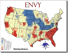
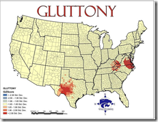
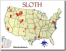
5 May 2009Greed was calculated by comparing average incomes with the total number of inhabitants living beneath the poverty line. Envy was calculated using the total number of thefts – robbery, burglary, larceny and stolen cars. Wrath was calculated by comparing the total number of violent crimes – murder, assault and rape – reported to the FBI per capita. Lust was calculated by compiling the number of sexually transmitted diseases – HIV, AIDS, syphilis, chlamydia and gonorrhea – reported per capita. Gluttony was calculated by counting the number of fast food restaurants per capita. Sloth was calculated by comparing expenditures on arts, entertainment and recreation with the rate of employment. And pride, lastly, is most important. The root of all sins, in this study, is the aggregate of all data. Vought and his Kansas colleagues combined all data from the six other sins and averaged it into an overview of all evil.
Related article with more details. (I couldn’t find the original study "The Spatial Distribution of the Seven Deadly Sins within Nevada” from Kansas State University)
Synchronized Global Cliff Diving
In: Global Economy Humor
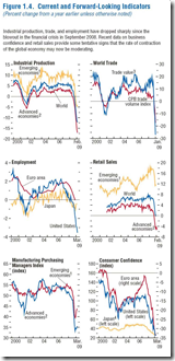
22 Apr 2009Not really anything new statistic-wise if you’ve been paying attention, but I love Calculated Risk’s description of these charts as “synchronized global cliff diving” (originally from the IMF’s World Economic Outlook)
Financial Infographics
15 Apr 2009Some nice presentations from creditloan.com:
Why everyone hates AIG:
US Stimulus Package breakdown:
Corporate bailouts since 1970:
the USA’s credit rating (below left) and How investment money is spent on wall street (below right. and I knew it!)
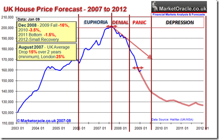
UK Housing Cycle
8 Apr 2009Nothing new, but you have to love the cycle annotation/commentary
(typical humor from Soot and Ashes)
Personal Visualizations
23 Mar 2009Last fall FlowingData ran a hilarious Personal Visualization project/contest with lots of great examples of clear design. (My personal favorite was the Bedposted application)
What is Chart Porn?
An addictive collection of beautiful charts, graphs, maps, and interactive data visualization toys -- on topics from around the world.
Categories
- Bailout (118)
- Chartporn Related (3)
- Commentary (21)
- Culture (669)
- Emerging Markets (66)
- Employment (245)
- Environment/weather (133)
- Finance (298)
- Food (92)
- Global Economy (373)
- Graphic Design (bad) (26)
- Graphic Design (general) (183)
- Graphic Tools (23)
- History (158)
- Housing (162)
- Humor (204)
- Innovative (183)
- Interactive (545)
- Internet/tech (97)
- Maps (578)
- News Media (34)
- Politics (329)
- Reference (97)
- Science (331)
- Source: Economist (101)
- Source: FT (92)
- Source: NYT (147)
- Source: Ritholtz (76)
- Source: USA Today (27)
- Source: Washington Post (90)
- Source: WSJ (135)
- Sports (58)
- Stock Market (74)
- Uncategorized (2)
- Updated regularly (76)
- US Economy (553)
- Video (22)
- Aram Korevaar: This chart is now being used as a projection in which countries such as China see themselves as in a [...]
- David: Welcome back Chart Porn! [...]
- J S: Thanks for the great story. Miss reading this blog. Hope to see you more active again. [...]
- jake: I lived in a DC row house for 6 years, and I'm writing this comment from my tiny 1 bedroom apartment [...]
- ronny pettersen: Hilarious and unfortunately accurate... ;-) [...]


