Humor Archive:
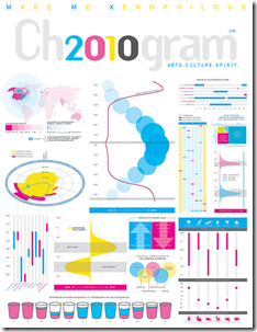
2010: A Formal Display of the Obvious
7 Jan 2010An entertaining compendium of visualizations about the upcoming year, created for Chronogram Magazine. The magazine write-up included a wonderful self-denigrating statement from designer Jason Cring: “Cring believes infographic purists like information design guru Edward Tufte would be appalled. ‘Tufte’s very opinionated about the right and wrong ways to present information. He would not approve of any of this, I’m quite sure.'”
2009 Top 200 Requested Songs
4 Jan 2010The Naughts
In: Culture Humor News Media
4 Jan 2010A table of important things, time-relevant things, and stuff we’ve already forgotten about. Thanks to Nathan Sweet for passing it on.
Causality
In: Culture Humor Innovative
28 Dec 2009I think the TSA should be sent this chart – or maybe Fox.
Thanks to Jonathan for sending me the link.
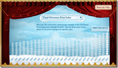
12 Days of Christmas cost $21,465.56
In: Culture Humor Interactive
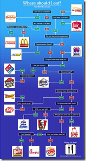
23 Dec 2009Junk Food Decision Tree
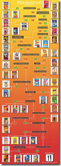
23 Nov 2009A reasonably accurate mapping of choices. Thanks to Sandy for pointing it out to me. and I just noticed there’s one on the same site for cereal.
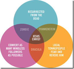
Relationship Venn
20 Nov 2009Because its Friday. something a little more entertaining – and it’s actually a nice combination of venn and axis chart styles.
Table of Condiments that Periodically Go Bad
20 Nov 2009Too funny. (via Jon Peltier’s Periodic Table of What?)
It’s Alive!!!
In: Humor US Economy
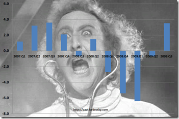
29 Oct 2009I couldn’t help but laugh at Infectious Greed’s response to today’s Q3 GDP numbers.
Turns out coursing a few gigavolts of financial stimulus current through even an economy the size of the U.S. will still get Frankenstein off the slab, however briefly.
What is Chart Porn?
An addictive collection of beautiful charts, graphs, maps, and interactive data visualization toys -- on topics from around the world.
Categories
- Bailout (118)
- Chartporn Related (3)
- Commentary (21)
- Culture (669)
- Emerging Markets (66)
- Employment (245)
- Environment/weather (133)
- Finance (298)
- Food (92)
- Global Economy (373)
- Graphic Design (bad) (26)
- Graphic Design (general) (183)
- Graphic Tools (23)
- History (158)
- Housing (162)
- Humor (204)
- Innovative (183)
- Interactive (545)
- Internet/tech (97)
- Maps (578)
- News Media (34)
- Politics (329)
- Reference (97)
- Science (331)
- Source: Economist (101)
- Source: FT (92)
- Source: NYT (147)
- Source: Ritholtz (76)
- Source: USA Today (27)
- Source: Washington Post (90)
- Source: WSJ (135)
- Sports (58)
- Stock Market (74)
- Uncategorized (2)
- Updated regularly (76)
- US Economy (553)
- Video (22)
- Aram Korevaar: This chart is now being used as a projection in which countries such as China see themselves as in a [...]
- David: Welcome back Chart Porn! [...]
- J S: Thanks for the great story. Miss reading this blog. Hope to see you more active again. [...]
- jake: I lived in a DC row house for 6 years, and I'm writing this comment from my tiny 1 bedroom apartment [...]
- ronny pettersen: Hilarious and unfortunately accurate... ;-) [...]


