Housing Archive:
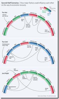
Perfect Landing
In: Bailout Employment Finance Housing Innovative Reference Source: WSJ
15 Jun 2009Ritholtz spotted this nice WSJ graphic on the importance of executing the Fed’s recession exit strategy just right. Related WSJ article.
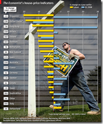
Global Housing Prices
15 Jun 2009Obviously I’m catching up on Economist charts. here’s one on global housing prices. They include three different measures, with the 97-09 long term one probably being the most interesting. I think sparklines probably would have worked better for this.
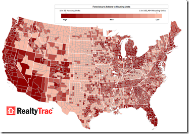
Foreclosures Continue to Rise
14 Jun 2009Click on the image below to see RealtyTracs full report. For discussion I’d recommend the comments over at Ritholtz (some of them – they tend to wander a bit there nowadays).
USAToday Economic Outlook Index
In: Finance Housing Interactive Reference Source: USA Today Updated regularly US Economy
11 Jun 2009USA Today and IHS Global Insight have created a new USA economic outlook index based on 11 “leading” indicators. The interactive charts are very well done, with roll-over data point info, and an explanation of what each indicator means. Notes at the bottom of the page describe how the methodology differs from the Conference Board’s “leading indicators”. They plan to update it monthly. USAtoday has come a long way from the crappy charts they used to produce (ok, a lot of them are still crappy – but this one’s damn good).
(note: I spotted this one because Utah has crappy newspapers and my only option for any actual news of the world was USAToday)
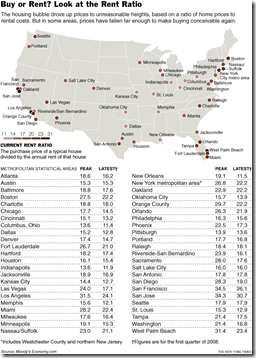
Nationwide Rent to Buy Ratios
In: Housing Maps Source: NYT
31 May 2009This data is from a year ago. but I’ve always been fascinated by it. Anyone know where to find more recent data? (yes, I know the source says “Moody’s”)
Federal Home Loan Bank Investments
In: Finance Housing US Economy
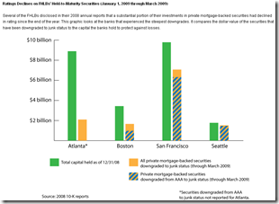
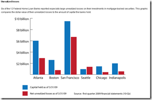
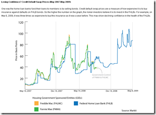
29 May 2009Worrisome analysis from SubsidyScope:
“The Federal Home Loan Banks, or FHLBs, may be the biggest financial players you’ve never heard of. Collectively, they hold $1.3 trillion in assets and are the largest U.S. borrower after the federal government.
A Subsidyscope review of the FHLBs’ financial statements has found that several of the banks are carrying substantial “unrealized losses” on their investments in mortgage-backed securities. [.]
What’s potentially worrisome is the sheer size of the losses. For the Federal Home Loan Bank of Seattle, they are substantially larger than the capital the bank holds to protect itself against such declines.”
The Problems Haven’t Gone Away
29 May 2009Well, the banks are close to being recapitalized, so that brings us roughly back to where we started (minus 5 million jobs and $11 trillion in wealth). But while that is a necessary condition for recovery, many of the other original problems (excessive household debt, for example) just keep chugging along.
“About 5.4 million of the country’s 45 million home loans were delinquent or in some stage of the foreclosure process in the first three months of the year, according to the Mortgage Bankers Association. [.] The figures released Thursday suggested that prime fixed-rate loans were supplanting risky subprime loans and rising adjustable-rate mortgages as the force behind the foreclosure crisis. In the first quarter, a seasonally adjusted 6.06 percent of all prime loans were delinquent.” (WSJ)
Case-Shiller (mar 09 data)
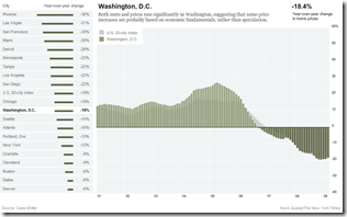
27 May 2009The NYT has updated one of my favorite interactive presentations of Case-Shiller’s 20 city housing index. It shows how each cities’ performance versus the national index (the light grey bars in the background).
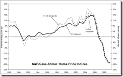
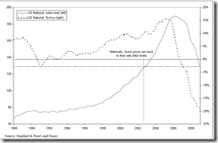
Home Prices Continue Down (Mar 09)
26 May 2009Charts from Ritholtz below. An amusing article on how they’re trying to spin them as not that bad: “Case-Shiller Sucks. But Who Cares, That’s Just Backwards Looking” by Joe Weisenthal.
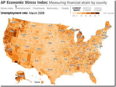
US Economic Stress Index (March 09 data)
17 May 2009More good work from AP. Shows unemployment, foreclosures, bankruptcy, and a composite “stress index”. Double click on a region to zoom in; click&hold to move around.
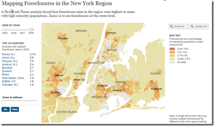
New York Foreclosures
17 May 2009Very detailed interactive map of NY area foreclosures – over time, zoom in, even just type in an address. Related article. (Hat tip to Ritholtz for the find)
Housing Listings (April)
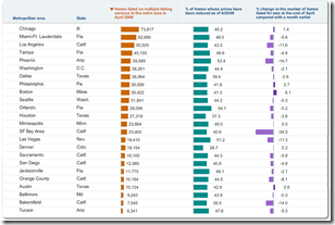
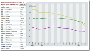
13 May 2009Housing inventory sortable by city, current (April) and over last 18 months (ZipReality data). As usual, the data is clouded by foreclosures. Related WSJ article.
Follow the Sub-Prime Money
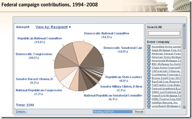
11 May 2009Interactive summary of $370 million in US campaign contributions made by originators of sub-prime mortgages, 1994-2008. Related article.
Shiller vs Lawler on housing stats
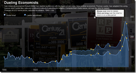
28 Apr 2009A WSJ article on Lawler’s criticism of Shiller’s data, and the difficulties coming up with good numbers. The chart below contrasts the two methods.
To Rent or Buy
23 Apr 2009For those who want to do the math on this questions, here is a nice calculator from the New York Times. Of course, most economists think prices are going to keep dropping until late 2010.
What is Chart Porn?
An addictive collection of beautiful charts, graphs, maps, and interactive data visualization toys -- on topics from around the world.
Categories
- Bailout (118)
- Chartporn Related (3)
- Commentary (21)
- Culture (669)
- Emerging Markets (66)
- Employment (245)
- Environment/weather (133)
- Finance (298)
- Food (92)
- Global Economy (373)
- Graphic Design (bad) (26)
- Graphic Design (general) (183)
- Graphic Tools (23)
- History (158)
- Housing (162)
- Humor (204)
- Innovative (183)
- Interactive (545)
- Internet/tech (97)
- Maps (578)
- News Media (34)
- Politics (329)
- Reference (97)
- Science (331)
- Source: Economist (101)
- Source: FT (92)
- Source: NYT (147)
- Source: Ritholtz (76)
- Source: USA Today (27)
- Source: Washington Post (90)
- Source: WSJ (135)
- Sports (58)
- Stock Market (74)
- Uncategorized (2)
- Updated regularly (76)
- US Economy (553)
- Video (22)
- Aram Korevaar: This chart is now being used as a projection in which countries such as China see themselves as in a [...]
- David: Welcome back Chart Porn! [...]
- J S: Thanks for the great story. Miss reading this blog. Hope to see you more active again. [...]
- jake: I lived in a DC row house for 6 years, and I'm writing this comment from my tiny 1 bedroom apartment [...]
- ronny pettersen: Hilarious and unfortunately accurate... ;-) [...]

