Housing Archive:
WSJ Economist Survey (July 09 edition)
In: Bailout Employment Finance Housing Interactive Source: WSJ Updated regularly US Economy
12 Jul 2009Interactive results of a survey of 54 economists, on a number of indicators and issues. Updated Monthly. Related article.
Six Things That Could Make It Worse
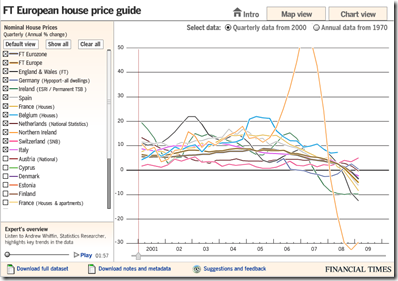
11 Jul 2009European Housing Prices (Q109 update)
8 Jul 2009In this case, the map view seems not very useful, but the chart view is well done, allowing a view of quarterly data from 2000 as well as annual from 1970. The links to the raw and meta data at the bottom is a nice touch I hope to see more often from everyone. Related article.
USA Today Economic Outlook Index (June edition)
In: Finance Housing Interactive Reference Source: USA Today Updated regularly US Economy
29 Jun 2009Updated June 24th. The best part is the lower chart showing the latest data for each of the 11 “leading indicators”.
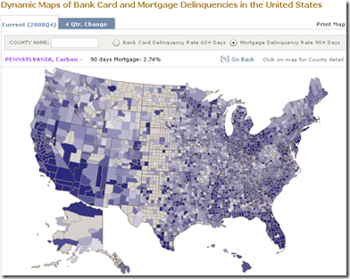
Credit Card and Mortgage Delinquency Map
29 Jun 2009From the NY Fed. Data available by county.
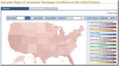
Non-Prime Mortgage Map
29 Jun 2009Produced by the NY Fed, this is an interactive map of non-prime mortgages. You can zoom down by zip code, view either the current or 6 month change, and pick from an assortment of loan-type indicators.
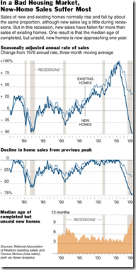
Housing is in Poor Shape
28 Jun 2009Despite what the NARs talking heads spout to the MSM at every data release, housing has not turned a corner. The related article includes a good explanation of what the charts show. For discussion check out Ritholtz’s post on the same article.
Yet Another Recovery Index
In: Bailout Employment Finance Housing Updated regularly US Economy
22 Jun 2009This one from Kiplinger. Pretty standard stuff – a color-coded summary and charts for each of six components. Uses a pretty weak (but easy to understand) recovery threshold: “When at least three of the six indicators go fully positive — with a check mark from us — it’s more than likely that the recession has ended.” The "watch for" section of each indicator are interesting.
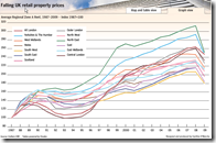
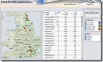
UK Retail Property Prices
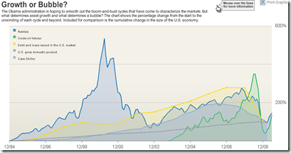
19 Jun 2009Bubbles 1994-2009
In: Bailout Finance Housing Reference Source: WSJ Stock Market US Economy
18 Jun 2009A good chart of US bubbles. The print version (p.A8, 6/18/09) had much better aesthetics. but the data are the same. Related article.
California Housing Inventory
In: Housing US Economy
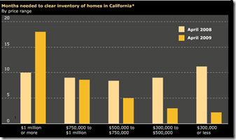
18 Jun 2009Not too bad. of course, these numbers are affected by all kinds of factors (people not listing because they’re underwater, etc). Source: Infectious Greed.
US Economic Stress Index (April 09 data)
In: Employment Finance Housing Interactive Maps Updated regularly US Economy
16 Jun 2009AP added to an already good interactive chart this month – you can now click through different periods with the slider at the bottom. The map displays unemployment, foreclosures, bankruptcy, or a composite “stress index”, by county. In the upper right you can change the period the %-change is calculated for. Double click on a region to zoom in; click&hold to move around.
What is Chart Porn?
An addictive collection of beautiful charts, graphs, maps, and interactive data visualization toys -- on topics from around the world.
Categories
- Bailout (118)
- Chartporn Related (3)
- Commentary (21)
- Culture (669)
- Emerging Markets (66)
- Employment (245)
- Environment/weather (133)
- Finance (298)
- Food (92)
- Global Economy (373)
- Graphic Design (bad) (26)
- Graphic Design (general) (183)
- Graphic Tools (23)
- History (158)
- Housing (162)
- Humor (204)
- Innovative (183)
- Interactive (545)
- Internet/tech (97)
- Maps (578)
- News Media (34)
- Politics (329)
- Reference (97)
- Science (331)
- Source: Economist (101)
- Source: FT (92)
- Source: NYT (147)
- Source: Ritholtz (76)
- Source: USA Today (27)
- Source: Washington Post (90)
- Source: WSJ (135)
- Sports (58)
- Stock Market (74)
- Uncategorized (2)
- Updated regularly (76)
- US Economy (553)
- Video (22)
- Aram Korevaar: This chart is now being used as a projection in which countries such as China see themselves as in a [...]
- David: Welcome back Chart Porn! [...]
- J S: Thanks for the great story. Miss reading this blog. Hope to see you more active again. [...]
- jake: I lived in a DC row house for 6 years, and I'm writing this comment from my tiny 1 bedroom apartment [...]
- ronny pettersen: Hilarious and unfortunately accurate... ;-) [...]


