Housing Archive:
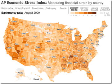
The well designed map displays unemployment, foreclosures, bankruptcy, or a composite “stress index”, by county. In the upper right you can change the period the %-change is calculated for (try it, it’s pretty nifty). To look at data over time, click on the “Oct.2007 to present” option and a historical slider will appear at the bottom (very slick to play with). Double click on a region to zoom in; click & hold to move around.
NYT Economic Indicators
In: Employment Finance Housing Reference Source: NYT US Economy
2 Oct 2009The NYT has a nice tiny tool that provides the most recent data for 25 economic indicators (housing, employment, production, confidence, etc). It appears at the top of their “Economy” page, and an ugly version of the flash tool can be viewed directly here.
International Housing Indicators
In: Global Economy Housing Innovative Interactive Source: Economist Updated regularly
28 Sep 2009The Economist just released a nice new tool for looking at several housing indicators across major countries. They plan to expand and update it as more information becomes available.
State of the Union
In: Culture Housing Maps US Economy
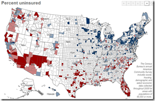
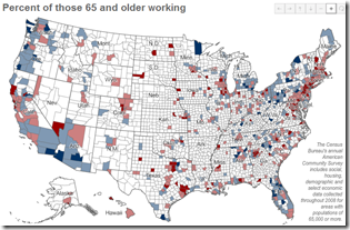
25 Sep 2009A number of interesting maps: percent of people uninsured (below), percent of people 65+ years old still working (below), median income, homeowners, percent of carpoolers, commute time.
Brookings Metro Monitor (Sept 09 report)
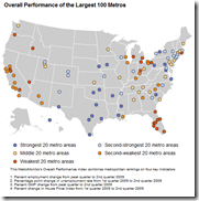
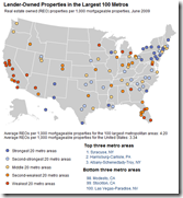
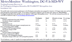
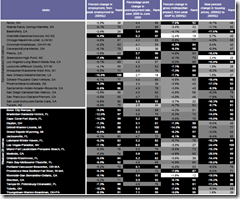
21 Sep 2009Brookings is tracking the economic health of 100 USA metro areas using a variety of indicators. Below are the maps for overall performance and REOs (there are more on the site). You can look up summary reports for individual cities. Also interesting are the rankings, which appear in the appendix of the full report.
One Crisis Later
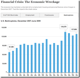
18 Sep 2009So many data releases focus (correctly) on percentage changes m-to-m or y-to-y; but once in a while it’s useful to look at the actual numbers. Below is the S&P, Employment, Foreclosures, and Bankruptcies.
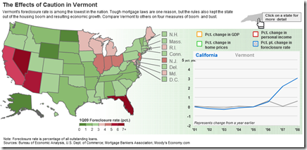
Housing: The United States vs Vermont
21 Aug 2009Compare some interesting housing variables (foreclosure rate, home price %change, personal income %change, and GDP). The related article talks about Vermont missing the boom and the bust.
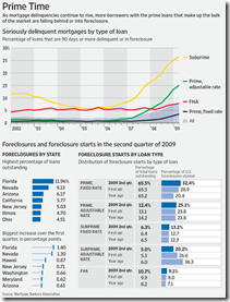
Foreclosure Breakdown
21 Aug 2009Excellent data from the WSJ, via The Big Picture.
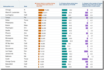
Home Available for Sale
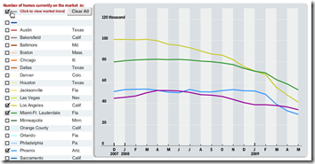
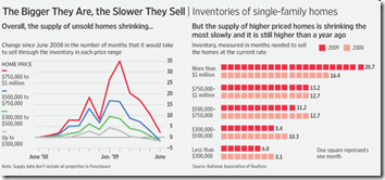
6 Aug 2009Two parts from the WSJ on home listings in major cities. First tab: bar charts showing number of homes for sale, percent who have reduced price, and change month-to-month.
Second tab: Line chart of inventories over the past 18 months.
Updated July 29th. The best part is the lower chart showing the latest data for each of the 11 “leading indicators”.
Housing Volume by Size
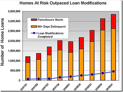
3 Aug 2009Foreclosures and Modifications
In: Housing US Economy
29 Jul 2009Not good. Is unemployment still a lagging indicator when housing and credit are at the center of a recession?
Housing Fraud in Florida
In: Housing Maps US Economy
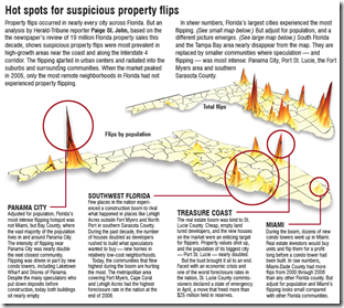
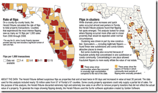
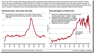
27 Jul 2009The Herald-Tribune is running a five-day investigative series on the rampant housing fraud in Florida. “Since 2000, more than 50,000 Florida properties flipped under circumstances that fraud investigators identify as suspicious — where homes, vacant land or commercial properties were bought and resold in 90 days or less and increased in value by at least 30 percent.” Wow!
What is Chart Porn?
An addictive collection of beautiful charts, graphs, maps, and interactive data visualization toys -- on topics from around the world.
Categories
- Bailout (118)
- Chartporn Related (3)
- Commentary (21)
- Culture (669)
- Emerging Markets (66)
- Employment (245)
- Environment/weather (133)
- Finance (298)
- Food (92)
- Global Economy (373)
- Graphic Design (bad) (26)
- Graphic Design (general) (183)
- Graphic Tools (23)
- History (158)
- Housing (162)
- Humor (204)
- Innovative (183)
- Interactive (545)
- Internet/tech (97)
- Maps (578)
- News Media (34)
- Politics (329)
- Reference (97)
- Science (331)
- Source: Economist (101)
- Source: FT (92)
- Source: NYT (147)
- Source: Ritholtz (76)
- Source: USA Today (27)
- Source: Washington Post (90)
- Source: WSJ (135)
- Sports (58)
- Stock Market (74)
- Uncategorized (2)
- Updated regularly (76)
- US Economy (553)
- Video (22)
- Aram Korevaar: This chart is now being used as a projection in which countries such as China see themselves as in a [...]
- David: Welcome back Chart Porn! [...]
- J S: Thanks for the great story. Miss reading this blog. Hope to see you more active again. [...]
- jake: I lived in a DC row house for 6 years, and I'm writing this comment from my tiny 1 bedroom apartment [...]
- ronny pettersen: Hilarious and unfortunately accurate... ;-) [...]

