Housing Archive:
Even When you Own, You’re Really Renting
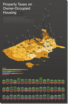
23 Sep 2010Property taxes nation-wide. Uses “median property tax paid” rather than the actual tax rate, so might be saying more about the size and value of houses in that state rather than the tax differential.
Update: AP Economic Stress Map
2 Aug 2010This map displays unemployment, foreclosures, bankruptcies, or a composite “stress index”, by county. Easy to miss: in the upper right you can change the scale of the mapping (rates, m-t-m, y-t-y). To look at data over time, click on the “monthly rates” option and a historical slider will appear at the bottom. Double click on a region to zoom in. Updated 8/2/10.
History of Home Values (1890-2010)
28 Jul 2010Update: NPR’s Toxic Real Estate Asset
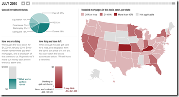
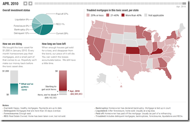
24 Jul 2010Planet Money bought a toxic mortgage asset and has been tracking it’s death spiral. It’s now almost completely dead (non-performing). In a recent article they also tried to track down the people who originally took out the mortgages.
Update: Economic Indicators Dashboard (July ‘10)
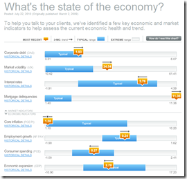
23 Jul 2010A great monthly status board for market and economic indicators. Click on anything – the popup details are great.
$4 Trillion Housing Bubble Hangover
19 Jul 2010Why housing prices (and the economy) are not going to recover any time soon. (via The Big Picture; earlier post)
Double Dip Danger Signs
In: Bailout Finance Housing Source: WSJ Stock Market US Economy
1 Jul 2010The WSJ looks at indicators in seven areas to gauge whether we are sliding back into recession. Related article.
China’s Housing Market
7 Jun 2010Economic Indicators Dashboard (May ‘10 update)
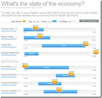
25 May 2010One of my favorite summaries of economic indicators. Click on any of the “historical details” to see what each indicator means and why it’s important.
The Planet Money blog at NPR bought their very own mortgage based toxic asset a few months ago (and named it “Toxie”). Not surprisingly, it’s not performing very well. The related articles are worth a read if you want a solid, simple explanation of how this stuff works.
Economic Indicators Dashboard (Apr ‘10 ver)
In: Employment Finance Housing Interactive Stock Market US Economy
23 Apr 2010One of my favorite summaries of economic indicators. Click on any of the “historical details” to see what each indicator means and why it’s important.
AP Economic Stress Map (March ‘10 update)
6 Apr 2010The map displays unemployment, foreclosures, bankruptcy, or a composite “stress index”, by county. Easy to miss: in the upper right you can change the scale of the mapping (rates, m-t-m, y-t-y). To look at data over time, click on the “monthly rates” option and a historical slider will appear at the bottom. Double click on a region to zoom in; click & hold to move around, point at a county for popup detail.
American Households (50s-00s)
5 Apr 2010Would have preferred to see this info in chart form. (via)
Housing Booms and Busts
31 Mar 2010Although this NY FED article is primarily focused on explaining Upstate NY’s immunity from the boom/bust cycle, it includes some interesting analysis of nation wide trends. (via The Big Picture).
What is Chart Porn?
An addictive collection of beautiful charts, graphs, maps, and interactive data visualization toys -- on topics from around the world.
Categories
- Bailout (118)
- Chartporn Related (3)
- Commentary (21)
- Culture (669)
- Emerging Markets (66)
- Employment (245)
- Environment/weather (133)
- Finance (298)
- Food (92)
- Global Economy (373)
- Graphic Design (bad) (26)
- Graphic Design (general) (183)
- Graphic Tools (23)
- History (158)
- Housing (162)
- Humor (204)
- Innovative (183)
- Interactive (545)
- Internet/tech (97)
- Maps (578)
- News Media (34)
- Politics (329)
- Reference (97)
- Science (331)
- Source: Economist (101)
- Source: FT (92)
- Source: NYT (147)
- Source: Ritholtz (76)
- Source: USA Today (27)
- Source: Washington Post (90)
- Source: WSJ (135)
- Sports (58)
- Stock Market (74)
- Uncategorized (2)
- Updated regularly (76)
- US Economy (553)
- Video (22)
- Aram Korevaar: This chart is now being used as a projection in which countries such as China see themselves as in a [...]
- David: Welcome back Chart Porn! [...]
- J S: Thanks for the great story. Miss reading this blog. Hope to see you more active again. [...]
- jake: I lived in a DC row house for 6 years, and I'm writing this comment from my tiny 1 bedroom apartment [...]
- ronny pettersen: Hilarious and unfortunately accurate... ;-) [...]

