Housing Archive:
Still falling…
23 Apr 2009Data Density
In: Culture Employment Food Global Economy Housing Innovative Maps Science
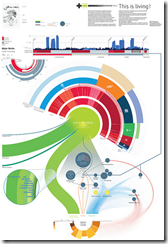
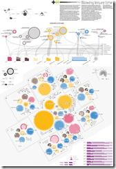
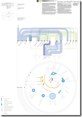
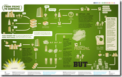
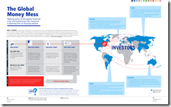
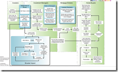
20 Apr 2009Visual Think Map recently turned me onto Design Density‘s Infographics – they include so much information it is almost hard to read them on a computer screen. truly “super-graphics” in Tufte’s meaning of the phrase.
Here’s a few examples on poverty related to housing, leisure, health care & food.
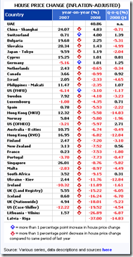
Global Property Prices
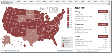
14 Apr 2009US Adversity Index
In: Employment Housing Interactive Maps Updated regularly US Economy
8 Apr 2009For major cities/states, based on employment, housing, and industrial production. Click on the slider to see monthly data back to 1994, click on a state to see cities on the right. (From MSNBC & Moody’s)
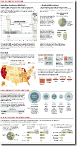
Economic State of the Union
In: Bailout Employment Finance Housing Source: Washington Post US Economy
8 Apr 2009A little dated now, but I didn’t come across the online version of this until today. it’d be nice if they kept it up to date.
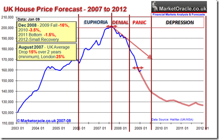
UK Housing Cycle
8 Apr 2009Nothing new, but you have to love the cycle annotation/commentary
(typical humor from Soot and Ashes)
Housing Continues to Tank (Jan 09 data)
1 Apr 2009State of the Economy (2/28 update)
In: Employment Finance Housing Interactive Source: Ritholtz Updated regularly US Economy
26 Mar 2009A very powerful interactive analytical presentation/tool.
From Russell Investments (via Ritholtz)
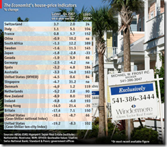
Global Housing Prices
23 Mar 2009Not the best labeled table I’ve seen, and putting the newest data on the left is a bit odd – the numbers themselves are depressing, of course (if you own a house).
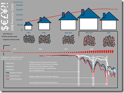
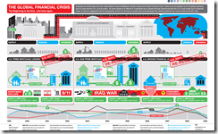
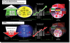
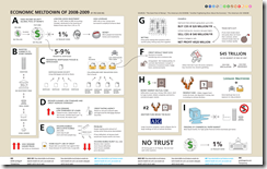
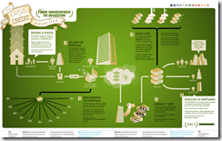
I recently came across FlowingData, a fantastic blog of data analysis and graphic design. Nathan covers a lot of the same territory that I do here, but casts a much broader net and has a lot of discussion about the design methods and tools of the trade. This post about Financial Crisis visualizations is a great example. The links below are to graphics I haven’t posted before (most of which are from a Good Magazine contest).
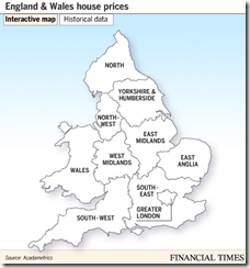
England and Wales House Price Map (Feb 09 data)
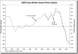
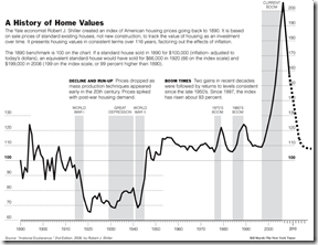
13 Mar 2009Nice Presentation of the Shiller Index
9 Mar 2009Most people are familiar with how this is calculated, but if you’re not:
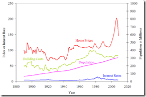
While we’re at it, here’s the famous long term chart and explanation:
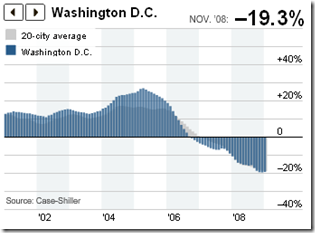
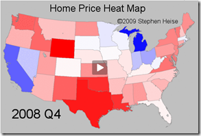
US Home Price Heat Map 1975-2008
6 Mar 2009What is Chart Porn?
An addictive collection of beautiful charts, graphs, maps, and interactive data visualization toys -- on topics from around the world.
Categories
- Bailout (118)
- Chartporn Related (3)
- Commentary (21)
- Culture (669)
- Emerging Markets (66)
- Employment (245)
- Environment/weather (133)
- Finance (298)
- Food (92)
- Global Economy (373)
- Graphic Design (bad) (26)
- Graphic Design (general) (183)
- Graphic Tools (23)
- History (158)
- Housing (162)
- Humor (204)
- Innovative (183)
- Interactive (545)
- Internet/tech (97)
- Maps (578)
- News Media (34)
- Politics (329)
- Reference (97)
- Science (331)
- Source: Economist (101)
- Source: FT (92)
- Source: NYT (147)
- Source: Ritholtz (76)
- Source: USA Today (27)
- Source: Washington Post (90)
- Source: WSJ (135)
- Sports (58)
- Stock Market (74)
- Uncategorized (2)
- Updated regularly (76)
- US Economy (553)
- Video (22)
- Aram Korevaar: This chart is now being used as a projection in which countries such as China see themselves as in a [...]
- David: Welcome back Chart Porn! [...]
- J S: Thanks for the great story. Miss reading this blog. Hope to see you more active again. [...]
- jake: I lived in a DC row house for 6 years, and I'm writing this comment from my tiny 1 bedroom apartment [...]
- ronny pettersen: Hilarious and unfortunately accurate... ;-) [...]





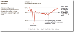
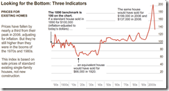


Bubble, Bubble, Economic Trouble…
In: Commentary Finance Housing Source: Ritholtz Source: WSJ US Economy
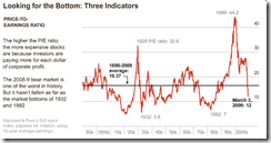
8 Apr 2009Nice WSJ article on bubbles. (via Ritholtz)