History Archive:
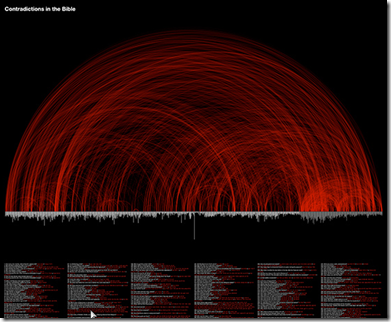
Contradictions in the Bible
12 Nov 2010This infographic identifies some 439 places where the Bible contradicts itself. From Project-reason.org.
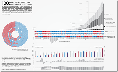
100 Years of US Government and Economy
2 Nov 2010A comprehensive timeline of parties and indicators. (via)
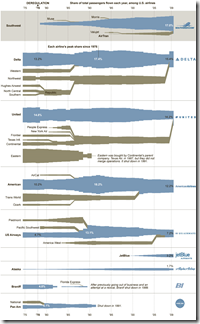
Fly Me! Airlines 1975-2010
30 Sep 2010A typically cool graphic from the NYT showing the births, deaths, assimilations, and growth of airlines since the 1970s.
Israeli Settlements (1990-2010)
27 Sep 2010From the Economist, a graph of public and private settlements. From the BBC, a map of the settlements and a summary of previous peace talks. note: we posted a (slightly better) WSJ settlement map in Feb.
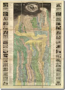
Tableau De L’Histoire Universelle
In: History
24 Sep 2010A beautifully drawn timeline of history, from creation to 1858 (when it was published). Very impressive..
WWI-II Economics and Design
In: Culture Graphic Design (general) History Politics Science
21 Sep 2010Saturday Morning Cartoons (1966-88)
21 Sep 2010The website is not the prettiest, and they skip a lot of the 80s, but looking at the annotated timeline I can literally remember how I got off the couch and switched channels each year.
Here’s an un-annotated version, covering 1979-1990 – sourced from TV guides:
and one for the 90s.
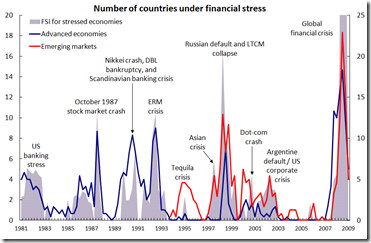
Financial Stress (1981-2009)
13 Sep 2010Interesting graph of global financial crises. I can’t tell why it has two different axis, though. I suppose the data is from the IMF’s Financial Stress Index.
History of GDP (1-2008)
17 Aug 2010Data compiled by Angus Maddison, an economist who died earlier this year, suggest that China and India were the biggest economies in the world for almost all of the past 2000 years. Why they fell so far behind may be more of a mystery than why they are currently flourishing.
(ps – the comments at the Economist are worth the read)
The History of Social Security
16 Aug 2010Roll over the timeline to see how funding, eligibility, and benefits have changed over the last 75 years. However, I think AP got the beneficiaries numbers completely wrong – the 2009 total is more like 52 million (source).
Correct graph:
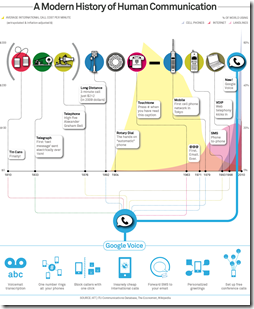
History of Communication
10 Aug 2010This infographic is intriguing because the most interesting part: the graph of call costs is hidden behind the jumble of labels – I didn’t even notice it until Ben Edmonds pointed it out. For the heck of it, I’ve also linked to other communication timelines.
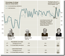
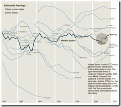
How Conservative is the US Supreme Court?
29 Jul 2010The Roberts Court has issued conservative decisions at a slightly higher rate than the Rehnquist or the Burger Courts. [Related article]
Thanks to epetrela for the link!
History of Home Values (1890-2010)
28 Jul 2010What is Chart Porn?
An addictive collection of beautiful charts, graphs, maps, and interactive data visualization toys -- on topics from around the world.
Categories
- Bailout (118)
- Chartporn Related (3)
- Commentary (21)
- Culture (669)
- Emerging Markets (66)
- Employment (245)
- Environment/weather (133)
- Finance (298)
- Food (92)
- Global Economy (373)
- Graphic Design (bad) (26)
- Graphic Design (general) (183)
- Graphic Tools (23)
- History (158)
- Housing (162)
- Humor (204)
- Innovative (183)
- Interactive (545)
- Internet/tech (97)
- Maps (578)
- News Media (34)
- Politics (329)
- Reference (97)
- Science (331)
- Source: Economist (101)
- Source: FT (92)
- Source: NYT (147)
- Source: Ritholtz (76)
- Source: USA Today (27)
- Source: Washington Post (90)
- Source: WSJ (135)
- Sports (58)
- Stock Market (74)
- Uncategorized (2)
- Updated regularly (76)
- US Economy (553)
- Video (22)
- Aram Korevaar: This chart is now being used as a projection in which countries such as China see themselves as in a [...]
- David: Welcome back Chart Porn! [...]
- J S: Thanks for the great story. Miss reading this blog. Hope to see you more active again. [...]
- jake: I lived in a DC row house for 6 years, and I'm writing this comment from my tiny 1 bedroom apartment [...]
- ronny pettersen: Hilarious and unfortunately accurate... ;-) [...]












How Stupid is it to Buy a Diamond?
In: Commentary Culture History
29 Oct 2010This classic Atlantic article explains in detail how the USA was manipulated into thinking diamond rings are a classy expression of your love – when in fact they are just a ripoff. While reading it I couldn’t help but see multiple parallels to what happened to the housing market and the “american dream”.
Here is a chart of diamond prices, 1960-2010: