History Archive:
The World is Getting Fat(ter)
4 Feb 2011Male and female body mass indices by country, from 1980-2008. Some interesting, but perhaps not surprising, observations: European men are consistently fatter than the women, poor people are skinny, and everyone has gotten fatter over the past 18 years. (related article)
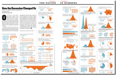
How the Recession Changed Us
In: Culture History US Economy
14 Jan 2011I’ve tried to avoid posting most of the trite “end of the year” infographics, but this one from the Atlantic comparing today to before the recession is interesting. (via)
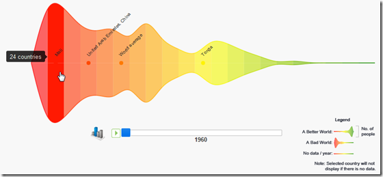
History of Global Health and Happiness (1960-2010)
In: History Interactive
13 Jan 2011Using data from the World Bank’s open data initiative, this interactive tool let’s you pick from a variety of social indicators, then animate how the world’s countries perform over time. It’s basically a colorful histogram, and I know some people are critical of mirroring above and below the axis like this – but it sure is pretty. (via)
I always love this type of kinetic video-graphic. It seems to me, though, that they are best suited to broad overview topics where you are trying to establish perspective, and not so good when your audience is already well informed. If you want to play with creating something like this yourself, a good tool to start with would be Prezi. (via)
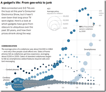
A very cool look at the cost and popularity of gadgets since the 1980s – covering phones, computers, TV, video, and audio. You can clearly see the “digital revolution” start around 2000, killing off earlier technologies; it’s also interesting to see the cost of any gizmo fall over time (the circles get smaller). By Alicia Parlapiano for the Washington post. (related article)
Seven Billion People
22 Dec 2010The Economist produced this video explaining population trends using a series of well designed radial diagrams, including the birth of the 7th billion living person, expected in 2011. The surprising part: after ridiculous growth in the past century, things are starting to slow down.
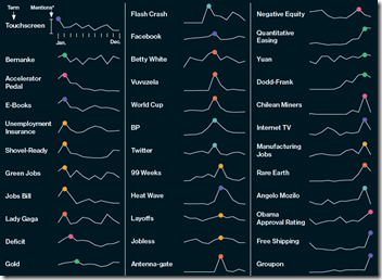
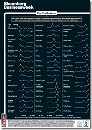
The 2010 Lexicon
20 Dec 2010Bloomberg mapped out the use of 2010’s buzzwords using sparklines, marking the peaks with some confusing colored dots (there’s a gaga color?!?). Oh, and the chart is sponsored by FourLoko – way to keep it classy, Bloomberg!
Ok, I’m being a little harsh – the charts are actually pretty cool to look through, and the use of sparklines is spot on.
Mapping America
15 Dec 2010The NYT’s has created a huge variety of interactive maps based on the Census Bureau’s American Community Survey. Click on “view more maps” to see different breakdowns (income, race, housing, education). Roll-overs popup details at the county or census area level. Related article.
Here’s the percentage of foreign born population in Washington DC:
Change in income level since 2000:
This one shows how racially divided DC still is (green vs blue)”:
They also used the data for some more detailed analysis, such as “How NYC’s Racial Makeup has changed since 2000” (clockwise from upper left: white, hipanic, asian, black). Related article.
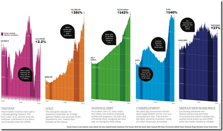
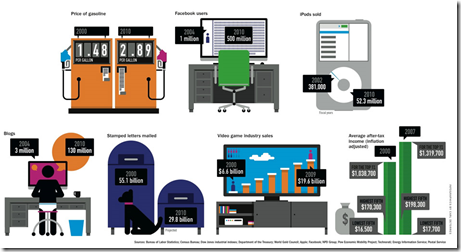
A Decade of Facts and Figures
15 Dec 2010I suppose we should prepare ourselves for the inevitable deluge of “end of decade” infographics. The below are from Time Magazine (which also has already compiled 40+ 2010 top ten lists – ick.)
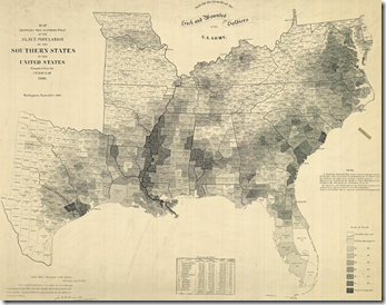
Map of American Slavery:1860
14 Dec 2010Contrary to my expectations, the use of slaves across the pre-civil war South was pretty diverse – as this map and accompanying article in the NYT shows. There is also an interactive version with annotated popups. (via)
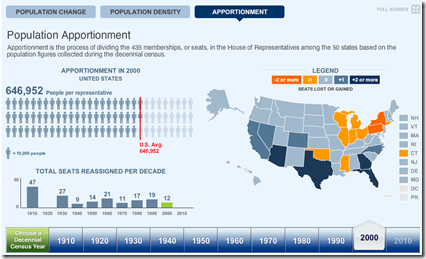
Census Map (1910-2010)
13 Dec 2010The 2010 data isn’t being released until next week, but the Census Bureau has pre-staged a very nice multi-part interactive map displaying state level data and related congressional apportionments from 1910-2010. (thanks to Samantha O’Neil for the link!)
Map of Metal
In: History Interactive Maps
9 Dec 2010A truly impressive interactive map of Heavy Metal music. Scroll through the decades of genres (separated by chains) from the 60s til today. Click on any skull to read a description and hear related tracks. (Thanks to Michael Lewis for the link!)
\m/
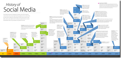
History of Social Media (550bc to 2010)
3 Dec 2010A pretty annotated timeline. Not much new here, and it seems a bit redundant to put the date on every cell, considering that they’re organized by column. (via)
World Bank Data Visualizer
In: Emerging Markets Global Economy History Interactive Reference
30 Nov 2010Graph a wide range of World Development Indicators, gapminder-style, using the World Bank’s Data Visualizer. There is also a trade-related version.
The 18th Century’s Internet
21 Nov 2010A very cool video describing Stanford University’s tracking of written letter networks of the 18th century. (Project site; related article; via)
What is Chart Porn?
An addictive collection of beautiful charts, graphs, maps, and interactive data visualization toys -- on topics from around the world.
Categories
- Bailout (118)
- Chartporn Related (3)
- Commentary (21)
- Culture (669)
- Emerging Markets (66)
- Employment (245)
- Environment/weather (133)
- Finance (298)
- Food (92)
- Global Economy (373)
- Graphic Design (bad) (26)
- Graphic Design (general) (183)
- Graphic Tools (23)
- History (158)
- Housing (162)
- Humor (204)
- Innovative (183)
- Interactive (545)
- Internet/tech (97)
- Maps (578)
- News Media (34)
- Politics (329)
- Reference (97)
- Science (331)
- Source: Economist (101)
- Source: FT (92)
- Source: NYT (147)
- Source: Ritholtz (76)
- Source: USA Today (27)
- Source: Washington Post (90)
- Source: WSJ (135)
- Sports (58)
- Stock Market (74)
- Uncategorized (2)
- Updated regularly (76)
- US Economy (553)
- Video (22)
- Aram Korevaar: This chart is now being used as a projection in which countries such as China see themselves as in a [...]
- David: Welcome back Chart Porn! [...]
- J S: Thanks for the great story. Miss reading this blog. Hope to see you more active again. [...]
- jake: I lived in a DC row house for 6 years, and I'm writing this comment from my tiny 1 bedroom apartment [...]
- ronny pettersen: Hilarious and unfortunately accurate... ;-) [...]


