History Archive:
The Wonderful Work of Karl Hartig
In: Culture Employment Finance Graphic Design (general) History Innovative Politics Science US Economy
22 Mar 2011Karl Hartig was creating beautiful complex data visualizations back when most of us “graphics experts” were still trying to figure out how to change colors in excel. Here is a selection of his work on population, electronics, energy, stocks, immigration, politics, and music. Soak it up!
World Map Drawn on a Fool’s Head
21 Mar 2011Just a beautiful map. From around 1590. Interestingly, nobody knows who created it and it is interpreted as a sort of 16th century commentary/protest. (alternate high def link)
digging around I found this version as well:
The legend in the left panel reads: “Democritus of Abdera laughed at [the world], Heraclitus of Ephesus wept over it, Epichtonius Cosmopolites portrayed it” (3). Over the cap is the Latin version of the Greek dictum, “Know thyself” (4). Across the cap’s brow, the inscription translates as “O head, worthy of a dose of hellebore” (5).
The Latin quote just above the map is from Pliny the Elder (6): “For in the whole universe the earth is nothing els e and this is the substance of our glory, this is its habitation, here it is that we fill positions of power and covet wealth, and throw mankind into an uproar, and launch wars, even civil ones.”
The reason for so much trouble and strife is explained in the quote below the map, from Ecclesiastes: “The number of fools is infinite” (7). Another quote from that most depressing of Bible books, on the jester’s staff to the right, intones: “Vanity of vanities, all is vanity” (8). Inscribed on the badges adorning the shoulder belt are a few sayings in line with this cheerful message: “Oh, the worries of the world; oh, how much triviality is there in the world” (9), “Everyone is without sense” (10), and “All things are vanity: every man living” (11).
For some researchers, the sum of these messages, as well as their presentation in a cartographic setting, point to a little-known Christian sect called the Family of Love. This clandestine group is said to have numbered the Flemish cartographer Ortelius in its ranks. If this map is anything to go by, the Family of Love must have espoused a rather harsh and pessimistic view of the world, and of humanity’s place in it. (Source)
A Century of Meat
18 Mar 2011Go chicken! I wonder why pork has such volatility? (related ethical dietary ponderings; Thanks to Patty Gaffney for the link!)
Atomic Atlas
17 Mar 2011The FT has created two maps of the world’s nuclear power plants. The first is a fairly comprehensive collection of information on distribution, types, and history:
The second is an interactive googlemaps-based version which locates operating, under construction, planned, and shut down plants. (related article)
Japan Crisis
13 Mar 2011Want to understand some of the technical aspects of the disaster?
Here’s a NYT interactive explanation of the quake itself:
A Washington Post explanation of what’s been happening at the nuclear plants:
Interactive graphs of the last 7 days of Japanese earthquakes on the left, historical comparison on the right:
And one that really brings home how much bigger this quake was than previous ones:
College Degrees (1940-2009)
12 Mar 2011An interactive map of adults with college degrees. Filter by race or income or drill down to your county. I’m not sure if it’s more surprising that it went from 4.6% to 27.5%, or that we’re only at 27.5% today. How long do you suppose before someone puts this next to a red/blue state map? (via Sociological Images)
1940 vs 2009:
Artist Ward Shelly draws some fascinating cultural flow charts, as I’ve mentioned before. I’m never quite sure what the size and width of the shapes are supposed to represent, but shit — they’re done by hand, comprehensive, and gorgeous. (via via)
Weather Porn
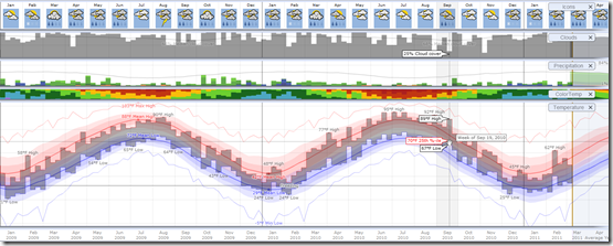
10 Mar 2011Weatherspark allows you to explore the entire historical record of more than 4,000 weather stations around the globe, using a variety of beautifully interactive graphs. Sites like this make me so click-happy – everything is so smooth and well-executed I can’t stop playing with all the options just to see what happens. Try drilling down from annual to daily data, for example, and watch how everything dynamically rescales. (via)
Here is Washington, DC 2009-11:
US GDP Per Capita (1871-2009)
In: History US Economy
9 Mar 2011I’m just posting this into the chart rolodex in case I ever have a need for it. Long time series can be a surprisingly big pain in the ass to pull together. Case in point: I had never seen the site MeasuringWorth before (which is where this data came from). Nice!
Case-Shiller as Rollercoaster (1890-2010)
In: History Housing Innovative
8 Mar 2011View the inflation adjusted Case-Shiller home price index as if you were riding the chart on a roller coaster. An update of the classic version from Speculative Bubble (that only went through 2007).
The Gender Gap
8 Mar 2011The Wall Street Journal has pulled together some interesting differences between the sexes concerning marital, educational, and employment trends.
Google and Eyebeam have created a $10,000 dataviz challenge for designers to visualize how individual federal income taxes are spent. The site includes details, data, and a few cool examples, like the one below that lets you input your income and see how the government shelled out your shekels. Submissions are due by March 27, 2011. (Thanks to Melissa Mac for the link!)
An inspirational British version:
and a excellent interactive chart one that let’s you examine the changing income inequality in the united states (and probably the only good use I’ve seen of a pie chart in a long time):
US Budget 1981-2012
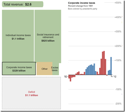
15 Feb 2011Here are some interactive tools to let you explore the President’s recent budget proposal, where that money comes from, and where it goes. First, from the Washington Post, a look at 30 years of budgets: Revenue is on the left, expenses on the right; click on any box to see the percentage change since 1981; bars are colored by the president’s party.
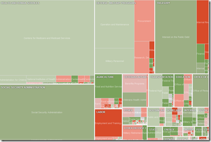
Next, a more detailed treemap from the NYT, but only covering the 2012 values and change from 2010.
Southern Democrats (1964-2010)
8 Feb 2011The Economist produced this annotated video-graphic of mapped donut charts illustrating the dominance of southern democrats in the 1960s, and their subsequent decline.
Global Debt (1880-2009)
In: Finance Global Economy History Interactive Maps Politics
7 Feb 2011The IMF has released a new database of sovereign debt-to-gdp ratios for 174 countries, going back as far as 1880 (for G7 countries).
The data shows how government debt has risen and fallen over the years as important events, such as wars and stock market crashes, affect a country’s decisions about when to save and when to spend. It turns out the relationship between debt and economic growth has changed over time; historically, fast growing countries had low debt ratios, while slow growers struggled under higher debt. In the past 30 years that relationship has altered as advanced economies’ debt levels have risen and their economies have grown.The data also debunks some old clichés, for example that African countries have the highest debt levels. In fact, low income countries in Africa today have lower debt ratios than do advanced economies in Europe and North America.
The below charts appear in a slightly slow, but interesting, IMF You-tube video:
The data can also be explored and exported using the IMF’s DataMapper (note the links at the bottom of the mapper to the related working paper and dataset):
What is Chart Porn?
An addictive collection of beautiful charts, graphs, maps, and interactive data visualization toys -- on topics from around the world.
Categories
- Bailout (118)
- Chartporn Related (3)
- Commentary (21)
- Culture (669)
- Emerging Markets (66)
- Employment (245)
- Environment/weather (133)
- Finance (298)
- Food (92)
- Global Economy (373)
- Graphic Design (bad) (26)
- Graphic Design (general) (183)
- Graphic Tools (23)
- History (158)
- Housing (162)
- Humor (204)
- Innovative (183)
- Interactive (545)
- Internet/tech (97)
- Maps (578)
- News Media (34)
- Politics (329)
- Reference (97)
- Science (331)
- Source: Economist (101)
- Source: FT (92)
- Source: NYT (147)
- Source: Ritholtz (76)
- Source: USA Today (27)
- Source: Washington Post (90)
- Source: WSJ (135)
- Sports (58)
- Stock Market (74)
- Uncategorized (2)
- Updated regularly (76)
- US Economy (553)
- Video (22)
- Aram Korevaar: This chart is now being used as a projection in which countries such as China see themselves as in a [...]
- David: Welcome back Chart Porn! [...]
- J S: Thanks for the great story. Miss reading this blog. Hope to see you more active again. [...]
- jake: I lived in a DC row house for 6 years, and I'm writing this comment from my tiny 1 bedroom apartment [...]
- ronny pettersen: Hilarious and unfortunately accurate... ;-) [...]


