History Archive:
Not Your Parents’ Economy
9 Sep 2011An elegant multi-indicator graphic from the NYT on income inequality and jobs. It’s disappointing that it took so long for the story of these trends to get traction in the media. (related article)
Post Offices 1700-1900
In: History Interactive Maps
10 Aug 2011Derek Watkins created this beautiful animated map proxying the expansion of “civilization” across the United States during the 18th and 19th centuries. I particularly like the running timeline at the bottom.
College Grade Inflation (1960-2008)
15 Jul 2011There’s a new study on the history of collegiate grade inflation. Fascinating stuff – particularly the difference in giving As in private vs public schools. Thanks to David Cramer for passing on the link!
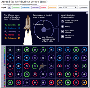
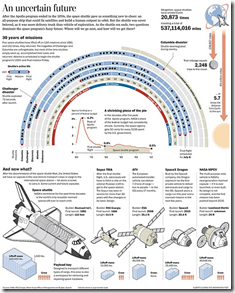
Space Shuttle Histories
7 Jul 2011An assortment of cool graphics charting the history of the space shuttle. I watched a launch in person back in 1989 – it was awesome.
Bonus: HD video compilation of launches from different angles:
Evolution of the Map of Africa (1554-1880)
7 Jul 201111 maps showing the evolution of what we thought Africa looked like. Personally, I’m fairly impressed by quickly they had it figured out. By the way, the site where I found this: www.howtobearetronaut.com is fantastic.
For comparison, here is Google’s satellite version, which I suppose is cheating:
Evolution of Alphabets
In: History Innovative
27 Jun 2011Animated evolution of the Latin character set from Phonecian. Other timelines are available.
What Makes a Hit Song?
In: Culture History Innovative
23 Jun 2011Rutgers students Shaun Ellis and Thomas Engelhardt tried to discover the secrets sauce behind a “hit” song by analyzing 4,200+ songs that made it to the top ten of Billboard’s Hot-100 chart. Using the echonest api, they took a look at tempo, duration, time signature, key, and abstracts like “energy” and “danceability”. The main results are laid out here.
The fun part is, they made the whole data set available in Tableau for us to play with (download Tableau reader (free) and the dataset). Using the filters, you can answer bizarre questions such as how many hits in 1979 were on the charts more than 20 weeks that were recorded in the key of C (answer: 7). Or you can look at the data over time to discover all kinds of interesting long-term trends:
A scatter of all of the songs illustrates that the average tempo is 120 BPM.
Finally proven mathematically, songs of the 1980s consistently had the highest “danceability” (suck it, 90s!):
Hits are getting longer in length:
You can document the much maligned increase in loudness after the introduction of the CD, though it is also part of a longer-term trend.
If you have the full version of Tableau, you can design your own charts (but you probably don’t, because Tableau is too damn expensive).
Update: There are a few additional Tableau visualizations of this data available (that don’t require you to install anything) that are also quite interesting.
Conflict Deaths (1915-Present)
21 May 2011In a strange juxtaposition of imagery, this photo uses fake blood and kitchen containers to visualize 38 million deaths from various conflicts. Overall, I really like the concept, but from the way the objects are arranged and the angle of the photograph (with the blood taking up only the lower 20% of the photo), they visually seem small to me. Also, I don’t quite get the “World Cuisine” title, despite the food/cooking metaphor.
Housing Prices (1890-2011)
15 Apr 2011Updated chart of the classic Case-Shiller housing price index. On the one hand it looks like the decline may be bottoming out – but on the other, there is still massive intervention supporting the market and we could very likely overshoot fair value.
Top Tax Rates (1916-2010)
15 Apr 2011More excellent work from VisualizingEconomics:
Geologic Time
In: History Innovative
5 Apr 2011There have been a number of beautiful attempts to diagram geologic time.
Interactive timeline from the Smithsonian:
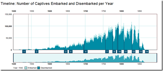
The trans-atlantic slave trade database has been assembling historic records of slave ship voyages. The stunning fact to me: of the 12 or so million slaves brought to the new world, only about 400,000 came to mainland North America. The database itself can be explored through a system of searches and pivot tables, right down to the names of the ships’ captains.
An 85 foot long annotated timeline of early American financial and industrial history. Similar to the 1775-1943 Booms and Busts timeline I posted last year, this one isn’t quite as technical, but the historical notes are fascinating: 1877: “Guaranteed Mtges coming into use”, 1899: “100 taxis in New York”, 1910: “Movie censorship being demanded”. (via)
US Eugenical Laws
28 Mar 2011The map below shows which states had pro-sterilization laws back in 1935, and the number of “operations” in each. Want to know who the government deemed ineligible to breed? – browse this scary-ass book from 1922. Not feeling that brave? — the wikipedia entry will give you the practical bits.
US Housing Prices, Nominal and Real (1890-2010)
In: History Housing US Economy
25 Mar 2011Housing prices trends don’t look the same if you adjust for inflation.
On a side note, the designer of the above, Catherine Mulbrandon over at Visualizing Economics, has a kickstarter campaign to fund production of a new publication on US Income. She does great work and I recommend you donate, if so inclined.
What is Chart Porn?
An addictive collection of beautiful charts, graphs, maps, and interactive data visualization toys -- on topics from around the world.
Categories
- Bailout (118)
- Chartporn Related (3)
- Commentary (21)
- Culture (669)
- Emerging Markets (66)
- Employment (245)
- Environment/weather (133)
- Finance (298)
- Food (92)
- Global Economy (373)
- Graphic Design (bad) (26)
- Graphic Design (general) (183)
- Graphic Tools (23)
- History (158)
- Housing (162)
- Humor (204)
- Innovative (183)
- Interactive (545)
- Internet/tech (97)
- Maps (578)
- News Media (34)
- Politics (329)
- Reference (97)
- Science (331)
- Source: Economist (101)
- Source: FT (92)
- Source: NYT (147)
- Source: Ritholtz (76)
- Source: USA Today (27)
- Source: Washington Post (90)
- Source: WSJ (135)
- Sports (58)
- Stock Market (74)
- Uncategorized (2)
- Updated regularly (76)
- US Economy (553)
- Video (22)
- Aram Korevaar: This chart is now being used as a projection in which countries such as China see themselves as in a [...]
- David: Welcome back Chart Porn! [...]
- J S: Thanks for the great story. Miss reading this blog. Hope to see you more active again. [...]
- jake: I lived in a DC row house for 6 years, and I'm writing this comment from my tiny 1 bedroom apartment [...]
- ronny pettersen: Hilarious and unfortunately accurate... ;-) [...]


