History Archive:
12 Historic Visualizations
31 Jan 2012Population Pyramids
23 Jan 2012I’ve loved these types of charts since I first saw them used for insight into the Arab Spring discontent. What’s great about the version linked below is the country coverage that Worldlifeexpectancy.com has managed to pull together – it’s very impressive. If you wander the site, there are a lot of additional maps and charts on global causes of death, life expectancy, and other fun demographic topics. (via)
On a design note: Wow. I haven’t seen someone attempt a black background and glowing neon fonts in such a manner since the earliest days of the internet. I don’t know whether to applaud the boldness and bust out some glowsticks, or put on sunglasses to prevent a seizure. I suppose since it’s all about death, the black kinda works.
A brilliant chart of computer sales. Note the log scale!
There’s also an animated version (but I like the static one better):
Here’s a look at the same data in terms of market share:
(via Ritholtz)
Financial Crises (1810-2010)
18 Jan 2012A new graphic from HistoryShots, based on Reinhart & Rogoff’s well researched book: This Time Is Different: Eight Centuries of Financial Folly. The top half of the chart maps financial crises in terms of GDP affected, while the bottom indicates number of sovereign defaults.
I just ordered a copy. If you’re into this long-term economic history stuff, check out US Booms and Busts (1775-1943).
Interest Rates (1831-2011)
In: Finance History US Economy
19 Dec 2011Road Casualties (2001-09)
In: History Interactive Maps
29 Nov 2011Death and Gravestone Symbolism
1 Nov 2011This is a strange little compendium of symbols. Half of these symbols are completely obvious, and I was ready to dismiss the whole thing as link-bait, but then there are a number of little gems that I never would have guessed. Also, when was the last time you saw a mono-spaced courier font used? It sort of works here, though overall there are a few too many different fonts strewn around. I also have to give credit that the source links at the bottom do indeed lead to more interesting information on the subject.
The Road to 7 Billion
27 Oct 2011The Financial Times has pulled together some interactive visualizations of world demographics as we approach 7 billion people. I would have liked to see the population pyramids for more countries. The fertility/education graph is a bit shocking.
Note: Some FT features require a subscription.
Scary Movies (1933-2006)
20 Oct 2011Halloween is next week! This graphic compares budget, box office revenue, and rotten tomatoes ratings of most of the classics.
Life Expectancy (1960-2009)
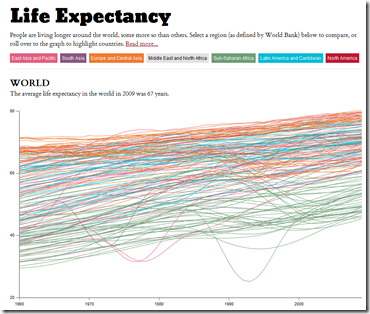
15 Oct 2011Highlight by region, roll over for individual country info. The interface is a little janky – you can join the discussion over at FlowingData if you have any suggestions.
Leader Timeline
3 Oct 2011Interesting photo timeline design idea. To be fair, they should have used a linear scale. (via; thanks to David Cramer for the link).
Airline Timeline
In: History US Economy
22 Sep 2011The good people over at HistoryShots created this beautiful geneology of airline companies. It’s interesting to note how many airlines disappeared right around the time of industry de-regulation in the late 1970s.
Newspapers (1690-2011)
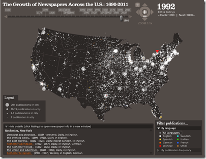
16 Sep 2011Much like the post office timeline movie I posted last month, below we have the history of newspaper expansion across the USA. Interestingly, this movie is actually an extraction from a very well done interactive visualization of the Library of Congress’s newspaper database. You can even drill down to individual towns and see information about each newspaper. (via)
The Cost of 9/11
11 Sep 2011NYT presents a graphical breakdown of some cost estimates for 9/11:
You can drill down into the different categories:
What is Chart Porn?
An addictive collection of beautiful charts, graphs, maps, and interactive data visualization toys -- on topics from around the world.
Categories
- Bailout (118)
- Chartporn Related (3)
- Commentary (21)
- Culture (669)
- Emerging Markets (66)
- Employment (245)
- Environment/weather (133)
- Finance (298)
- Food (92)
- Global Economy (373)
- Graphic Design (bad) (26)
- Graphic Design (general) (183)
- Graphic Tools (23)
- History (158)
- Housing (162)
- Humor (204)
- Innovative (183)
- Interactive (545)
- Internet/tech (97)
- Maps (578)
- News Media (34)
- Politics (329)
- Reference (97)
- Science (331)
- Source: Economist (101)
- Source: FT (92)
- Source: NYT (147)
- Source: Ritholtz (76)
- Source: USA Today (27)
- Source: Washington Post (90)
- Source: WSJ (135)
- Sports (58)
- Stock Market (74)
- Uncategorized (2)
- Updated regularly (76)
- US Economy (553)
- Video (22)
- Aram Korevaar: This chart is now being used as a projection in which countries such as China see themselves as in a [...]
- David: Welcome back Chart Porn! [...]
- J S: Thanks for the great story. Miss reading this blog. Hope to see you more active again. [...]
- jake: I lived in a DC row house for 6 years, and I'm writing this comment from my tiny 1 bedroom apartment [...]
- ronny pettersen: Hilarious and unfortunately accurate... ;-) [...]


