History Archive:
1870 Census Maps
10 Mar 201054 maps and charts. The level of detail and sophistication is pretty damn impressive for the period. (again from Radical Cartography — can you tell I’m digging through that site? Love it.)
137 Years of Popular Science
9 Mar 2010Popular Science magazine has partnered with Google to make available it’s entire archive. Keyword searches bring up an entire month/issue with your search result highlighted. It looks they have OCR’d every page, making for some cool search results. (via)
For example, a search of “map” brought up this map of US science sites from 1967:
and this first air-map of the north pole from 1931:
“Chart” brings up radiological diagrams from 1950 (among many many others)
History of the World in Objects
2 Mar 2010From the BBC. Use the slider on the right to scroll through history, then click on an object to see it’s significance; tons of filters on the left. (via)
NYC 1782 vs Today
17 Feb 2010Use the blue slider in the lower right to fade between a 1782 map that shows old streams and hills, and a modern map.
Major Trends and Events 1750-2100
In: Culture Global Economy History Politics Reference Science
8 Jan 2010Would make a good poster. Some of the predictions are questionable, of course. (via)
From the Neolithic till today, filter by country, zoom in to specific historic events, or take a journey based on certain topics. Very well done, from the BBC.
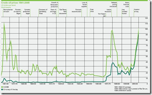
Crude Oil Prices 1861-2008
18 Jun 2009Some chart-junk here (raining data points? really?).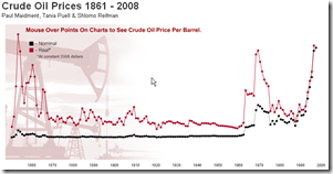
Infectious greed has another version, with historical annotations and some interesting comments:
What is Chart Porn?
An addictive collection of beautiful charts, graphs, maps, and interactive data visualization toys -- on topics from around the world.
Categories
- Bailout (118)
- Chartporn Related (3)
- Commentary (21)
- Culture (669)
- Emerging Markets (66)
- Employment (245)
- Environment/weather (133)
- Finance (298)
- Food (92)
- Global Economy (373)
- Graphic Design (bad) (26)
- Graphic Design (general) (183)
- Graphic Tools (23)
- History (158)
- Housing (162)
- Humor (204)
- Innovative (183)
- Interactive (545)
- Internet/tech (97)
- Maps (578)
- News Media (34)
- Politics (329)
- Reference (97)
- Science (331)
- Source: Economist (101)
- Source: FT (92)
- Source: NYT (147)
- Source: Ritholtz (76)
- Source: USA Today (27)
- Source: Washington Post (90)
- Source: WSJ (135)
- Sports (58)
- Stock Market (74)
- Uncategorized (2)
- Updated regularly (76)
- US Economy (553)
- Video (22)
- Aram Korevaar: This chart is now being used as a projection in which countries such as China see themselves as in a [...]
- David: Welcome back Chart Porn! [...]
- J S: Thanks for the great story. Miss reading this blog. Hope to see you more active again. [...]
- jake: I lived in a DC row house for 6 years, and I'm writing this comment from my tiny 1 bedroom apartment [...]
- ronny pettersen: Hilarious and unfortunately accurate... ;-) [...]


