History Archive:
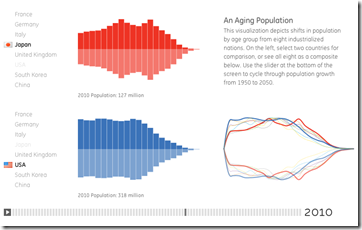
Demographics (1950-2050)
25 Jul 2010A very smooth interactive that allows you to compare the population composition of 8 countries over time. You can see some interesting trends by playing with the timeline control at the bottom — like watching the baby boom bulge move through the USA population then disappear, or the holes left in european age groups by WWII.
Data Visualization Timeline
15 Jul 2010An interactive timeline of innovations and milestones, from the 1600s-today. Note: click on any item for more details.
Interesting analysis of both the print and online versions, from a layout point of view. (via)
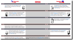
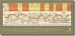
British Political Parties (1830-2010)
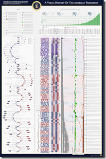
28 Jun 2010Visual History of the American Presidency
13 Jun 2010More beautifully detailed work from Timeplots.
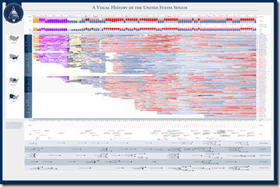
Visual History of the US Senate (1789-2010)
4 Jun 2010A very detailed visualization from the good people at Timeplots.
American Households (50s-00s)
5 Apr 2010Would have preferred to see this info in chart form. (via)
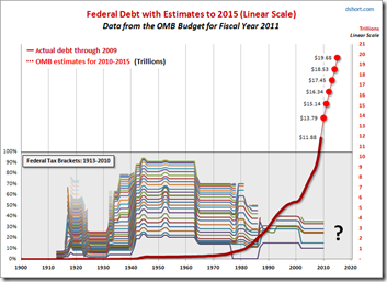
Federal Debt and Tax Brackets (1900-2015)
31 Mar 2010Dshort always has interesting medium/long-term analyses. I really like the representation of historic tax brackets in the bottom half of this one (based on data from taxfoundation.org)
2000 Years of Economic Growth
29 Mar 2010ok, maybe the scale needs work, but it’s interesting nonetheless – as is the accompanying article.
US Booms and Busts (1775-1943)
24 Mar 2010Fascinating time-line of US economic cycles. Someone should make a wall chart out of this – I would buy a copy. (via St Louis Fed and The Big Picture)
A nice companion piece perhaps is Irving Fisher’s 1932 “Booms and Depressions: Some First Principles“:
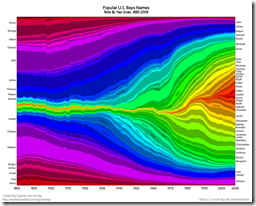
Popular Boys and Girls Names (1880-2008)
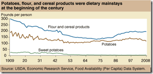
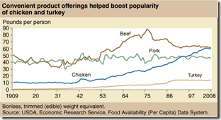
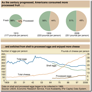
23 Mar 2010America’s Eating Habits (1909-2009)
17 Mar 2010What is Chart Porn?
An addictive collection of beautiful charts, graphs, maps, and interactive data visualization toys -- on topics from around the world.
Categories
- Bailout (118)
- Chartporn Related (3)
- Commentary (21)
- Culture (669)
- Emerging Markets (66)
- Employment (245)
- Environment/weather (133)
- Finance (298)
- Food (92)
- Global Economy (373)
- Graphic Design (bad) (26)
- Graphic Design (general) (183)
- Graphic Tools (23)
- History (158)
- Housing (162)
- Humor (204)
- Innovative (183)
- Interactive (545)
- Internet/tech (97)
- Maps (578)
- News Media (34)
- Politics (329)
- Reference (97)
- Science (331)
- Source: Economist (101)
- Source: FT (92)
- Source: NYT (147)
- Source: Ritholtz (76)
- Source: USA Today (27)
- Source: Washington Post (90)
- Source: WSJ (135)
- Sports (58)
- Stock Market (74)
- Uncategorized (2)
- Updated regularly (76)
- US Economy (553)
- Video (22)
- Aram Korevaar: This chart is now being used as a projection in which countries such as China see themselves as in a [...]
- David: Welcome back Chart Porn! [...]
- J S: Thanks for the great story. Miss reading this blog. Hope to see you more active again. [...]
- jake: I lived in a DC row house for 6 years, and I'm writing this comment from my tiny 1 bedroom apartment [...]
- ronny pettersen: Hilarious and unfortunately accurate... ;-) [...]

