Graphic Design (general) Archive:
What You Can Do About Global Warming
In: Culture Environment/weather Graphic Design (general) Science
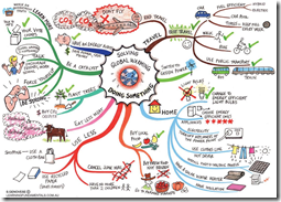
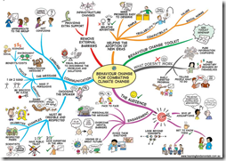
6 May 2010Some cool “mind-maps” of things you can do about global warming, your health, and connecting with nature. Simplistic, but appealing and effective. (via)
An excellent article from Cool Infographics.
Color Color and more Color
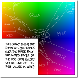
4 May 2010XKCD performed a lovely survey of his readers on color perception.
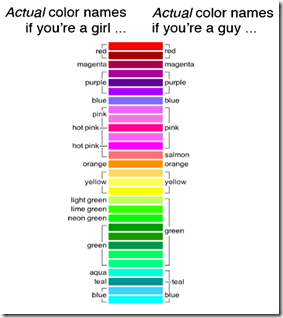
which made mention of the below humorous comic from Doghouse Diaries.
which inspired xkcd to use the same presentation for his real-world results:
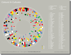
Also, Mike Lewis sent me a link to the below “Coulours in Cultures” wheel by Information is Beautiful.
Which reminded me of Cymbolism’s survey and graphs of colors and emotions:
You’ve probably seen the “Afghanistan Stability” chart below, and some of the commentary (e.g. – Guardian or the discussion at FlowingData). My personal favorite is the parody by John Stewart below which extends to Patton, Star Wars, and beyond.
| The Daily Show With Jon Stewart | Mon – Thurs 11p / 10c | |||
| Afghanistan Stability Chart | ||||
| ||||
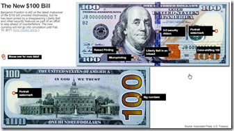
The New Benjamin
26 Apr 2010Anyone else think the 3d ribbon down the middle is butt ugly? And the liberty bell inside an inkwell? Ick.
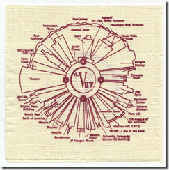
Napkin Map of NYC
26 Apr 2010A map of the NYC skyline as seen from the rotating restaurant the View. I like the simplicity and practicality.
Small Multiples: When to Use Them
26 Apr 2010A nice article from Juice Analytics on the advantages/disadvantages of using small multiples in graphic design, along with some good examples.
So You Need a Typeface
16 Apr 2010Infographic Infographic
12 Apr 2010Stacked Bar Chart Dos & Don’ts
31 Mar 2010Another great article from Jon Peltier on using design methods to make things clearer. Each of the below are based on the same data.
Simple data, with a quality discussion at Jon Peltier’s blog of the different ways to visualize it (based on this inspiration).
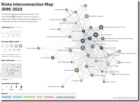
Risk Interconnection Map
In: Graphic Design (general) Innovative Interactive Maps Politics
21 Mar 2010From the World Economic Forum, based on this year’s Global Risk report. Thanks to Sean R. for passing it on!
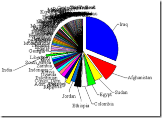
Where USA Foreign Aid Goes
16 Mar 2010Interesting: This chart uses poor design to help make it’s point. I like! (even if it wasn’t done on purpose).
Thanks to Sam Freund for passing it on! (originally via)
Context is Everything
16 Mar 2010Personally, I love image theory examples. Sociological Images links to a Montclair Socioblog post that noticed some interesting HSBC ads that illustrate how the same image can be interpreted different ways. “When we look at the world we see that different values are what make it so remarkable” reads one of the taglines. Inspirational, yes – but I’m not sure what that has to do with banking?!?
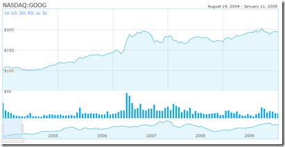
Make Your Own Interactive Finance Charts
16 Mar 2010A new method, using java and html instead of Google’s flash version. The documentation is slightly greek to me, but it doesn’t look too labor intensive. (via)
What is Chart Porn?
An addictive collection of beautiful charts, graphs, maps, and interactive data visualization toys -- on topics from around the world.
Categories
- Bailout (118)
- Chartporn Related (3)
- Commentary (21)
- Culture (669)
- Emerging Markets (66)
- Employment (245)
- Environment/weather (133)
- Finance (298)
- Food (92)
- Global Economy (373)
- Graphic Design (bad) (26)
- Graphic Design (general) (183)
- Graphic Tools (23)
- History (158)
- Housing (162)
- Humor (204)
- Innovative (183)
- Interactive (545)
- Internet/tech (97)
- Maps (578)
- News Media (34)
- Politics (329)
- Reference (97)
- Science (331)
- Source: Economist (101)
- Source: FT (92)
- Source: NYT (147)
- Source: Ritholtz (76)
- Source: USA Today (27)
- Source: Washington Post (90)
- Source: WSJ (135)
- Sports (58)
- Stock Market (74)
- Uncategorized (2)
- Updated regularly (76)
- US Economy (553)
- Video (22)
- Aram Korevaar: This chart is now being used as a projection in which countries such as China see themselves as in a [...]
- David: Welcome back Chart Porn! [...]
- J S: Thanks for the great story. Miss reading this blog. Hope to see you more active again. [...]
- jake: I lived in a DC row house for 6 years, and I'm writing this comment from my tiny 1 bedroom apartment [...]
- ronny pettersen: Hilarious and unfortunately accurate... ;-) [...]

