Graphic Design (general) Archive:
RSA Animations
28 Jun 2010The RSA (Royal Society for the encouragement of Arts, Manufactures and Commerce) has been producing a series of fascinating animated info-lectures on a variety of topics. Below is a sampling.
on time:
on being "happy!":
Superfreakonomics:
Infographomania
23 Jun 2010Another self-loathing infographic (that I am in complete agreement with). You might have noticed that Chartporn doesn’t post every infographic out there. I try to filter out the more boilerplate ones – I read all the crap, so you don’t have to.
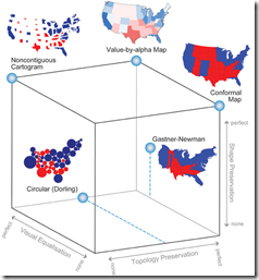
A detailed article discussing using alpha values (transparency) instead of standard cartograms. I really really like the cube of thematic map typography. Related paper.
Sparklines in Twitter
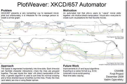
9 Jun 2010Plotweaver Graphing Software
9 Jun 2010Stanford Student Vadim Ogievetsky is writing some software to allow the automated creation of timeline charts like XKCD’s “Interactions of Move Characters”. I didn’t dig too deep into this, but there’s lots of detail there is you’re interested. (via)
Color Strata
9 Jun 2010A beautiful chart of the most popular colors (based on the xkcd survey data).
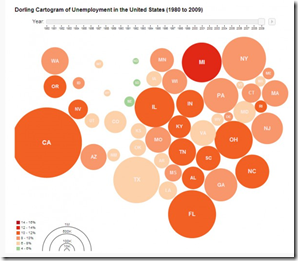
Unemployment 1980-2009
4 Jun 2010Odds of Being Killed
19 May 2010I don’t much care for the infographic, but I love weird warning signs. (via)
Thai Politics Timeline
18 May 20105 Myths of Visual Communication
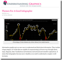
12 May 2010and while we’re at it, here’s another excellent article from the same blog (Understanding Grahics) on “Themes for a Good Infographic“:
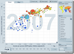
When to Use Motion Charts
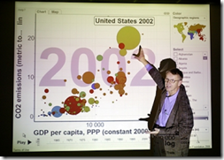
11 May 2010Everyone loves Hans Roslings Ted Talks, but when is motion a good thing to add to your visualizations? Juice Analytics has written up a short answer.
Excellent article by Sarah Slobin (who has worked for NYT, Fortune, CNN, WSJ, etc) on how to research and design your own work. (via)

History of the Infographic
7 May 2010Flowing Data has written up an interesting 1st hand account of the rise of online infographics (since ~2006).
What is Chart Porn?
An addictive collection of beautiful charts, graphs, maps, and interactive data visualization toys -- on topics from around the world.
Categories
- Bailout (118)
- Chartporn Related (3)
- Commentary (21)
- Culture (669)
- Emerging Markets (66)
- Employment (245)
- Environment/weather (133)
- Finance (298)
- Food (92)
- Global Economy (373)
- Graphic Design (bad) (26)
- Graphic Design (general) (183)
- Graphic Tools (23)
- History (158)
- Housing (162)
- Humor (204)
- Innovative (183)
- Interactive (545)
- Internet/tech (97)
- Maps (578)
- News Media (34)
- Politics (329)
- Reference (97)
- Science (331)
- Source: Economist (101)
- Source: FT (92)
- Source: NYT (147)
- Source: Ritholtz (76)
- Source: USA Today (27)
- Source: Washington Post (90)
- Source: WSJ (135)
- Sports (58)
- Stock Market (74)
- Uncategorized (2)
- Updated regularly (76)
- US Economy (553)
- Video (22)
- Aram Korevaar: This chart is now being used as a projection in which countries such as China see themselves as in a [...]
- David: Welcome back Chart Porn! [...]
- J S: Thanks for the great story. Miss reading this blog. Hope to see you more active again. [...]
- jake: I lived in a DC row house for 6 years, and I'm writing this comment from my tiny 1 bedroom apartment [...]
- ronny pettersen: Hilarious and unfortunately accurate... ;-) [...]


