Graphic Design (general) Archive:
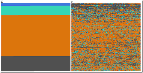
Deaths in Iraq
29 Oct 2010An interesting example of how completely different data can look when visualized over time versus when it is categorized.
Blue = *Friendly*, Green = *Host* Nation, Orange = Civilians, Grey = Enemies.
First one is function of sum, second one is function of time, or how you can dilute the media impact of a massacre by killing a few people each day for 6 years.
Based on the Guardian’s analysis of the Wikileaks data.
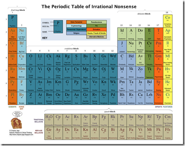
Some fantastic graphics over at Crispian Jago’s blog. First up, the Periodic Table of Irrational Nonsense:
Poverty and Food
4 Oct 2010An interesting radial variation on a scatter plot, displaying multiple variable from 50 states. It’s . (via the promising new visualization site Visualizing.org)
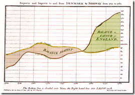
WWI-II Economics and Design
In: Culture Graphic Design (general) History Politics Science
21 Sep 201030 Creative Wedding Invitations
17 Aug 2010A collection of novel wedding invitation designs. Does anyone really send the embossed letter anymore?
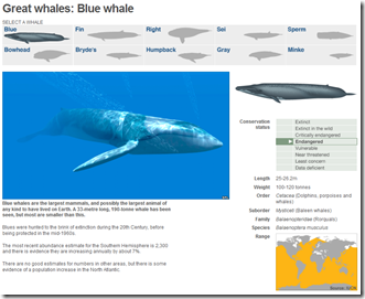
Whales
In: Environment/weather Graphic Design (general) Interactive Maps Science
4 Aug 2010A well designed and simple interactive of the 10 “great” whale species. It conveys images, scale, history, endangered status, and region all on one screen.
Art of Complex Problem Solving
27 Jul 2010The roll-over explanations are almost detailed to a distracting level, but the overall design is superb.
Data Visualization Timeline
15 Jul 2010An interactive timeline of innovations and milestones, from the 1600s-today. Note: click on any item for more details.
A Brief History of Visualization
15 Jul 2010This is the first part of a course from the School of Visual Arts. Its a very good introductory read. (via)
8-bit Washington DC
13 Jul 2010These maps are very odd. At first, I thought, why bother? Is there really a need for low-res maps based on 1980s video game graphic style? Then I typed in my address and realized how much was really going on. It’s still pretty silly, but it’s an impressive silly – and not everything has to be utilitarian. Available for 10 different cities.
2010 Radial Calendar
7 Jul 2010The year in a circle. Not sure I agree with a lot of the color choices, but the layout it comprehensive, and includes the lunar calendar. Available as a poster. (via)
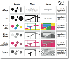
Juice Analytics has pulled together a month’s worth of great references and articles to feed your curiosity, and fill your creative well with great examples.
Data Circles
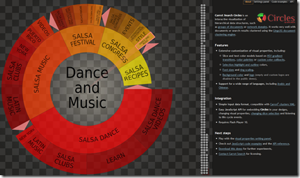
7 Jul 2010Nifty javascript tool for creating your own interactive hierarchical data structures. (via)
Art and Design Professions
30 Jun 2010The graphic at the top is kind of pointless, but the list of professions at the bottom might be an inspirational reference for some. By Tyler Lang – c.2007. (via)
Interesting analysis of both the print and online versions, from a layout point of view. (via)
What is Chart Porn?
An addictive collection of beautiful charts, graphs, maps, and interactive data visualization toys -- on topics from around the world.
Categories
- Bailout (118)
- Chartporn Related (3)
- Commentary (21)
- Culture (669)
- Emerging Markets (66)
- Employment (245)
- Environment/weather (133)
- Finance (298)
- Food (92)
- Global Economy (373)
- Graphic Design (bad) (26)
- Graphic Design (general) (183)
- Graphic Tools (23)
- History (158)
- Housing (162)
- Humor (204)
- Innovative (183)
- Interactive (545)
- Internet/tech (97)
- Maps (578)
- News Media (34)
- Politics (329)
- Reference (97)
- Science (331)
- Source: Economist (101)
- Source: FT (92)
- Source: NYT (147)
- Source: Ritholtz (76)
- Source: USA Today (27)
- Source: Washington Post (90)
- Source: WSJ (135)
- Sports (58)
- Stock Market (74)
- Uncategorized (2)
- Updated regularly (76)
- US Economy (553)
- Video (22)
- Aram Korevaar: This chart is now being used as a projection in which countries such as China see themselves as in a [...]
- David: Welcome back Chart Porn! [...]
- J S: Thanks for the great story. Miss reading this blog. Hope to see you more active again. [...]
- jake: I lived in a DC row house for 6 years, and I'm writing this comment from my tiny 1 bedroom apartment [...]
- ronny pettersen: Hilarious and unfortunately accurate... ;-) [...]

