Graphic Design (general) Archive:
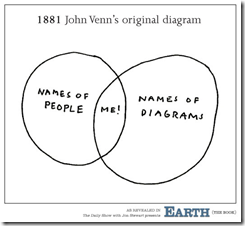
The Original Venn Diagram
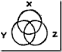
14 Jan 2011Contrary to the below, John Venn wasn’t an egomaniac when he developed venn diagrams; he called them “Eulerian Circles” in his July 1880 paper “On the Diagrammatic and Mechanical Representation of Propositions and Reasonings” (which includes a number of the “real” originals).
Chart Love for Children
11 Jan 2011A sesame-street style singing introduction to charts. Charts rule!
Thanks to Thibeaux Lincecum for the link!
I always love this type of kinetic video-graphic. It seems to me, though, that they are best suited to broad overview topics where you are trying to establish perspective, and not so good when your audience is already well informed. If you want to play with creating something like this yourself, a good tool to start with would be Prezi. (via)
Economist: Top 20 Charts of 2010
In: Global Economy Graphic Design (general) Interactive Source: Economist
3 Jan 2011Interactive tree map of the top 20 charts viewed on the Economist’s website.
Do It Yourself Climate Change Analysis
20 Dec 2010Kelly O’Day runs a fantastic blog where he takes publicly available datasets and walks you through how to visualize them in excel and R. If you just want to view his personal conclusions on climate change, check out ProcessTrends.
Bubble Charts: The Right Way
17 Dec 2010Flowingdata points out the right and wrong way to create proportionate circles, using a gaffe from Good to illustrate the point. You are supposed to size them to the AREA of the bubble (square root of the radius).
This is a nice followup to their tutorial last month on how to create bubble scatter diagrams in R (which also is a nice introduction to R if you’ve never played with it before.
For a more general discussion of bubble charts, try Junk Charts’ many critiques, or this article from Aventine Partners: “Bubble Charts, Good or Bad?”
More Party Animals
16 Dec 2010Ok, I’m swerving off the chart meme a bit — but I love the graphic design of the More Party Animals site.
More Party Animals is an apolitically-political idea of a heartfelt disenchantment with the status quo. As the current system continues to polarize this country, we strongly believe America is in need of a wider selection of political parties.
Why Graphic Designers are Hard to Date
13 Dec 2010Justin O’Beirne has written up a very nice analysis of what design tweaks make Google maps easier to read than Bing or Yahoo’s. (Thanks to Sean R for the link!)
Italian Justice
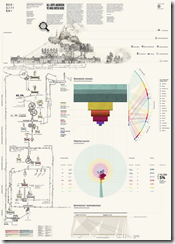
21 Nov 2010A beautiful analysis of the Italian criminal system. Seriously, check it out. Why don’t our crime statistics make this much sense?!
Colors of the Year 2010
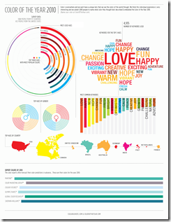
13 Nov 2010Based on a survey. I would think a more quantitative analysis of flickr, ads, or google images would have been more indicative.
Sensory Mapping Timeline
10 Nov 2010An interesting way to map out an experience of positive/negative feelings across all five senses. (via)
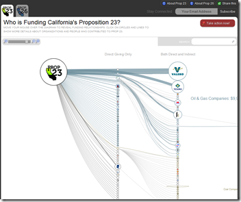
This is an interesting design for examining funding sources using a zoomable SVG network. (by Skye Bender-deMoll)
Visual Survey of Tree Visualization
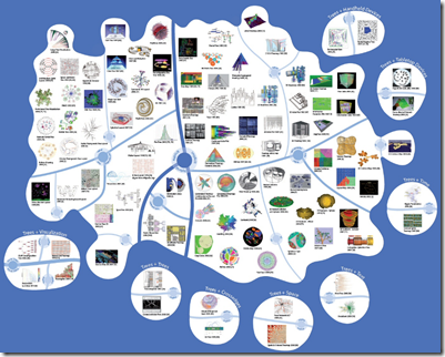
29 Oct 2010I can’t say that I understand all the differentiations being made here, but it’s a treasure trove of examples to feed your creativity-rolodex. (via)
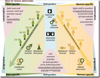
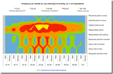
Sex in the USA
29 Oct 2010Flowingdata had a design contest this week based on data from the National Survey of Sexual Health and Behavior. Here are some of the interesting results:
What is Chart Porn?
An addictive collection of beautiful charts, graphs, maps, and interactive data visualization toys -- on topics from around the world.
Categories
- Bailout (118)
- Chartporn Related (3)
- Commentary (21)
- Culture (669)
- Emerging Markets (66)
- Employment (245)
- Environment/weather (133)
- Finance (298)
- Food (92)
- Global Economy (373)
- Graphic Design (bad) (26)
- Graphic Design (general) (183)
- Graphic Tools (23)
- History (158)
- Housing (162)
- Humor (204)
- Innovative (183)
- Interactive (545)
- Internet/tech (97)
- Maps (578)
- News Media (34)
- Politics (329)
- Reference (97)
- Science (331)
- Source: Economist (101)
- Source: FT (92)
- Source: NYT (147)
- Source: Ritholtz (76)
- Source: USA Today (27)
- Source: Washington Post (90)
- Source: WSJ (135)
- Sports (58)
- Stock Market (74)
- Uncategorized (2)
- Updated regularly (76)
- US Economy (553)
- Video (22)
- Aram Korevaar: This chart is now being used as a projection in which countries such as China see themselves as in a [...]
- David: Welcome back Chart Porn! [...]
- J S: Thanks for the great story. Miss reading this blog. Hope to see you more active again. [...]
- jake: I lived in a DC row house for 6 years, and I'm writing this comment from my tiny 1 bedroom apartment [...]
- ronny pettersen: Hilarious and unfortunately accurate... ;-) [...]

