Graphic Design (general) Archive:
Life is a Series of Months
12 Aug 2009The average persons life in months, with some milestone achievements colored in. I like the idea of the presentation. but could use more work. Spotted at DataViz. originally(?) from SubversiveInfluence.
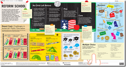
School Days
23 Jul 2009A hodge-podge of school related facts. You always walk away from a Good infographic wanting more, but nobody does the easy read overviews as well as they do.
Fun with Venn
23 Jul 2009Venn diagrams can be very useful in organizing information and are catching on in the mainstream. (top 2 spotted on DataViz the bottom is from Diesel Sweeties)
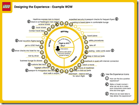
Mood Maps
14 Jul 2009Tired of red/yellow/green or up/down arrows for indicators? Take a look at this description of Mood Maps and a great example of process mapping from Lego. Very interesting. Hat tip to Vizworld for spotting it.
Ok, enough war and money. Here are two (stunningly similar) infographics on what goes into all those fireworks. Have a nice holiday weekend everyone!
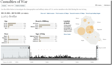
Casualties of War
In: Culture Graphic Design (general) Innovative Interactive Maps Politics Source: NYT
2 Jul 2009The breakdown by age, race, branch, and type of duty is fascinations, and the adjustable time scale is a nice touch.
From the Neolithic till today, filter by country, zoom in to specific historic events, or take a journey based on certain topics. Very well done, from the BBC.
Color and Design
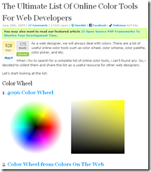
29 Jun 2009I’ve posted several online color choosing tools before, but here is the Ultimate List of Online Color Tools from WebDesignBooth, including more than 40 tools:
While we’re at it, the 12 Essential Rules to Follow When Designing a Logo from WebDesignerDepot are a reminder of good drafting and design practices no matter what it is you’re creating:
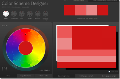
Color Scheme Designer
16 Jun 2009A great color selection tool with ridiculously detailed controls. You can generate web page examples instantly, export photoshop palette files, even adjust for color blindness?!
Chart Chooser
15 May 2009Interactive aid for picking the right chart, from Juice Analytics.
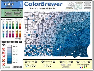
Colors
15 May 2009Picking colors for visualizations is always a tough chore. Cindy Brewer’s ColorBrewer is a helpful tool. Don’t forget to click on the “Learn More” button in each option group to see explanations of categorization and color theory.
Data Visualization Sites
11 May 2009Nathan over at FlowingData recently posted a very nice comprehensive list of data visualization sites, blogs, and resources. Obviously a lot of content log-rolling goes on between these sites, but each has it’s own niche and spin on things.
Gunnmap has created a nice online tool.
(hat tip to Cool Infographics for the find)
What is Chart Porn?
An addictive collection of beautiful charts, graphs, maps, and interactive data visualization toys -- on topics from around the world.
Categories
- Bailout (118)
- Chartporn Related (3)
- Commentary (21)
- Culture (669)
- Emerging Markets (66)
- Employment (245)
- Environment/weather (133)
- Finance (298)
- Food (92)
- Global Economy (373)
- Graphic Design (bad) (26)
- Graphic Design (general) (183)
- Graphic Tools (23)
- History (158)
- Housing (162)
- Humor (204)
- Innovative (183)
- Interactive (545)
- Internet/tech (97)
- Maps (578)
- News Media (34)
- Politics (329)
- Reference (97)
- Science (331)
- Source: Economist (101)
- Source: FT (92)
- Source: NYT (147)
- Source: Ritholtz (76)
- Source: USA Today (27)
- Source: Washington Post (90)
- Source: WSJ (135)
- Sports (58)
- Stock Market (74)
- Uncategorized (2)
- Updated regularly (76)
- US Economy (553)
- Video (22)
- Aram Korevaar: This chart is now being used as a projection in which countries such as China see themselves as in a [...]
- David: Welcome back Chart Porn! [...]
- J S: Thanks for the great story. Miss reading this blog. Hope to see you more active again. [...]
- jake: I lived in a DC row house for 6 years, and I'm writing this comment from my tiny 1 bedroom apartment [...]
- ronny pettersen: Hilarious and unfortunately accurate... ;-) [...]












Poor Design as Scare Tactic?
In: Commentary Graphic Design (general) Innovative US Economy
23 Jul 2009The Good blog discusses the Republican/Democratic scuffle about the below graphic and health care reform issues. (note: clicking on the below brings up a larger version on another blog).
Here is a better designed graphic (with some chart junk of it’s own, admittedly) from Good showing problems with the existing heath care system: