Graphic Design (general) Archive:
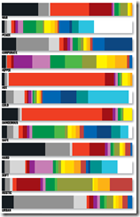
What Color are Words?
1 Feb 2010Cymbolism.com creates graphs based on surveys of what colors people associate with different words. The blog has a lot of interesting articles about color theory, cultural differences, etc. (via)
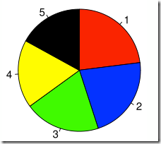
Time For Pie?
13 Jan 2010Eager eyes has an excellent article that lays out the problems with pie charts, and includes suggestions on how to avoid some of the more glaring issues.
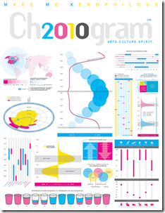
2010: A Formal Display of the Obvious
7 Jan 2010An entertaining compendium of visualizations about the upcoming year, created for Chronogram Magazine. The magazine write-up included a wonderful self-denigrating statement from designer Jason Cring: “Cring believes infographic purists like information design guru Edward Tufte would be appalled. ‘Tufte’s very opinionated about the right and wrong ways to present information. He would not approve of any of this, I’m quite sure.'”
Google Image Searches
1 Dec 2009Several sites have noted Google’s new “Image Swirl” toy (FlowingData for example). It’s fun to play with. An example search for “Santa” is below. I would add that the standard Google image search now has a number of really cool options: you can filter by image size, dominant color, and type of image (photo/clipart/drawing – those these categories aren’t always accurate). Filtering by image size, for example, can help exclude pay-for-image library thumbnails.
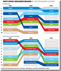
Colorful Rankings
23 Nov 2009I’m just posting this because I know eventually I will use the design for a silly powerpoint or diagram.
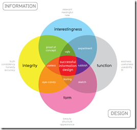
Good Design
11 Nov 2009From Information is Beautiful, a nice venn of what goes into good design – should be helpful when trying to figure out what’s missing from a graphic.
Draw Your Accident
2 Nov 2009It’s a bit off-topic, but I like this niche little online tool for mapping out the scene of your own automobile accident.
Fun with Weekly Data
In: Graphic Design (general) Innovative Reference US Economy
29 Oct 2009This is a bit old (the data ends in July ’08), but I like this animated approach to displaying high frequency data over time. Something like this might be interesting to do for cross-country financial data-series.
Impressively, Jon Peltier came up with a way to do this in excel (and check out his blog for other really cool excel chart tricks and solutions)
Cultural Memes
14 Oct 2009Sometimes a good graphic design takes on a life of it’s own.
of course, the original was based on a great photograph:
and if you want to you can make your own.
GDP per Capita
6 Oct 2009Nothing all that new data-wise, but what’s interesting is the tool and the odd list of groups that the tool uses as filters, including “primarily muslim”, “smallest area”, “Horn of Africa” and others.
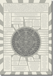
Ancient Graphic Design
23 Sep 2009Now I Know
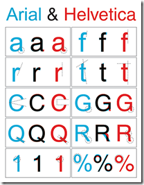
23 Sep 2009The differences between Arial and Helvetica fonts. (source)
Fun With [Banking] Data
In: Employment Finance Graphic Design (general) Reference US Economy
22 Sep 2009The St. Louis Federal Reserve has an excellent graphing tool called Fred Graph. You can view a variety of economic (not just banking) data over any time period, add/delete series at will, and download the raw data. Below is an example of commercial, consumer, and real estate loans (1940-today); and the same data zoomed in on 2007-today (note the total absence of increased lending). To start, pick a data series from the Fred Page then click on the graph itself to bring up more design options.
Art vs Graphic Design
21 Sep 2009A great article over at webdesigndepot about the difference between art and design. I don’t agree with all the distinctions he makes, but it’s an interesting read.

GDP Dots
13 Sep 2009A novel way of presenting GDP (and I’ve seen a lot of them). It’s a sorted time-line-chart with scaling. Nicely done. Spotted over at Visualizing Economics. Originally by Joe Swainson.
What is Chart Porn?
An addictive collection of beautiful charts, graphs, maps, and interactive data visualization toys -- on topics from around the world.
Categories
- Bailout (118)
- Chartporn Related (3)
- Commentary (21)
- Culture (669)
- Emerging Markets (66)
- Employment (245)
- Environment/weather (133)
- Finance (298)
- Food (92)
- Global Economy (373)
- Graphic Design (bad) (26)
- Graphic Design (general) (183)
- Graphic Tools (23)
- History (158)
- Housing (162)
- Humor (204)
- Innovative (183)
- Interactive (545)
- Internet/tech (97)
- Maps (578)
- News Media (34)
- Politics (329)
- Reference (97)
- Science (331)
- Source: Economist (101)
- Source: FT (92)
- Source: NYT (147)
- Source: Ritholtz (76)
- Source: USA Today (27)
- Source: Washington Post (90)
- Source: WSJ (135)
- Sports (58)
- Stock Market (74)
- Uncategorized (2)
- Updated regularly (76)
- US Economy (553)
- Video (22)
- Aram Korevaar: This chart is now being used as a projection in which countries such as China see themselves as in a [...]
- David: Welcome back Chart Porn! [...]
- J S: Thanks for the great story. Miss reading this blog. Hope to see you more active again. [...]
- jake: I lived in a DC row house for 6 years, and I'm writing this comment from my tiny 1 bedroom apartment [...]
- ronny pettersen: Hilarious and unfortunately accurate... ;-) [...]

