Graphic Design (general) Archive:
Nation Frightened by Block of Text
16 Mar 2010Great article from the Onion – probably more accurate than we’d like to admit.
WASHINGTON-Unable to rest their eyes on a colorful photograph or boldface heading that could be easily skimmed and forgotten about, Americans collectively recoiled Monday when confronted with a solid block of uninterrupted text.
Google Public Data Explorer
In: Employment Global Economy Graphic Design (general) Innovative Maps Reference Science
9 Mar 2010Free Graphic Design
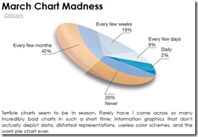
3 Mar 2010Bad Charts! Bad!
3 Mar 2010Eager Eyes looks at several recent charting blunders. I don’t agree with all of the analysis, but for the most part it’s spot on.
Web Design Hell
2 Mar 2010I’ve just started playing with this new online interactive visualization tool, but it looks fantastic.
Here are some examples of what other people have produced with it:
The Economist produces quality audio annotated presentations on a number of topics. Here are a few recent ones:
Asia’s Growing Economic Power (a historical perspective) 
Olympic Pictograms
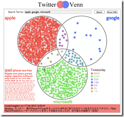
28 Feb 2010Jeff Clark and Twitter Venn
22 Feb 2010Nice article about Jeff Clark’s visualization work including the below twitter venn (enter three terms and see how they overlap).(via)
Chart Choices
19 Feb 2010Juice Analytics has a very nice article about how to select from all the chart types available today.
Power Morphing
19 Feb 2010I recently had to animate some morphing for a presentation, and came across the below. Stunning and beautiful (the music selection is kind of annoying, though)
Medicine vs Terrorists
16 Feb 2010A little outside Chartporn’s normal bailiwick, but I like to make note of effective graphic design when I find it.
Boilerplate
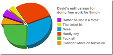
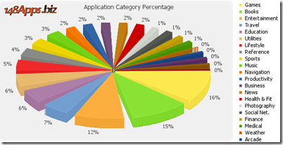
15 Feb 2010How Much Pie Charts Suck (in 3D!)
5 Feb 2010Jon Peltier executes another one of his wonderful critiques/rants about the uselessness of pie charts.
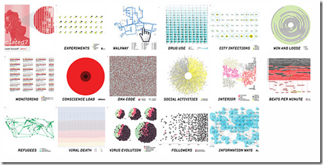
Data Fiction
5 Feb 2010Something a little different today: A fictional story told through data visualizations. The link below goes to the flickr version, while a larger presentation appears on designer Kim Asendorf’s website. I definitely love the idea and the execution — of course, visualizations are probably a little easier to create when you get to make up the data. 🙂
What is Chart Porn?
An addictive collection of beautiful charts, graphs, maps, and interactive data visualization toys -- on topics from around the world.
Categories
- Bailout (118)
- Chartporn Related (3)
- Commentary (21)
- Culture (669)
- Emerging Markets (66)
- Employment (245)
- Environment/weather (133)
- Finance (298)
- Food (92)
- Global Economy (373)
- Graphic Design (bad) (26)
- Graphic Design (general) (183)
- Graphic Tools (23)
- History (158)
- Housing (162)
- Humor (204)
- Innovative (183)
- Interactive (545)
- Internet/tech (97)
- Maps (578)
- News Media (34)
- Politics (329)
- Reference (97)
- Science (331)
- Source: Economist (101)
- Source: FT (92)
- Source: NYT (147)
- Source: Ritholtz (76)
- Source: USA Today (27)
- Source: Washington Post (90)
- Source: WSJ (135)
- Sports (58)
- Stock Market (74)
- Uncategorized (2)
- Updated regularly (76)
- US Economy (553)
- Video (22)
- Aram Korevaar: This chart is now being used as a projection in which countries such as China see themselves as in a [...]
- David: Welcome back Chart Porn! [...]
- J S: Thanks for the great story. Miss reading this blog. Hope to see you more active again. [...]
- jake: I lived in a DC row house for 6 years, and I'm writing this comment from my tiny 1 bedroom apartment [...]
- ronny pettersen: Hilarious and unfortunately accurate... ;-) [...]

