Global Economy Archive:
Economist Covers
12 Apr 2010The Economist magazine always has interesting designs on the cover. If you’re looking for inspiration for economic imagery, you can view them online going back to 2000, including by the different editions (US/EU/etc):
Global Debt Map
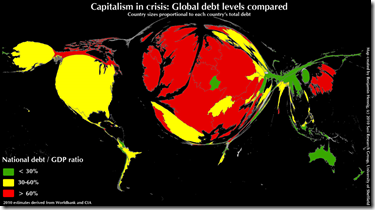
11 Apr 2010Countries re-sized in proportion to government debt. (via)
China: #1 Exporter
8 Apr 2010UK Swing
8 Apr 2010Lots of people appear to be concerned with the potential “swing” in the upcoming UK elections.
BBC’s interactive “Swingometer”: 
Opinion polls (with nice interactive features): 
I don’t know who copied who, but the Guardian also has it’s own “swingometer” (move the dot on the little pie chart on the right to adjust swing amount) and interactive poll-chart. 
G20 Interest Rates
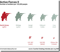
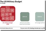
6 Apr 2010The Global Military
5 Apr 2010A great series of charts by Information is Beautiful for the Guardian.
Sovereign Debt 2000-10
5 Apr 2010The projections are based on last fall’s IMF/WEO, and it focuses on emerging and developing countries, but the presentation is certainly interesting.
Flags as Charts
30 Mar 2010Harsh, but innovative (even though it came out in 2005). Additional info on the campaign.
2000 Years of Economic Growth
29 Mar 2010ok, maybe the scale needs work, but it’s interesting nonetheless – as is the accompanying article.
Tracking the Global Economy
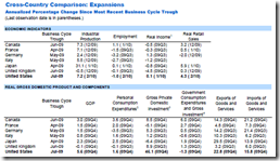
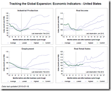
29 Mar 2010The St. Louis Fed is maintaining a nice compendium of economic indicators on the G7 & OECD, including comparisons with previous recessions and expansions.
What is Chart Porn?
An addictive collection of beautiful charts, graphs, maps, and interactive data visualization toys -- on topics from around the world.
Categories
- Bailout (118)
- Chartporn Related (3)
- Commentary (21)
- Culture (669)
- Emerging Markets (66)
- Employment (245)
- Environment/weather (133)
- Finance (298)
- Food (92)
- Global Economy (373)
- Graphic Design (bad) (26)
- Graphic Design (general) (183)
- Graphic Tools (23)
- History (158)
- Housing (162)
- Humor (204)
- Innovative (183)
- Interactive (545)
- Internet/tech (97)
- Maps (578)
- News Media (34)
- Politics (329)
- Reference (97)
- Science (331)
- Source: Economist (101)
- Source: FT (92)
- Source: NYT (147)
- Source: Ritholtz (76)
- Source: USA Today (27)
- Source: Washington Post (90)
- Source: WSJ (135)
- Sports (58)
- Stock Market (74)
- Uncategorized (2)
- Updated regularly (76)
- US Economy (553)
- Video (22)
- Aram Korevaar: This chart is now being used as a projection in which countries such as China see themselves as in a [...]
- David: Welcome back Chart Porn! [...]
- J S: Thanks for the great story. Miss reading this blog. Hope to see you more active again. [...]
- jake: I lived in a DC row house for 6 years, and I'm writing this comment from my tiny 1 bedroom apartment [...]
- ronny pettersen: Hilarious and unfortunately accurate... ;-) [...]


