Global Economy Archive:
FTSE 350: Executive Pay
24 May 2010Some interesting filters and graphic options in this interactive summary. (via)
Europe: How Bad is it?
13 May 2010Household Debt by Country
In: Global Economy
13 May 2010Wow. I would have thought the USA would easily be #1. From a Canadian study, based on OECD data. (via)
World Bank “Open Data” Initiative
7 May 2010The World Bank has recently expanded public access to their datasets on a huge scale (many previously only available by subscription). You can view data by country or topic, create a map out of any indicator, download the raw data, and there’s even an iphone app. They are also reaching out to developers to create additional tools and apps. Unlike many UN/WB/IMF online databases, this one is intuitive and easy to explore. (List of available datasets)
Sovereign Credit Ratings?
6 May 2010Where do they come from and what do they mean. Note: a complete list of ratings is at the bottom of the same page.
Car Company Alliances
5 May 2010Mouse over any company to see the overlaps and connections. Related articles.
Chinese Investment Tracker
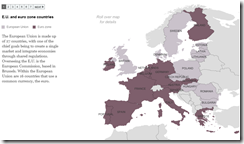
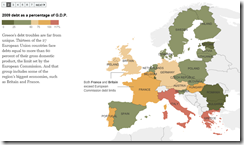
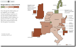
5 May 2010Europe Debt Maps
4 May 2010European Dominoes
3 May 2010How the PIIGS are connected. An interactive from the Guardian.
Web of European Debt
3 May 2010Global Interest Rate Tracker
In: Finance Global Economy Interactive Maps Politics Source: WSJ Updated regularly US Economy
26 Apr 2010Central bank rates from 2004-present (updated 4/20). See how countries are exiting from their stimulus policies.
European Airport Status Map
19 Apr 2010Looks like they might be updating this periodically (was showing 9:50am Monday when I posted). Related article.
Here’s another one from the Guardian that also shows the spread of the ash over time:
Psychological Cycles of Recessions
In: Finance Global Economy Reference Source: Ritholtz Stock Market
15 Apr 2010Barry Ritholtz has pulled together a great collection of charts mapping out how we tend to view economic cycles. Check out his post for an interesting related discussion.
What is Chart Porn?
An addictive collection of beautiful charts, graphs, maps, and interactive data visualization toys -- on topics from around the world.
Categories
- Bailout (118)
- Chartporn Related (3)
- Commentary (21)
- Culture (669)
- Emerging Markets (66)
- Employment (245)
- Environment/weather (133)
- Finance (298)
- Food (92)
- Global Economy (373)
- Graphic Design (bad) (26)
- Graphic Design (general) (183)
- Graphic Tools (23)
- History (158)
- Housing (162)
- Humor (204)
- Innovative (183)
- Interactive (545)
- Internet/tech (97)
- Maps (578)
- News Media (34)
- Politics (329)
- Reference (97)
- Science (331)
- Source: Economist (101)
- Source: FT (92)
- Source: NYT (147)
- Source: Ritholtz (76)
- Source: USA Today (27)
- Source: Washington Post (90)
- Source: WSJ (135)
- Sports (58)
- Stock Market (74)
- Uncategorized (2)
- Updated regularly (76)
- US Economy (553)
- Video (22)
- Aram Korevaar: This chart is now being used as a projection in which countries such as China see themselves as in a [...]
- David: Welcome back Chart Porn! [...]
- J S: Thanks for the great story. Miss reading this blog. Hope to see you more active again. [...]
- jake: I lived in a DC row house for 6 years, and I'm writing this comment from my tiny 1 bedroom apartment [...]
- ronny pettersen: Hilarious and unfortunately accurate... ;-) [...]


