Global Economy Archive:
Global Debt
In: Finance Global Economy Interactive Maps Source: Economist
25 Jun 2010Often these charts only deal with government or household debt – this one covers it all. Click on any country to bring up a time series chart – use the tabs at the top to view time series of debt types.
World Wine
21 Jun 2010A collection of interactives from the FT:
Drill down maps of each region:
Grape varieties, and production stats:
The Greek Tangle
9 Jun 2010Emerging Africa: in Depth
In: Emerging Markets Environment/weather Global Economy Interactive Maps Politics Source: FT
9 Jun 2010Several interactive graphics related to the FT’s June 2010 “in depth” analysis of Africa.
The Trail of Debt
9 Jun 2010China’s Housing Market
7 Jun 2010Finviz Financial Visualizations
In: Finance Global Economy Interactive Reference Stock Market Updated regularly US Economy
7 Jun 2010Some really great financial analysis tools here.
Treemaps (for S&P, world, filter by sector, period, drill down as far as you want)

Same info as bubbles, with roll over graphs:
Bar, Spectrum, and other performance charts by industry, country, or capitalization:
Tables of insider trading:
Futures:
Foreign Exchange:
And a crazy filter system for stock tables:
The Greek Crisis in Three Acts
3 Jun 2010Ok, apparently this is only the first three acts – so stay tuned!!!
Wealth vs Health
In: Global Economy Maps
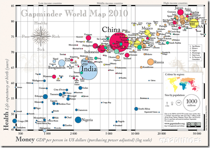
2 Jun 2010Gapminder 2010 World Map of countries’ GDP per capita vs life expectancy. Bubbles are sized by population.
Tracking Indexes for the Global Economic Recovery (TIGER)
In: Finance Global Economy Interactive Maps Source: FT Updated regularly
26 May 2010Joint effort of the Brookings Institute and the Financial Times. Click on a country to open a PDF with detailed information. Or, you can look at the summary for all countries. Related Brookings post.
What is Chart Porn?
An addictive collection of beautiful charts, graphs, maps, and interactive data visualization toys -- on topics from around the world.
Categories
- Bailout (118)
- Chartporn Related (3)
- Commentary (21)
- Culture (669)
- Emerging Markets (66)
- Employment (245)
- Environment/weather (133)
- Finance (298)
- Food (92)
- Global Economy (373)
- Graphic Design (bad) (26)
- Graphic Design (general) (183)
- Graphic Tools (23)
- History (158)
- Housing (162)
- Humor (204)
- Innovative (183)
- Interactive (545)
- Internet/tech (97)
- Maps (578)
- News Media (34)
- Politics (329)
- Reference (97)
- Science (331)
- Source: Economist (101)
- Source: FT (92)
- Source: NYT (147)
- Source: Ritholtz (76)
- Source: USA Today (27)
- Source: Washington Post (90)
- Source: WSJ (135)
- Sports (58)
- Stock Market (74)
- Uncategorized (2)
- Updated regularly (76)
- US Economy (553)
- Video (22)
- Aram Korevaar: This chart is now being used as a projection in which countries such as China see themselves as in a [...]
- David: Welcome back Chart Porn! [...]
- J S: Thanks for the great story. Miss reading this blog. Hope to see you more active again. [...]
- jake: I lived in a DC row house for 6 years, and I'm writing this comment from my tiny 1 bedroom apartment [...]
- ronny pettersen: Hilarious and unfortunately accurate... ;-) [...]

