Global Economy Archive:
“Freedom” down slightly in 2008
12 Jan 2009Economist article on the 2009 Freedom in the World report.
Currency Maps
In: Global Economy Interactive Maps Source: FT Updated regularly US Economy
7 Jan 2009From FT: An interactive map that shows the relative performance of a currency against other major currencies for a range of time periods (today, 5day,. up to 1 year)
[Note: There is no direct link to the map (silly java), you have to click on the “Currency Macromap Launch now” window on this page]
A similar heatmap (with more currency coverage) is available at Oanda.com
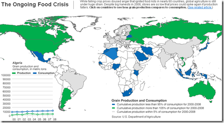
Food still in Crisis
5 Jan 2009Interactive chart of production and consumption. Related Article.
Yikes!
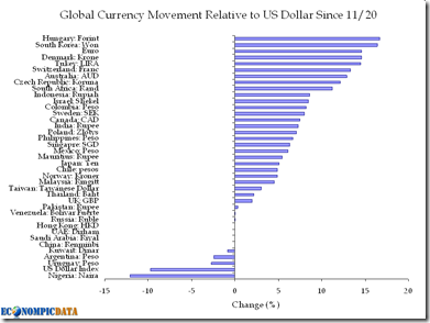
30 Dec 2008US debt and net worth:
And a big hat tip to Econompicdata, where I steal so many of these charts from.
2009 Emerging Market Debt
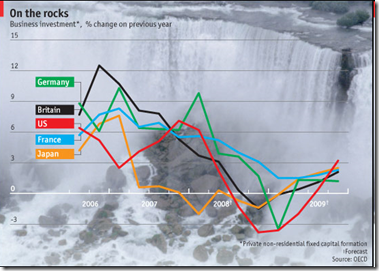
30 Dec 2008Economist: Top and Bottom 10 in 2009
29 Dec 2008Projections from the OECD via the Economist.
Global Equities and Currencies
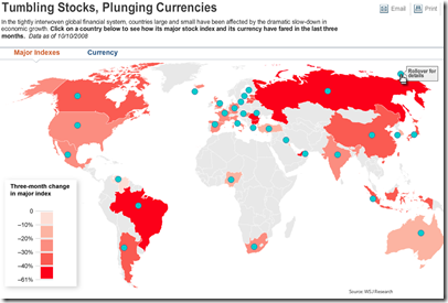
13 Oct 2008Map of world currency and equity market declines (October data).
related article
Global Consumption
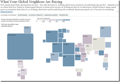
4 Sep 2008A nice interactive chart showing what the world spends it’s money on. Click on the tabs at the top to see different sectors.
(note: September data. it’d be nice if they kept this updated)
What is Chart Porn?
An addictive collection of beautiful charts, graphs, maps, and interactive data visualization toys -- on topics from around the world.
Categories
- Bailout (118)
- Chartporn Related (3)
- Commentary (21)
- Culture (669)
- Emerging Markets (66)
- Employment (245)
- Environment/weather (133)
- Finance (298)
- Food (92)
- Global Economy (373)
- Graphic Design (bad) (26)
- Graphic Design (general) (183)
- Graphic Tools (23)
- History (158)
- Housing (162)
- Humor (204)
- Innovative (183)
- Interactive (545)
- Internet/tech (97)
- Maps (578)
- News Media (34)
- Politics (329)
- Reference (97)
- Science (331)
- Source: Economist (101)
- Source: FT (92)
- Source: NYT (147)
- Source: Ritholtz (76)
- Source: USA Today (27)
- Source: Washington Post (90)
- Source: WSJ (135)
- Sports (58)
- Stock Market (74)
- Uncategorized (2)
- Updated regularly (76)
- US Economy (553)
- Video (22)
- Aram Korevaar: This chart is now being used as a projection in which countries such as China see themselves as in a [...]
- David: Welcome back Chart Porn! [...]
- J S: Thanks for the great story. Miss reading this blog. Hope to see you more active again. [...]
- jake: I lived in a DC row house for 6 years, and I'm writing this comment from my tiny 1 bedroom apartment [...]
- ronny pettersen: Hilarious and unfortunately accurate... ;-) [...]


