Global Economy Archive:
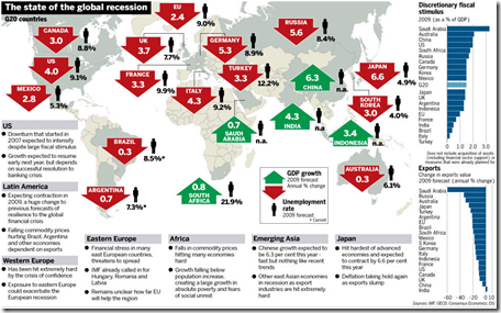
Global Recession Summary
2 Apr 2009Stock Market Heat Map
In: Global Economy Interactive Maps Source: WSJ Stock Market US Economy
1 Apr 2009Interactive map of equity market performance (click on tabs to switch between quarters; click on dots for values)
G-20 Stimulus Spending
In: Bailout Commentary Finance Global Economy Interactive Maps Source: Washington Post US Economy
30 Mar 2009Related Washington Post article.
Of course, not being in terms of GDP, that isn’t the best perspective.
Here’s the original data from Brookings:
And here’s a nice interactive heatmap of the plans (roll-over for country details):
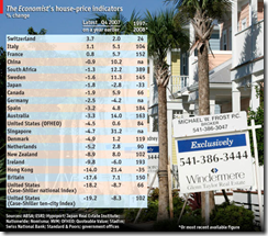
Global Housing Prices
23 Mar 2009Not the best labeled table I’ve seen, and putting the newest data on the left is a bit odd – the numbers themselves are depressing, of course (if you own a house).
Top 20 Financial Institutions, 1999-2009
In: Finance Global Economy Interactive Source: FT US Economy
23 Mar 2009Click on a bank to highlight it, then move the year slider at the bottom to watch the rankings change
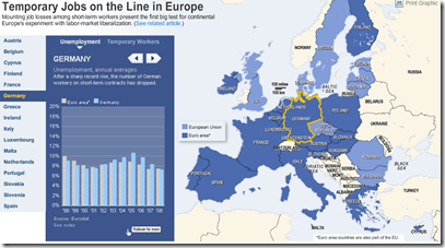
European Unemployment
13 Mar 2009Nice interactive map of european unemployment. Related article.
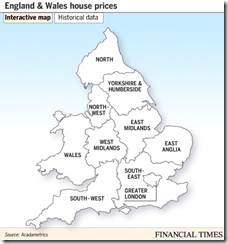
England and Wales House Price Map (Feb 09 data)
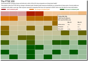
13 Mar 2009FTSE Dividends Heat Map
13 Mar 2009G20 Wishlist
In: Emerging Markets Finance Global Economy Interactive Source: FT
13 Mar 2009OECD 2008 Factbook in Gapminder
13 Mar 2009Speaking of Gapminder, the OECD has it’s 2008 factbook dataset available using it:
I know this is a chart blog, but I love Michael Lewis’ writing. Here’s a great article on how Iceland got in trouble.
Link: Lewis’s Dec 2008 article on the demise of Wall Street.
The Master Does it Again
9 Mar 2009Hans Rosling, creator of Gapminder, creates another wonderful presentation on long term global trends (broken up into three parts):
here’s his classic 2006 Ted conference video “Debunking Myths About the ‘Third World'”:
What is Chart Porn?
An addictive collection of beautiful charts, graphs, maps, and interactive data visualization toys -- on topics from around the world.
Categories
- Bailout (118)
- Chartporn Related (3)
- Commentary (21)
- Culture (669)
- Emerging Markets (66)
- Employment (245)
- Environment/weather (133)
- Finance (298)
- Food (92)
- Global Economy (373)
- Graphic Design (bad) (26)
- Graphic Design (general) (183)
- Graphic Tools (23)
- History (158)
- Housing (162)
- Humor (204)
- Innovative (183)
- Interactive (545)
- Internet/tech (97)
- Maps (578)
- News Media (34)
- Politics (329)
- Reference (97)
- Science (331)
- Source: Economist (101)
- Source: FT (92)
- Source: NYT (147)
- Source: Ritholtz (76)
- Source: USA Today (27)
- Source: Washington Post (90)
- Source: WSJ (135)
- Sports (58)
- Stock Market (74)
- Uncategorized (2)
- Updated regularly (76)
- US Economy (553)
- Video (22)
- Aram Korevaar: This chart is now being used as a projection in which countries such as China see themselves as in a [...]
- David: Welcome back Chart Porn! [...]
- J S: Thanks for the great story. Miss reading this blog. Hope to see you more active again. [...]
- jake: I lived in a DC row house for 6 years, and I'm writing this comment from my tiny 1 bedroom apartment [...]
- ronny pettersen: Hilarious and unfortunately accurate... ;-) [...]






Central Bank Salaries
In: Bailout Commentary Finance Global Economy
30 Mar 2009An amusing list of central bank salaries. (Bernanke’s underpaid)
Of course, they don’t mention their incomes before or after service.