Global Economy Archive:
The Aging World
11 May 2009If recent economic data isn’t depressing enough, here’s some from the future to remind you that everyone has some nice Malthusian demographic mountains to climb in the next 20+ years.

GDP for Beginners
5 May 2009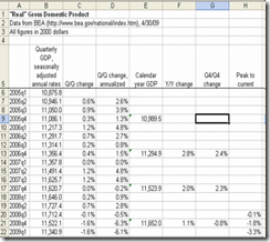 Joseph Kwak over at The Baseline Scenario has a nice explanation of how GDP is calculated, and what all those different growth rates you read in the paper mean. Of course, you could go to wikipedia for more wonk.
European Economic Map
23 Apr 2009The data’s slightly old, but its a really nice presentation. Click on the different data series in the upper right box to switch between them on the map and graph.

Global Malaria Map
23 Apr 2009Another nice interactive map from the FT, with drill downs.

Synchronized Global Cliff Diving
In: Global Economy Humor
22 Apr 2009Not really anything new statistic-wise if you’ve been paying attention, but I love Calculated Risk’s description of these charts as “synchronized global cliff diving” (originally from the IMF’s World Economic Outlook)


$4 Trillion in losses
21 Apr 2009From the IMF’s latest Global Financial Stability Report, released today:
Data Density
In: Culture Employment Food Global Economy Housing Innovative Maps Science
20 Apr 2009Visual Think Map recently turned me onto Design Density‘s Infographics – they include so much information it is almost hard to read them on a computer screen. truly “super-graphics” in Tufte’s meaning of the phrase.
Here’s a few examples on poverty related to housing, leisure, health care & food.


Village of 100
14 Apr 2009the design of these infographics bother my statistical aesthetic a bit, but overall they are quite effective. (From Tony Ng via FlowingData)

Global Equity Performance Map
In: Emerging Markets Finance Global Economy Interactive Maps Source: FT Stock Market Updated regularly US Economy
14 Apr 2009Interactive map displays the performance of all the major global equity markets for today, or versus a selection of time periods (5days/10days/1month/etc up to a year). You can also click on any exchange to drill down to more information.
[Note: There is no direct link to the map (silly java), you have to click on the "Market Macromap" window on this page]

Global Property Prices
14 Apr 2009
Global Recession Monitor
8 Apr 2009From Moody’s. Click on countries for more info. Appears to roughly use the 2 quarters of negative growth definition, based on “current” information(updated as data becomes available).

UK Housing Cycle
8 Apr 2009Nothing new, but you have to love the cycle annotation/commentary
(typical humor from Soot and Ashes)

Gunnmap has created a nice online tool.
(hat tip to Cool Infographics for the find)

Banker Musical Chairs
8 Apr 2009From the FT: Interactive display of European investment banker staff moves.


What is Chart Porn?
An addictive collection of beautiful charts, graphs, maps, and interactive data visualization toys -- on topics from around the world.
Categories
- Bailout (118)
- Chartporn Related (3)
- Commentary (21)
- Culture (669)
- Emerging Markets (66)
- Employment (245)
- Environment/weather (133)
- Finance (298)
- Food (92)
- Global Economy (373)
- Graphic Design (bad) (26)
- Graphic Design (general) (183)
- Graphic Tools (23)
- History (158)
- Housing (162)
- Humor (204)
- Innovative (183)
- Interactive (545)
- Internet/tech (97)
- Maps (578)
- News Media (34)
- Politics (329)
- Reference (97)
- Science (331)
- Source: Economist (101)
- Source: FT (92)
- Source: NYT (147)
- Source: Ritholtz (76)
- Source: USA Today (27)
- Source: Washington Post (90)
- Source: WSJ (135)
- Sports (58)
- Stock Market (74)
- Uncategorized (2)
- Updated regularly (76)
- US Economy (553)
- Video (22)
- Aram Korevaar: This chart is now being used as a projection in which countries such as China see themselves as in a [...]
- David: Welcome back Chart Porn! [...]
- J S: Thanks for the great story. Miss reading this blog. Hope to see you more active again. [...]
- jake: I lived in a DC row house for 6 years, and I'm writing this comment from my tiny 1 bedroom apartment [...]
- ronny pettersen: Hilarious and unfortunately accurate... ;-) [...]