Global Economy Archive:
Credit Crisis Indicators
In: Global Economy Reference Source: NYT Updated regularly US Economy
27 May 2009The NYT maintains a tool showing the latest updates for five credit market indicators (3mo Treasuries, Libor, Ted spread, 30-day commercial paper, and high yield bond yields). Sometimes I just want a quick look at the latest numbers.
Note: Similarly, their Markets page and Economy pages provide clean up-to-date presentations on a variety of indicators.
Pension Losses
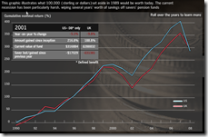
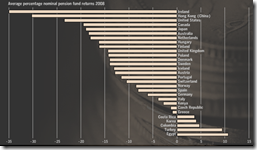
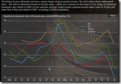
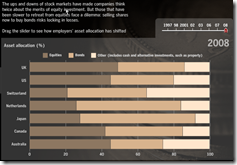
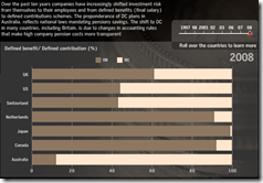
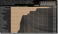
27 May 2009Buried in a lot of videos and audio analysis on this FT tool are some very interesting charts showing how much damage has been done to pension systems around the world (and not just in the past year).
Commitment to Development Index Map (2008)
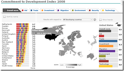
26 May 2009From the Center for Global Development, the Commitment to Development Index (CDI) rates 22 rich countries on how much they help poor countries build prosperity, good government, and security. Each rich country gets scores in seven policy areas, which are averaged for an overall score.
IMF Datamapper Updated with 2009-14 Projections
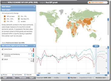
26 May 2009Updated with data from the latest World Economic Outlook report. Allows drill down, country and aggregate comparisons (via the chart at the bottom), and animation of the last 29 years (to watch the world change). You can also view other datasets (BOP, etc).
Empty Ships: not a green shoot
In: Global Economy Maps
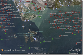
21 May 2009Foreign Policy has an article on how VesselTracker.com uses Google Earth to literally show the stalled world economy in the form of ships sitting idle off the shore of Singapore.
US China Trade
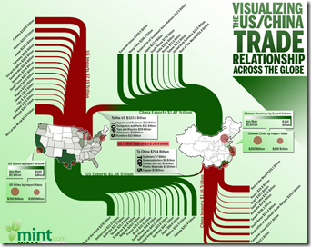
19 May 2009These info graphics are always pretty, but I sometimes wonder if a table isn’t just as good, or better. Perhaps if they added capital flows.
IMF Forecasts
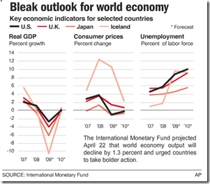
17 May 2009A little old now, but I like this type of multi-indicator chart. The original was part of an AP interactive graphic that included maps.
European GDP Map (Q109)
In: Emerging Markets Global Economy Interactive Maps Source: WSJ
17 May 2009Not much information here – just updated GDP data. Related article.
European Economic Forecast Map (5/13/09 update)
In: Emerging Markets Global Economy Innovative Maps Source: FT Updated regularly
15 May 2009Click on the timeline at the top to view past versions. Roll over country names to see real GDP growth 2007-10.
Global Breeding Incentives
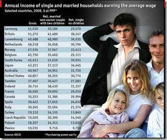
14 May 2009In all but one of 30 OECD countries, a married one-earner couple with two children takes home more money than a single person with no children on the same average annual salary. (from Economist)
Writedown Estimates (again)
In: Bailout Finance Global Economy Interactive Source: FT US Economy
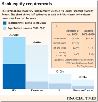
14 May 2009As we noted a couple weeks ago, the IMF released estimates of bank writedowns past and future in this years GFSR. Below is today’s FT interactive graphic of the same info (the total is $4 trillion if you were wondering).
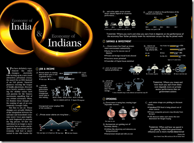
Indian Economy
14 May 2009(more) OECD Composite Leading Indicators
12 May 2009I just noticed that the front page FT graphics I posted earlier today were actually just chopped versions of figures from the OECD’s press release. You also might notice that this analysis covers six non-OECD countries (Brazil, China, India, Indonesia, Russian Federation and South Africa). Here’s the Raw data if you want to dig.
OECD Business Cycle Clock
12 May 2009The OECD has a nifty toy, the Business Cycle Clock, where you can construct animations of business cycles for different countries. The example below shows USA Industrial Production, Business Confidence, Consumer Confidence, and a Composite Leading Indicator – the arrow heads show March 09 and the tails the previous periods. The four quadrants show downturn/slowdown/expansion/recovery. You can even throw up two different countries to compare performance. I wish there was a way to export the animations.
OECD Composite Leading Indicators
12 May 2009“OECD composite leading indicators (CLIs) for March 2009 continue to point to a strong slowdown in the OECD. However France, Italy and the United Kingdom are showing tentative signs of, at least, a pause in the economic slowdown. Weak though these signals are, they are present in the majority of the CLI component series for these countries. In other major OECD economies the CLIs continue to point to deterioration in the business cycle, but at a decreasing rate. However, with the exception of China, where signs of a pause have also emerged, major non-OECD economies still face deteriorating conditions.”
Related FT article.
OECD press release and data website (will be updated regularly)
What is Chart Porn?
An addictive collection of beautiful charts, graphs, maps, and interactive data visualization toys -- on topics from around the world.
Categories
- Bailout (118)
- Chartporn Related (3)
- Commentary (21)
- Culture (669)
- Emerging Markets (66)
- Employment (245)
- Environment/weather (133)
- Finance (298)
- Food (92)
- Global Economy (373)
- Graphic Design (bad) (26)
- Graphic Design (general) (183)
- Graphic Tools (23)
- History (158)
- Housing (162)
- Humor (204)
- Innovative (183)
- Interactive (545)
- Internet/tech (97)
- Maps (578)
- News Media (34)
- Politics (329)
- Reference (97)
- Science (331)
- Source: Economist (101)
- Source: FT (92)
- Source: NYT (147)
- Source: Ritholtz (76)
- Source: USA Today (27)
- Source: Washington Post (90)
- Source: WSJ (135)
- Sports (58)
- Stock Market (74)
- Uncategorized (2)
- Updated regularly (76)
- US Economy (553)
- Video (22)
- Aram Korevaar: This chart is now being used as a projection in which countries such as China see themselves as in a [...]
- David: Welcome back Chart Porn! [...]
- J S: Thanks for the great story. Miss reading this blog. Hope to see you more active again. [...]
- jake: I lived in a DC row house for 6 years, and I'm writing this comment from my tiny 1 bedroom apartment [...]
- ronny pettersen: Hilarious and unfortunately accurate... ;-) [...]


