Global Economy Archive:
Six Things That Could Make It Worse
11 Jul 2009London Stats
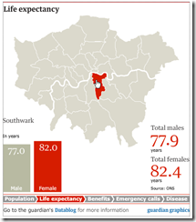
11 Jul 2009London population, life expectancy, benefits, emergency calls, and disease.I think a heat map with the rollovers would have been better.
The Global Happy Planet Index
In: Global Economy Maps
8 Jul 20092009 version just released by the New Economics Foundation. The overall index (which measures “the ecological efficiency with which human well being is delivered”) and it’s components (life expectancy, life satisfaction, and some environmental vectors) can be viewed on an interactive map.
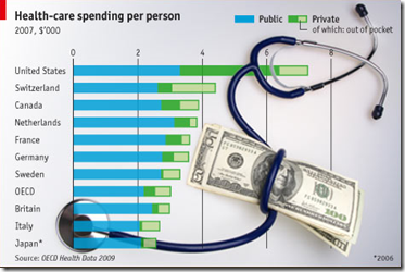
US Health System
8 Jul 2009Getting Old
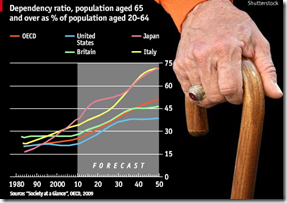
8 Jul 2009Animated charts with talk-over commentary on why most countries’ pension systems are in trouble.
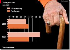
In 1935, when America first introduced state pensions to relieve poverty in old age, the average life expectancy was 62. The official pension age was 65. That meant the cost of the pension system was very modest.
These days people live a lot longer. America’s official pension age is now 66, but people on average retire at 64 and can then expect to draw their pension for 16 years.
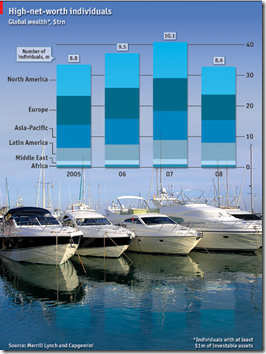
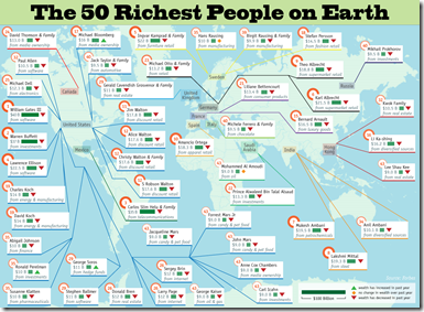
The Rich Lost Money Too
8 Jul 2009But they still have plenty left.
The wealth of the world’s richest people fell by almost a fifth last year to $33 trillion
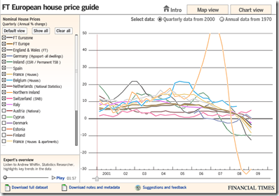
European Housing Prices (Q109 update)
8 Jul 2009In this case, the map view seems not very useful, but the chart view is well done, allowing a view of quarterly data from 2000 as well as annual from 1970. The links to the raw and meta data at the bottom is a nice touch I hope to see more often from everyone. Related article.
Tackling Inflation
In: Finance Global Economy Source: FT Updated regularly US Economy
2 Jul 2009Interactive display of central bank interest rates. It would be useful if you could scroll in and enlarge the last couple years, obviously. It looks like they might update this regularly.
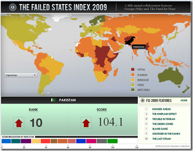
Failed States Index 2009
2 Jul 2009Produced by Foreign Policy. Lots of good analysis in this years report.
Detailed Timelines of the Financial Crisis
In: Bailout Finance Global Economy Interactive Reference Updated regularly US Economy
29 Jun 2009Ok, obviously it’s NY Fed day at ChartPorn. Interactive PDF files (click on events to jump to more details) provide a detailed list of policy actions and events. It is supposedly updated the 1st of every month.
There is both a domestic version, organized by Fed Policy Actions/Market Events/Other Policy Actions:
And an international (G7) version, organized by Bank Liability Guarantees/Liquidity and Rescue Interventions/Other Market Interventions:
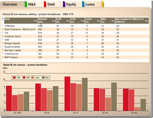
Investment Banking (1st Half 2009 update)
26 Jun 2009The FT has updated its interactive tables of investment banking activity. Lots of good data in here.
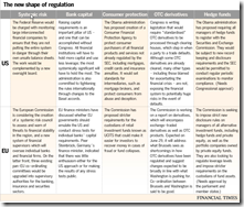
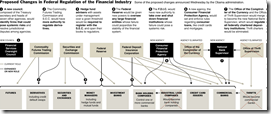
Financial Reform
In: Finance Global Economy Source: FT Source: NYT Source: Ritholtz Stock Market US Economy
23 Jun 2009Summary of EU and US reforms. The related article is a very good read on the subject.
NYT’s version of just the USA (hat-tip to Ritholtz). Related article.
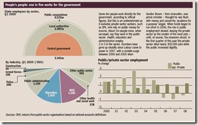
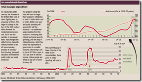
The State of Britain
23 Jun 2009Food Inflation
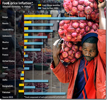
19 Jun 2009CHANGES in global food prices are affecting some countries much more than others. Despite a big fall from peaks in 2008, food-price inflation remains high in places such as Kenya and Russia. In China, however, falling international commodity prices have been passed on to consumers faster.
What is Chart Porn?
An addictive collection of beautiful charts, graphs, maps, and interactive data visualization toys -- on topics from around the world.
Categories
- Bailout (118)
- Chartporn Related (3)
- Commentary (21)
- Culture (669)
- Emerging Markets (66)
- Employment (245)
- Environment/weather (133)
- Finance (298)
- Food (92)
- Global Economy (373)
- Graphic Design (bad) (26)
- Graphic Design (general) (183)
- Graphic Tools (23)
- History (158)
- Housing (162)
- Humor (204)
- Innovative (183)
- Interactive (545)
- Internet/tech (97)
- Maps (578)
- News Media (34)
- Politics (329)
- Reference (97)
- Science (331)
- Source: Economist (101)
- Source: FT (92)
- Source: NYT (147)
- Source: Ritholtz (76)
- Source: USA Today (27)
- Source: Washington Post (90)
- Source: WSJ (135)
- Sports (58)
- Stock Market (74)
- Uncategorized (2)
- Updated regularly (76)
- US Economy (553)
- Video (22)
- Aram Korevaar: This chart is now being used as a projection in which countries such as China see themselves as in a [...]
- David: Welcome back Chart Porn! [...]
- J S: Thanks for the great story. Miss reading this blog. Hope to see you more active again. [...]
- jake: I lived in a DC row house for 6 years, and I'm writing this comment from my tiny 1 bedroom apartment [...]
- ronny pettersen: Hilarious and unfortunately accurate... ;-) [...]


