Global Economy Archive:
European Economic Weather Map (updated Aug 09)
In: Emerging Markets Global Economy Innovative Interactive Maps Source: FT Updated regularly
21 Aug 2009I’ve been tempted to steal this design many times. it’s a nice way to present mostly qualitative information for a large number of countries – and people understand it intuitively.
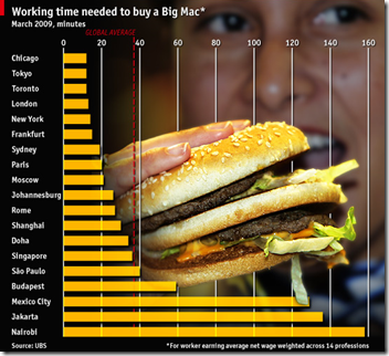
Variation on the Big Max index
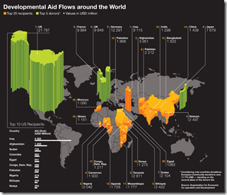
20 Aug 2009Development aid
In: Global Economy Maps
18 Aug 2009Only includes the top 20 recipients and top 5 donors. This is a map that screams for an interactive version with roll over numbers rather than all the lines (and more country coverage)
Hard Workers
In: Global Economy Maps
18 Aug 2009Hours worked per week around the world. Via DataViz.
European GDP
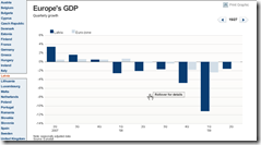
16 Aug 2009Interactive bar chart of EU country GDP. Unfortunately, they resize the scale on every chart, making it tough to do cross-country comparisons (though they do put the euro-zone average on each chart).
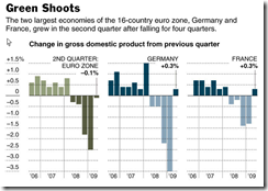
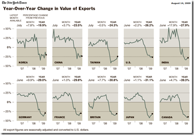
From the NYT:
World Exports
14 Aug 2009A mixed story on trade – I think people are still reaching pretty hard for green shoot, especially in this data. Related article.
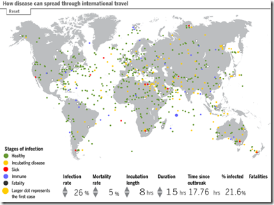
Fun With Infectious Diseases
In: Global Economy Innovative Interactive Maps Science Source: FT
6 Aug 2009A morbid tool from the FT. Click on any traveler on the map to make him sick, then watch the disease spread. Modify the infection rate, mortality rates, and other factors to see how they affect the simulation.
UNEP Atlas of Environmental Impact
6 Aug 2009Click on any item on the map, then on “Story”. Spotted over at Kelso’s Corner.
Global Recession Map
In: Global Economy Maps Source: Economist Updated regularly US Economy
3 Aug 2009From the Economist:
Which is just a recycled version of Moody’s regularly updated map (that includes pop-up drill downs):
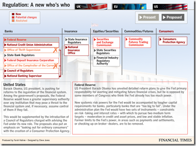
Financial Regulation
3 Aug 2009The FT has some nice charts on proposed changes to financial oversight. Related article.
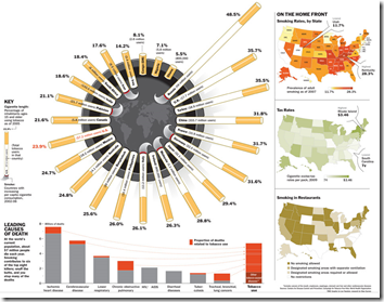
Smoking Stats: World and US
29 Jul 2009Stock Exchange Capitalization Map
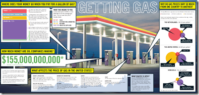
29 Jul 2009Gas Prices
23 Jul 2009Not bad as an overview, but still doesn’t explain why the supply/demand/price relationships are such a mess in the US.
What is Chart Porn?
An addictive collection of beautiful charts, graphs, maps, and interactive data visualization toys -- on topics from around the world.
Categories
- Bailout (118)
- Chartporn Related (3)
- Commentary (21)
- Culture (669)
- Emerging Markets (66)
- Employment (245)
- Environment/weather (133)
- Finance (298)
- Food (92)
- Global Economy (373)
- Graphic Design (bad) (26)
- Graphic Design (general) (183)
- Graphic Tools (23)
- History (158)
- Housing (162)
- Humor (204)
- Innovative (183)
- Interactive (545)
- Internet/tech (97)
- Maps (578)
- News Media (34)
- Politics (329)
- Reference (97)
- Science (331)
- Source: Economist (101)
- Source: FT (92)
- Source: NYT (147)
- Source: Ritholtz (76)
- Source: USA Today (27)
- Source: Washington Post (90)
- Source: WSJ (135)
- Sports (58)
- Stock Market (74)
- Uncategorized (2)
- Updated regularly (76)
- US Economy (553)
- Video (22)
- Aram Korevaar: This chart is now being used as a projection in which countries such as China see themselves as in a [...]
- David: Welcome back Chart Porn! [...]
- J S: Thanks for the great story. Miss reading this blog. Hope to see you more active again. [...]
- jake: I lived in a DC row house for 6 years, and I'm writing this comment from my tiny 1 bedroom apartment [...]
- ronny pettersen: Hilarious and unfortunately accurate... ;-) [...]


