Global Economy Archive:
Who Knew?
30 Sep 2009It turns out the Economist has a series of very well produced explanatory videographics on a variety of economic and political topics:
Top 50 Women in World Business
28 Sep 2009From the Financial Times. Click on pictures for roll over details. Filter with the controls on the bottom.
International Housing Indicators
In: Global Economy Housing Innovative Interactive Source: Economist Updated regularly
28 Sep 2009The Economist just released a nice new tool for looking at several housing indicators across major countries. They plan to expand and update it as more information becomes available.
EU Expenditure
In: Emerging Markets Global Economy Interactive Maps Politics
24 Sep 2009EU 2007 spending by country, or on a map. (via)
FDI Continues to Fall
In: Emerging Markets Finance Global Economy Source: Economist
21 Sep 2009G20 Pittsburgh
21 Sep 2009Interactive tool for grasping what the G20 has said, and done, over the last three summits.
In depth G20 coverage from the FT is available here.
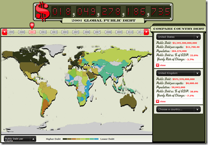
Global Debt
In: Global Economy Interactive Maps Politics Source: Economist
18 Sep 2009From the Economist, an interactive map and clock of global debt (1999-2011). Spotted over at Infectious Greed.
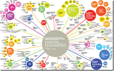
UK Government Spending
16 Sep 2009Click below for the PDF. There’s also an audio annotated interactive version. From the Guardian.
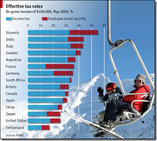
Effective Tax Rates
14 Sep 2009Can you tell I’m catching up on Economist charts? Well, suffer – because they’re pretty good, despite the overuse of distracting background graphics.
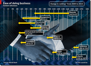
Doing Business Around the World
14 Sep 2009The World Bank’s Doing Business survey analysis has come under some criticism recently, but still provides a good broad cross-country indicator of business related practices.
GDP Dots
13 Sep 2009A novel way of presenting GDP (and I’ve seen a lot of them). It’s a sorted time-line-chart with scaling. Nicely done. Spotted over at Visualizing Economics. Originally by Joe Swainson.
Global Diseases
In: Global Economy Interactive Maps Science Updated regularly
10 Sep 2009A map of the “current global state of infectious diseases and their effect on human and animal health.” Filter by country, type of disease, etc. Spotted at Cool Infographics.
Asia Economic Weather Forecast (Aug. 09 version)
10 Sep 2009From Ritholtz. more of a timeline quiz than a chart.
1. Tulip Mania
2. South Sea /Mississippi Company Bubbles
3. Railway Mania
4. Florida Speculative Building Mania
5. Roaring 1920s/1929
6. Poseidon Bubble
7. Gold
8. Japanese Asset Bubble
9. Dot Com/Tech/Telecoms
10. Global Real Estate/Credit Bubble
11. China/Shanghai Index Stock Bubble
12. Commodity Bubble
13. Oil Bubble
14. Leverage/Derivative/Financial Bubble
Helping People is Dangerous
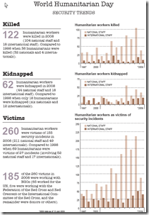
21 Aug 2009August 19th was World Humanitarian Day. The PDF file below charts the number of humanitarian workers who have been killed, kidnapped, and injured trying to help their fellow man. Thanks to Nancy Meaker for sending the link.
What is Chart Porn?
An addictive collection of beautiful charts, graphs, maps, and interactive data visualization toys -- on topics from around the world.
Categories
- Bailout (118)
- Chartporn Related (3)
- Commentary (21)
- Culture (669)
- Emerging Markets (66)
- Employment (245)
- Environment/weather (133)
- Finance (298)
- Food (92)
- Global Economy (373)
- Graphic Design (bad) (26)
- Graphic Design (general) (183)
- Graphic Tools (23)
- History (158)
- Housing (162)
- Humor (204)
- Innovative (183)
- Interactive (545)
- Internet/tech (97)
- Maps (578)
- News Media (34)
- Politics (329)
- Reference (97)
- Science (331)
- Source: Economist (101)
- Source: FT (92)
- Source: NYT (147)
- Source: Ritholtz (76)
- Source: USA Today (27)
- Source: Washington Post (90)
- Source: WSJ (135)
- Sports (58)
- Stock Market (74)
- Uncategorized (2)
- Updated regularly (76)
- US Economy (553)
- Video (22)
- Aram Korevaar: This chart is now being used as a projection in which countries such as China see themselves as in a [...]
- David: Welcome back Chart Porn! [...]
- J S: Thanks for the great story. Miss reading this blog. Hope to see you more active again. [...]
- jake: I lived in a DC row house for 6 years, and I'm writing this comment from my tiny 1 bedroom apartment [...]
- ronny pettersen: Hilarious and unfortunately accurate... ;-) [...]


