Global Economy Archive:
BBC G20
In: Bailout Emerging Markets Finance Global Economy Interactive Maps Politics US Economy
19 Oct 2009A bit dated as these were prepared in the lead up to the Pittsburgh summit a few weeks ago. Worth passing on nonetheless.
A checklist of the G20’s April London Summit pledges and whether they’ve been fulfilled. Included some nice graphics on IMF and tax reforms.
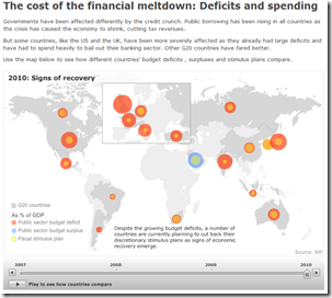
G20 Stimulus and Fiscal Deficit map. Use the slider to look at the changes 2007-2010. Mouse over a country to view popup data details.
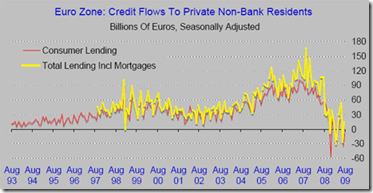
EU: Lending Down
18 Oct 2009We’ve seen this data before for the United States. The below chart confirms the same for the EU: banks are not lending.
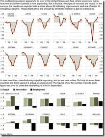
Recovery?
16 Oct 2009Global recovery based on manufacturing output. Related NYT article.
Carry Trade
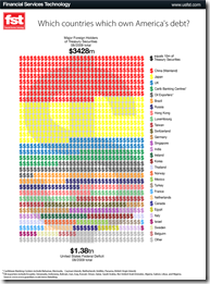
16 Oct 2009US Debt
13 Oct 2009GOLD!
13 Oct 2009Currency Trends
In: Emerging Markets Finance Global Economy Interactive Source: FT US Economy
13 Oct 2009The FT takes a graphic look at a number of currency trends (dollar/euro, carry trade, commodity currencies, the renminbi, and a trade weighted exchange index). [the links on the below images all go to the same interactive tool]
What countries have improved the most since 1990? (it’s an index of life expectancy, literacy, education, and per capita GDP).
GDP per Capita
6 Oct 2009Nothing all that new data-wise, but what’s interesting is the tool and the odd list of groups that the tool uses as filters, including “primarily muslim”, “smallest area”, “Horn of Africa” and others.
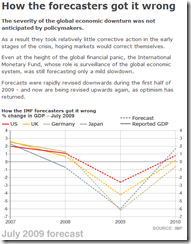
Bad Economists!
In: Global Economy
5 Oct 2009A month old now (new IMF data is now available), but this slideshow of charts from the BBC shows the changing GDP predictions over the course of the crisis.
Follow the Money
5 Oct 2009G20 Financial Support
5 Oct 2009It’s unclear what the vintage of the data is, but the below map shows G20 crisis spending. Thanks to Silona for the heads up.
FDI Flows
2 Oct 2009A map of foreign direct investment inflows, in percent of GDP. Somewhat oddly, you have to click on the different ratio ranges at the bottom to color the relevant countries – at a minimum, they should have included the option to see the whole map (all ranges) colored at once.
60 Years of Communism
2 Oct 2009This one of those infographics that provides a lot of information – but also prompts a lot of questions; such as “How many of these changes took place in the last 20 years after they opened up?”, and “How would the United States look on these same indicators?”. (via)
What is Chart Porn?
An addictive collection of beautiful charts, graphs, maps, and interactive data visualization toys -- on topics from around the world.
Categories
- Bailout (118)
- Chartporn Related (3)
- Commentary (21)
- Culture (669)
- Emerging Markets (66)
- Employment (245)
- Environment/weather (133)
- Finance (298)
- Food (92)
- Global Economy (373)
- Graphic Design (bad) (26)
- Graphic Design (general) (183)
- Graphic Tools (23)
- History (158)
- Housing (162)
- Humor (204)
- Innovative (183)
- Interactive (545)
- Internet/tech (97)
- Maps (578)
- News Media (34)
- Politics (329)
- Reference (97)
- Science (331)
- Source: Economist (101)
- Source: FT (92)
- Source: NYT (147)
- Source: Ritholtz (76)
- Source: USA Today (27)
- Source: Washington Post (90)
- Source: WSJ (135)
- Sports (58)
- Stock Market (74)
- Uncategorized (2)
- Updated regularly (76)
- US Economy (553)
- Video (22)
- Aram Korevaar: This chart is now being used as a projection in which countries such as China see themselves as in a [...]
- David: Welcome back Chart Porn! [...]
- J S: Thanks for the great story. Miss reading this blog. Hope to see you more active again. [...]
- jake: I lived in a DC row house for 6 years, and I'm writing this comment from my tiny 1 bedroom apartment [...]
- ronny pettersen: Hilarious and unfortunately accurate... ;-) [...]


