Global Economy Archive:
UK Government Salaries
17 Nov 2009From the Queen on down. Click on “fullscreen” to vew a large zoomable version. Related Guardian article. (via)
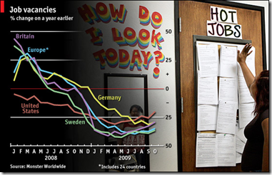
Recruitment Up
16 Nov 2009A slightly different measure of unemployment – this one based on online job listings (the Monster.com employment index).
Europe’s Finance Ministers
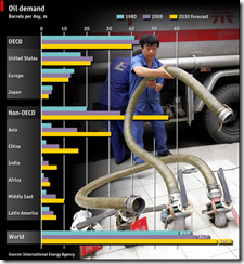
16 Nov 2009Oil Demand
13 Nov 2009Finance Timeline
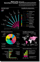
11 Nov 2009Asian Pentagon/Spoke
9 Nov 2009I like the idea of using spokes for different series, though it could be confusing. I have no idea why they included the same data as pie charts, unless just as an example of how much clearer bar-charts are. (via)
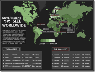
Government Spending
5 Nov 2009Global Life and Death
29 Oct 2009A data packed international comparison of health statistics. I give Good a lot of grief for the design of some of their infographics, but this one is well done. (via Simple Complexity)
Rigged Trade Rules
In: Global Economy
27 Oct 2009Oxfam has produced a series of six simple, but effective and entertaining, animations that argue how global trade practices are hurting developing countries.
UK Quantitative Easing
26 Oct 2009Cumulative total of gilt purchases by the Bank of England. Related article. <insert generic comment about how the mind doesn’t easily distinguish arc lengths in spiral charts>
Population Problems
23 Oct 2009A graphic of several countries’ population distribution. The related article points out that while many OECD countries are facing problems because of their aging population, many developing countries are dealing with the opposite. Uganda, for example has 70 percent of the population under 30.
Russia vs USA
23 Oct 2009Human Transportation
20 Oct 2009Similar in concept to the US McDonalds map, this map colors how long it takes to get to a city of 50,000 people from any location in the world. (via Simple Complexity & Visual Complexity)
the same New Scientist gallery has a map of roads, trains, shipping lanes, and navigable rivers (we’re pretty much everywhere).

What is Chart Porn?
An addictive collection of beautiful charts, graphs, maps, and interactive data visualization toys -- on topics from around the world.
Categories
- Bailout (118)
- Chartporn Related (3)
- Commentary (21)
- Culture (669)
- Emerging Markets (66)
- Employment (245)
- Environment/weather (133)
- Finance (298)
- Food (92)
- Global Economy (373)
- Graphic Design (bad) (26)
- Graphic Design (general) (183)
- Graphic Tools (23)
- History (158)
- Housing (162)
- Humor (204)
- Innovative (183)
- Interactive (545)
- Internet/tech (97)
- Maps (578)
- News Media (34)
- Politics (329)
- Reference (97)
- Science (331)
- Source: Economist (101)
- Source: FT (92)
- Source: NYT (147)
- Source: Ritholtz (76)
- Source: USA Today (27)
- Source: Washington Post (90)
- Source: WSJ (135)
- Sports (58)
- Stock Market (74)
- Uncategorized (2)
- Updated regularly (76)
- US Economy (553)
- Video (22)
- Aram Korevaar: This chart is now being used as a projection in which countries such as China see themselves as in a [...]
- David: Welcome back Chart Porn! [...]
- J S: Thanks for the great story. Miss reading this blog. Hope to see you more active again. [...]
- jake: I lived in a DC row house for 6 years, and I'm writing this comment from my tiny 1 bedroom apartment [...]
- ronny pettersen: Hilarious and unfortunately accurate... ;-) [...]


