Global Economy Archive:
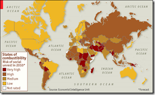
2010 Social Unrest
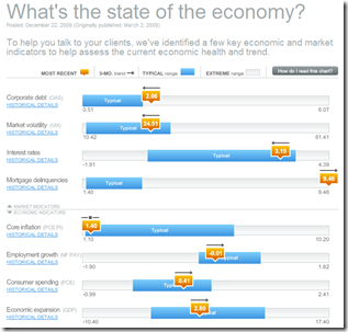
28 Dec 2009Economic Recovery Dashboard (Dec 09 ver)
In: Employment Finance Global Economy Housing Interactive US Economy
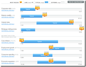
22 Dec 2009December update of one of my favorite summaries of economic indicators. If you normally find this stuff confusing you should check it out – click on any of the “historical details” to see what each indicator means and why it’s important.
Market Decade
In: Finance Global Economy Interactive Source: FT Stock Market US Economy
22 Dec 2009An interactive look at 10 years of global indices, bonds, interest rates, commodities, and a few key stocks.
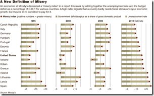
The Misery Index
In: Employment Finance Global Economy Source: NYT Source: Ritholtz
21 Dec 2009The index adds together a country’s budget deficit, as a percentage of gross domestic product, and its unemployment rate.
Government Debt
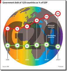
21 Dec 2009The IMF forecasts that gross government debt among advanced economies will continue to rise until 2014, reaching 114% of GDP, compared to just 35% for developing nations. With governments struggling to rein in their finances, rating agencies are becoming increasingly twitchy; rich countries such as America and Britain are fearful of losing their hallowed triple-A status.
Global Energy Consumption
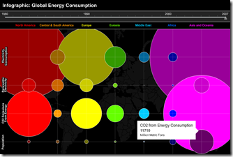
18 Dec 2009Interactive timeline of electricity, CO2, and population, 1980-2007. (via VizWorld)
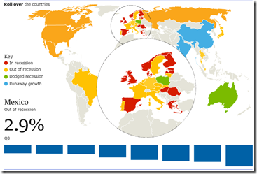
Recovery?
14 Dec 2009Falling Dollar
In: Emerging Markets Finance Global Economy Source: NYT Source: Ritholtz US Economy
8 Dec 2009Who are the winners and losers? (via The Big Picture)
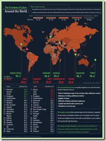
Freedom of Labor
1 Dec 2009Oil and Gas Executive Pay
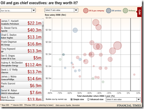
1 Dec 2009A fairly detailed analysis of pay vs performance. You can pick from 10 indicators of compensation and 8 indicators of corporate performance. Click on any bubble to popup details of that company and executive. Related article.
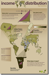
Income Distribution
In: Global Economy Maps
29 Nov 2009Economic Recovery Dashboard (Nov 09 ver)
In: Employment Finance Global Economy Housing Interactive US Economy
23 Nov 2009November update of one of my favorite summaries of economic indicators. If you normally find this stuff confusing you should check it out – click on any of the “historical details” to see what each indicator means and why it’s important.
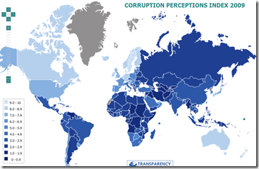
Corruption 2009
20 Nov 2009Interactive map of Transparency International’s 2009 “Corruption Perception Index”. (via)
What is Chart Porn?
An addictive collection of beautiful charts, graphs, maps, and interactive data visualization toys -- on topics from around the world.
Categories
- Bailout (118)
- Chartporn Related (3)
- Commentary (21)
- Culture (669)
- Emerging Markets (66)
- Employment (245)
- Environment/weather (133)
- Finance (298)
- Food (92)
- Global Economy (373)
- Graphic Design (bad) (26)
- Graphic Design (general) (183)
- Graphic Tools (23)
- History (158)
- Housing (162)
- Humor (204)
- Innovative (183)
- Interactive (545)
- Internet/tech (97)
- Maps (578)
- News Media (34)
- Politics (329)
- Reference (97)
- Science (331)
- Source: Economist (101)
- Source: FT (92)
- Source: NYT (147)
- Source: Ritholtz (76)
- Source: USA Today (27)
- Source: Washington Post (90)
- Source: WSJ (135)
- Sports (58)
- Stock Market (74)
- Uncategorized (2)
- Updated regularly (76)
- US Economy (553)
- Video (22)
- Aram Korevaar: This chart is now being used as a projection in which countries such as China see themselves as in a [...]
- David: Welcome back Chart Porn! [...]
- J S: Thanks for the great story. Miss reading this blog. Hope to see you more active again. [...]
- jake: I lived in a DC row house for 6 years, and I'm writing this comment from my tiny 1 bedroom apartment [...]
- ronny pettersen: Hilarious and unfortunately accurate... ;-) [...]

