Global Economy Archive:
Food Maps
In: Food Global Economy Maps
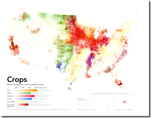
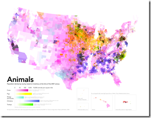
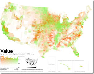
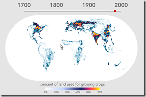
10 Mar 2010Cool maps of farming, via Sociological images and F.A.D (check them out for some discussion), originally from Radical Cartography.
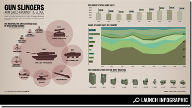
Global Arms Trade
10 Mar 2010Google Public Data Explorer
In: Employment Global Economy Graphic Design (general) Innovative Maps Reference Science
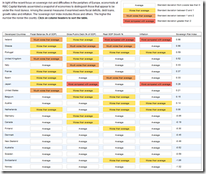
9 Mar 2010Sovereign Debt Hot Spots
8 Mar 2010Among the several measures it examined were fiscal deficits, debt loans, growth rates and inflation. The ‘sovereign risk’ index includes those and others. The higher the number the riskier the country.
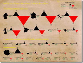
Global Recession Map
In: Global Economy Maps
3 Mar 2010I’d expect better from Moody’s (or maybe not). Most of the analysis is meaningless because it isn’t dated. for example, France’s rating is based on Q209 data? Maybe they’re just not updating it at all anymore?
Time Spent Retired
23 Feb 2010Official retirement ages have failed to keep pace with rising life expectancy, making pensions increasingly unaffordable. In practice many people in the rich-world OECD countries retire several years early, which lets them enjoy, on average, some 19 years in retirement before death.
UK Quantitative Easing
12 Feb 2010From the Daily Telegraph via Igraphics explained.
Manufacturing Rebound
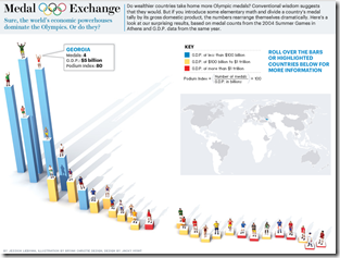
9 Feb 2010Heavy Medal
2 Feb 2010Interactive bar chart of Olympic medals divided by GDP. Rollover for details. (via VizWorld)
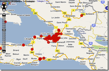
Crowdsourcing Crisis Management
31 Jan 2010Several articles about the Ushahidi system : TED blog. Washington post. Guardian.
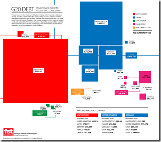
World Bailouts and Stimulus
In: Bailout Finance Global Economy Maps Source: Ritholtz US Economy
27 Jan 2010Powerful summary from the Harvard Business Review (hardcopy apparently) via The Big Picture.
What is Chart Porn?
An addictive collection of beautiful charts, graphs, maps, and interactive data visualization toys -- on topics from around the world.
Categories
- Bailout (118)
- Chartporn Related (3)
- Commentary (21)
- Culture (669)
- Emerging Markets (66)
- Employment (245)
- Environment/weather (133)
- Finance (298)
- Food (92)
- Global Economy (373)
- Graphic Design (bad) (26)
- Graphic Design (general) (183)
- Graphic Tools (23)
- History (158)
- Housing (162)
- Humor (204)
- Innovative (183)
- Interactive (545)
- Internet/tech (97)
- Maps (578)
- News Media (34)
- Politics (329)
- Reference (97)
- Science (331)
- Source: Economist (101)
- Source: FT (92)
- Source: NYT (147)
- Source: Ritholtz (76)
- Source: USA Today (27)
- Source: Washington Post (90)
- Source: WSJ (135)
- Sports (58)
- Stock Market (74)
- Uncategorized (2)
- Updated regularly (76)
- US Economy (553)
- Video (22)
- Aram Korevaar: This chart is now being used as a projection in which countries such as China see themselves as in a [...]
- David: Welcome back Chart Porn! [...]
- J S: Thanks for the great story. Miss reading this blog. Hope to see you more active again. [...]
- jake: I lived in a DC row house for 6 years, and I'm writing this comment from my tiny 1 bedroom apartment [...]
- ronny pettersen: Hilarious and unfortunately accurate... ;-) [...]

