Food Archive:
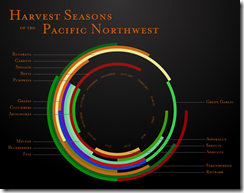
Harvest Timeline
In: Culture Food Innovative
19 Jan 2010I like these. They should be on the front door of every supermarket. (via)
Caffeine Delivery Vehicles
11 Jan 2010I don’t think most people realize that coffee usually has more than twice the caffeine of a Red Bull.
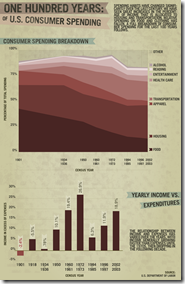
100 Years of Consumer Spending
In: Culture Food US Economy
6 Jan 2010I really don’t like area charts much. They should at least show the beginning and ending percentages for each section. I’m a little surprised food has declined so much.
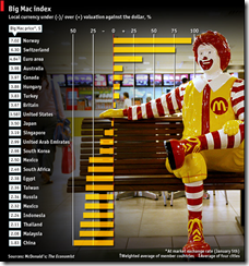
The Economist Big Mac Index
6 Jan 2010THE Big Mac index is based on the theory of purchasing-power parity (PPP)-exchange rates should equalise the price of a basket of goods in different countries. The exchange rate that leaves a Big Mac costing the same in dollars everywhere is our fair-value benchmark. So our light-hearted index shows which countries the foreign-exchange market has blessed with a cheap currency, and which has it burdened with a dear one.
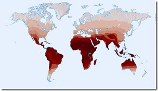
Why are Europeans White? Cereal?!
14 Dec 2009Using maps to investigate a simple puzzle. (via)
Junk Food Decision Tree
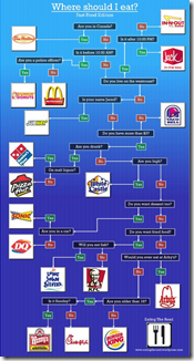
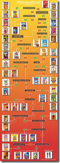
23 Nov 2009A reasonably accurate mapping of choices. Thanks to Sandy for pointing it out to me. and I just noticed there’s one on the same site for cereal.
Why You Have a Nose
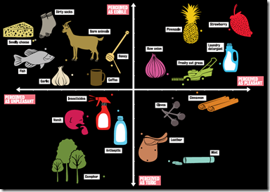
23 Oct 2009There are two evolutionary reasons for having a nose, runs one theory. The first is to ascertain whether it would be safe to put something in your mouth – to gauge edibility. The second is to advise about whether it would be a good idea to run away
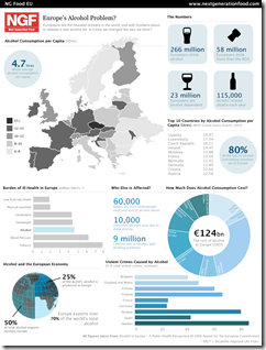
Europeans are a Bunch of Drunks?
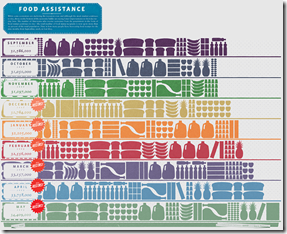
16 Oct 2009Food Stamps
In: Culture Food US Economy
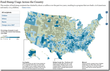
16 Sep 2009At first I liked this, thinking that the icons identified different food assistance programs – but it’s just a one series bar chart (number of food stamp recipients). Spotted at FlowingData.
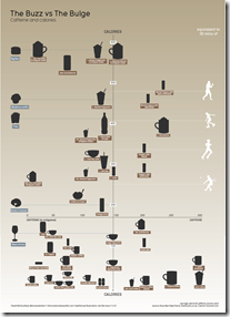
Calories in Caffeine Delivery Vehicles
In: Culture Food Innovative
21 Aug 2009Fantastic chart from Information is Beautiful. Caffeine on one axis, calories on the other.
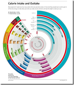
Food In, Calories Out
In: Food Innovative
22 Jun 2009Colorful presentation of how much exercise you have to do after eating certain foods. Spotted by DataViz.
Food Inflation
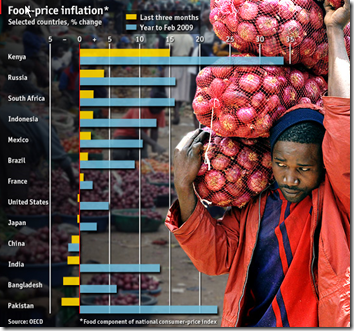
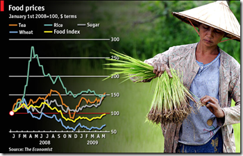
19 Jun 2009CHANGES in global food prices are affecting some countries much more than others. Despite a big fall from peaks in 2008, food-price inflation remains high in places such as Kenya and Russia. In China, however, falling international commodity prices have been passed on to consumers faster.
Data Density
In: Culture Employment Food Global Economy Housing Innovative Maps Science
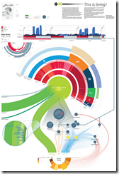
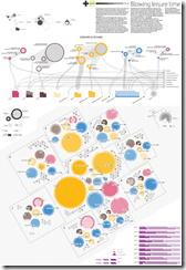
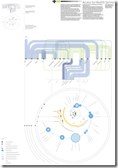
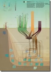
20 Apr 2009Visual Think Map recently turned me onto Design Density‘s Infographics – they include so much information it is almost hard to read them on a computer screen. truly “super-graphics” in Tufte’s meaning of the phrase.
Here’s a few examples on poverty related to housing, leisure, health care & food.
What is Chart Porn?
An addictive collection of beautiful charts, graphs, maps, and interactive data visualization toys -- on topics from around the world.
Categories
- Bailout (118)
- Chartporn Related (3)
- Commentary (21)
- Culture (669)
- Emerging Markets (66)
- Employment (245)
- Environment/weather (133)
- Finance (298)
- Food (92)
- Global Economy (373)
- Graphic Design (bad) (26)
- Graphic Design (general) (183)
- Graphic Tools (23)
- History (158)
- Housing (162)
- Humor (204)
- Innovative (183)
- Interactive (545)
- Internet/tech (97)
- Maps (578)
- News Media (34)
- Politics (329)
- Reference (97)
- Science (331)
- Source: Economist (101)
- Source: FT (92)
- Source: NYT (147)
- Source: Ritholtz (76)
- Source: USA Today (27)
- Source: Washington Post (90)
- Source: WSJ (135)
- Sports (58)
- Stock Market (74)
- Uncategorized (2)
- Updated regularly (76)
- US Economy (553)
- Video (22)
- Aram Korevaar: This chart is now being used as a projection in which countries such as China see themselves as in a [...]
- David: Welcome back Chart Porn! [...]
- J S: Thanks for the great story. Miss reading this blog. Hope to see you more active again. [...]
- jake: I lived in a DC row house for 6 years, and I'm writing this comment from my tiny 1 bedroom apartment [...]
- ronny pettersen: Hilarious and unfortunately accurate... ;-) [...]

