Finance Archive:
Global Mergers and Acquisitions (2000-09)
18 Mar 2010A particularly useless pie chart, but the map and table are interesting to use with the timeline slider.
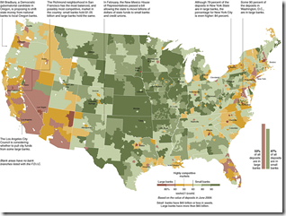
Bank Competition Map
16 Mar 2010Big banks vs small. (via)
Wall Street Bonuses
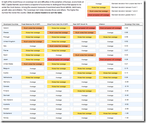
8 Mar 2010Sovereign Debt Hot Spots
8 Mar 2010Among the several measures it examined were fiscal deficits, debt loans, growth rates and inflation. The ‘sovereign risk’ index includes those and others. The higher the number the riskier the country.
TARP?
In: Bailout Finance US Economy
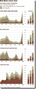
2 Mar 2010Bad Loans
28 Feb 2010Wall Street Bonuses
In: Bailout Finance Source: Economist Stock Market US Economy
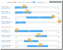
25 Feb 2010Economic Indicators Dashboard (Feb 10 ver)
23 Feb 2010One of my favorite summaries of economic indicators. Click on any of the “historical details” to see what each indicator means and why it’s important.
Banking Earnings vs Compensation
19 Feb 2010“Drag the slider to see how staff compensation at these major banks relates to revenue and net income over time and see which bank pays their employees the most on average.”
UK Quantitative Easing
12 Feb 2010From the Daily Telegraph via Igraphics explained.
Obama’s Bank Reform Plan
In: Bailout Finance Politics Source: FT Stock Market US Economy
9 Feb 2010The FT has an audio annotated slideshow explaining the proposal.
(note, to get around FT’s registration try this link)
Inflated Worth
2 Feb 2010USA Today Economic Outlook Index (Jan ‘10 version)
In: Employment Finance Housing Interactive Source: USA Today Stock Market US Economy
29 Jan 2010The best part is the lower chart showing the latest data for each of the 11 “leading indicators”. Updated 1/27/09.
Crisis Winners and Losers
In: Finance US Economy
27 Jan 2010What is Chart Porn?
An addictive collection of beautiful charts, graphs, maps, and interactive data visualization toys -- on topics from around the world.
Categories
- Bailout (118)
- Chartporn Related (3)
- Commentary (21)
- Culture (669)
- Emerging Markets (66)
- Employment (245)
- Environment/weather (133)
- Finance (298)
- Food (92)
- Global Economy (373)
- Graphic Design (bad) (26)
- Graphic Design (general) (183)
- Graphic Tools (23)
- History (158)
- Housing (162)
- Humor (204)
- Innovative (183)
- Interactive (545)
- Internet/tech (97)
- Maps (578)
- News Media (34)
- Politics (329)
- Reference (97)
- Science (331)
- Source: Economist (101)
- Source: FT (92)
- Source: NYT (147)
- Source: Ritholtz (76)
- Source: USA Today (27)
- Source: Washington Post (90)
- Source: WSJ (135)
- Sports (58)
- Stock Market (74)
- Uncategorized (2)
- Updated regularly (76)
- US Economy (553)
- Video (22)
- Aram Korevaar: This chart is now being used as a projection in which countries such as China see themselves as in a [...]
- David: Welcome back Chart Porn! [...]
- J S: Thanks for the great story. Miss reading this blog. Hope to see you more active again. [...]
- jake: I lived in a DC row house for 6 years, and I'm writing this comment from my tiny 1 bedroom apartment [...]
- ronny pettersen: Hilarious and unfortunately accurate... ;-) [...]









Wall Street Grifters
In: Bailout Commentary Finance Stock Market US Economy
19 Feb 2010I don’t post many editorials, but I love Matt Taibbi’s gonzo journalism style and his insights about cracks in the financial system.