Finance Archive:
Banks Still Hiding Risk
9 Apr 2010Interactive from the WSJ showing how banks reduce short term borrowing each quarter before releasing info to the public. Related article. (via)
AP Economic Stress Map (March ‘10 update)
6 Apr 2010The map displays unemployment, foreclosures, bankruptcy, or a composite “stress index”, by county. Easy to miss: in the upper right you can change the scale of the mapping (rates, m-t-m, y-t-y). To look at data over time, click on the “monthly rates” option and a historical slider will appear at the bottom. Double click on a region to zoom in; click & hold to move around, point at a county for popup detail.
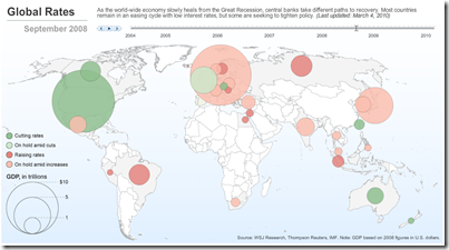
G20 Interest Rates
6 Apr 2010Executive Pay 2009
In: Bailout Employment Finance Source: NYT Stock Market US Economy
5 Apr 2010This time from the NYT, covering 200 CEOs. Related article.
Executive Compensation 2009
2 Apr 2010Sortable tables of S&P 500 executives. As of March 24, 2010.
which, of course, is nothing compared to hedge fund manager compensation:
They are planning to stop buying them (or maybe not). Updated 3/25.
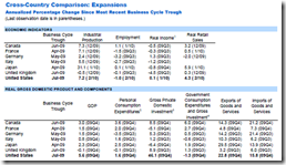
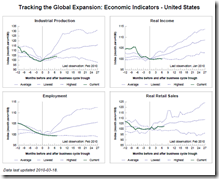
Tracking the Global Economy
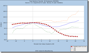
29 Mar 2010The St. Louis Fed is maintaining a nice compendium of economic indicators on the G7 & OECD, including comparisons with previous recessions and expansions.
US Booms and Busts (1775-1943)
24 Mar 2010Fascinating time-line of US economic cycles. Someone should make a wall chart out of this – I would buy a copy. (via St Louis Fed and The Big Picture)
A nice companion piece perhaps is Irving Fisher’s 1932 “Booms and Depressions: Some First Principles“:
Banks at Risk
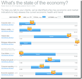
23 Mar 2010Economic Indicators Dashboard (Mar 2010 ver)
22 Mar 2010One of my favorite summaries of economic indicators. Click on any of the “historical details” to see what each indicator means and why it’s important.
Tracking a Toxic Mortgage Security
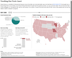
19 Mar 2010A fantastic look at what owning one of these assets looks like. NPR’s Planet Money bought a $1000 mortgage bond and is tracking it’s performance. You can view how many payments they’ve received versus how many properties in their portion of the bond have been sold at a loss. Related article. (via Vizworld)
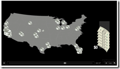
There’s also a cute simple explanation video:
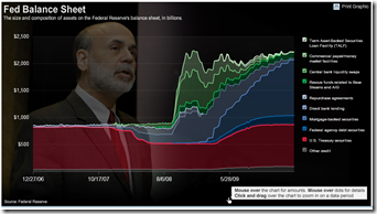
FED Balance Sheet (updated)
18 Mar 2010What is Chart Porn?
An addictive collection of beautiful charts, graphs, maps, and interactive data visualization toys -- on topics from around the world.
Categories
- Bailout (118)
- Chartporn Related (3)
- Commentary (21)
- Culture (669)
- Emerging Markets (66)
- Employment (245)
- Environment/weather (133)
- Finance (298)
- Food (92)
- Global Economy (373)
- Graphic Design (bad) (26)
- Graphic Design (general) (183)
- Graphic Tools (23)
- History (158)
- Housing (162)
- Humor (204)
- Innovative (183)
- Interactive (545)
- Internet/tech (97)
- Maps (578)
- News Media (34)
- Politics (329)
- Reference (97)
- Science (331)
- Source: Economist (101)
- Source: FT (92)
- Source: NYT (147)
- Source: Ritholtz (76)
- Source: USA Today (27)
- Source: Washington Post (90)
- Source: WSJ (135)
- Sports (58)
- Stock Market (74)
- Uncategorized (2)
- Updated regularly (76)
- US Economy (553)
- Video (22)
- Aram Korevaar: This chart is now being used as a projection in which countries such as China see themselves as in a [...]
- David: Welcome back Chart Porn! [...]
- J S: Thanks for the great story. Miss reading this blog. Hope to see you more active again. [...]
- jake: I lived in a DC row house for 6 years, and I'm writing this comment from my tiny 1 bedroom apartment [...]
- ronny pettersen: Hilarious and unfortunately accurate... ;-) [...]


