Finance Archive:
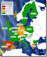
Map: European Bank Stress Tests
26 Jul 2010This is kind of a silly map considering only 7 of 91 banks failed. Related article.
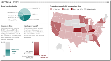
Update: NPR’s Toxic Real Estate Asset
24 Jul 2010Planet Money bought a toxic mortgage asset and has been tracking it’s death spiral. It’s now almost completely dead (non-performing). In a recent article they also tried to track down the people who originally took out the mortgages.
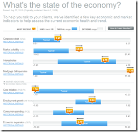
Update: Economic Indicators Dashboard (July ‘10)
23 Jul 2010A great monthly status board for market and economic indicators. Click on anything – the popup details are great.
The Financial Overhaul Bill: What Does it Fix?
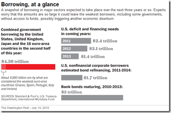
16 Jul 2010Global Tidal Wave of Debt
14 Jul 2010Double Dip Danger Signs
In: Bailout Finance Housing Source: WSJ Stock Market US Economy
1 Jul 2010The WSJ looks at indicators in seven areas to gauge whether we are sliding back into recession. Related article.
Sovereign Debt Levels 1980-2009
1 Jul 2010Global Debt
In: Finance Global Economy Interactive Maps Source: Economist
25 Jun 2010Often these charts only deal with government or household debt – this one covers it all. Click on any country to bring up a time series chart – use the tabs at the top to view time series of debt types.
The Greek Tangle
9 Jun 2010The Trail of Debt
9 Jun 2010Finviz Financial Visualizations
In: Finance Global Economy Interactive Reference Stock Market Updated regularly US Economy
7 Jun 2010Some really great financial analysis tools here.
Treemaps (for S&P, world, filter by sector, period, drill down as far as you want)

Same info as bubbles, with roll over graphs:
Bar, Spectrum, and other performance charts by industry, country, or capitalization:
Tables of insider trading:
Futures:
Foreign Exchange:
And a crazy filter system for stock tables:
What is Chart Porn?
An addictive collection of beautiful charts, graphs, maps, and interactive data visualization toys -- on topics from around the world.
Categories
- Bailout (118)
- Chartporn Related (3)
- Commentary (21)
- Culture (669)
- Emerging Markets (66)
- Employment (245)
- Environment/weather (133)
- Finance (298)
- Food (92)
- Global Economy (373)
- Graphic Design (bad) (26)
- Graphic Design (general) (183)
- Graphic Tools (23)
- History (158)
- Housing (162)
- Humor (204)
- Innovative (183)
- Interactive (545)
- Internet/tech (97)
- Maps (578)
- News Media (34)
- Politics (329)
- Reference (97)
- Science (331)
- Source: Economist (101)
- Source: FT (92)
- Source: NYT (147)
- Source: Ritholtz (76)
- Source: USA Today (27)
- Source: Washington Post (90)
- Source: WSJ (135)
- Sports (58)
- Stock Market (74)
- Uncategorized (2)
- Updated regularly (76)
- US Economy (553)
- Video (22)
- Aram Korevaar: This chart is now being used as a projection in which countries such as China see themselves as in a [...]
- David: Welcome back Chart Porn! [...]
- J S: Thanks for the great story. Miss reading this blog. Hope to see you more active again. [...]
- jake: I lived in a DC row house for 6 years, and I'm writing this comment from my tiny 1 bedroom apartment [...]
- ronny pettersen: Hilarious and unfortunately accurate... ;-) [...]

