Finance Archive:
Update: The State of the Economy
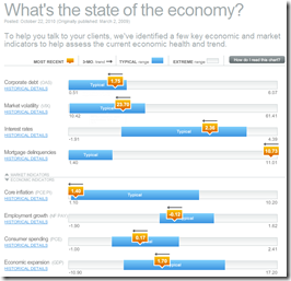
25 Oct 2010October’s update of the Economic Indicators Dashboard:
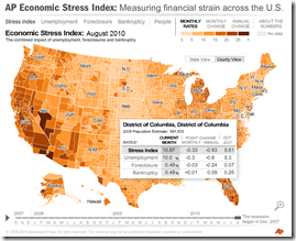
and while we’re at it, here is the AP’s Economic Stress Map, which shows unemployment, foreclosures, and bankruptcies from 2007-today, by county.
Currency Wars Explained
21 Oct 2010The FT has an interactive feature explaining the latest financial mainstream media buzz-word, and tracking individual country actions. Related articles.
note: some FT articles require a subscription.
Update: Wall Street Compensation
In: Employment Finance Interactive Source: WSJ Stock Market US Economy
12 Oct 2010Explore what percentage of revenue at Wall Street firms goes to compensation. Updated with 2010 data.
Rolling up TARP
4 Oct 2010A summary of the infamous Troubled Asset Relief Program. (via)
State Debt
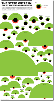
30 Sep 2010Interesting presentation of multiple debt related indicators. The alien invasion look is a bit strong, but they did refrain from including red circles and having them all look like ladybugs – just sayin.
Bank Failures
27 Sep 2010Interactive map of banks that have been shut down in 2010. You can also resize markers by metrics such as total deposits, number of branches, or cost to FDIC. The related WSJ article is very depressing to read.
Update: Economic Indicators Dashboard
In: Employment Finance Housing Interactive Updated regularly US Economy
24 Sep 2010One of my favorite summaries of economic indicators. Click on any of the “historical details” to see what each indicator means and why it’s important. Updated 9/22/10.
Update: European Economic Weather Map
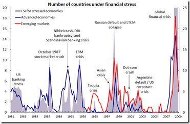
19 Sep 2010Financial Stress (1981-2009)
13 Sep 2010Interesting graph of global financial crises. I can’t tell why it has two different axis, though. I suppose the data is from the IMF’s Financial Stress Index.
Global Competitiveness Report 2010-11
In: Employment Finance Global Economy Interactive Maps Politics Updated regularly
10 Sep 2010The World Economic Forum has a number of interactive tools for examining the results of it’s Global Competitiveness Report. You can view the aggregate index or any of the many (very interesting) sub-components as maps, bar charts, scatter plots, rankings, or individual profiles. FYI – The United States has slipped from 2nd to 4th overall.
Bankruptcies Back on the Rise
19 Aug 2010Personal Finance Advice on Napkins
10 Aug 2010Napkins are not where you would expect to find good financial advice, but when they come from the New York Times they are worth reading (and each is linked to a related blog post).
State Budget Deficits
2 Aug 2010Yields on top-rated, tax exempt US municipal bonds have dropped to near-record lows, allowing many local borrowers to access cheap financing in spite of their recent fiscal troubles. Following concerns over public finances in Europe, the $2,800bn market for “munis” has come into the spotlight after several years of budget deficits. Related articles.
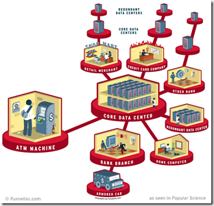
Where Your Money is Stored
2 Aug 2010There’s not a lot of surprising information here, but I’m posting it anyway to reward the graphic designer for including the horns and pitchfork in the “Credit Card Company” section, and the holdup man in the “Bank Branch”. Well done! (via)
Reforming the Global Financial System
In: Finance Global Economy Interactive Maps Politics Source: FT
28 Jul 2010From Dodd-Frank to Basel III, this graphic explains the current plans for global financial regulatory reform in advanced economies, from the US to the eurozone.
(note: some FT items require a subscription – you can view up to 10 articles a month for free)
What is Chart Porn?
An addictive collection of beautiful charts, graphs, maps, and interactive data visualization toys -- on topics from around the world.
Categories
- Bailout (118)
- Chartporn Related (3)
- Commentary (21)
- Culture (669)
- Emerging Markets (66)
- Employment (245)
- Environment/weather (133)
- Finance (298)
- Food (92)
- Global Economy (373)
- Graphic Design (bad) (26)
- Graphic Design (general) (183)
- Graphic Tools (23)
- History (158)
- Housing (162)
- Humor (204)
- Innovative (183)
- Interactive (545)
- Internet/tech (97)
- Maps (578)
- News Media (34)
- Politics (329)
- Reference (97)
- Science (331)
- Source: Economist (101)
- Source: FT (92)
- Source: NYT (147)
- Source: Ritholtz (76)
- Source: USA Today (27)
- Source: Washington Post (90)
- Source: WSJ (135)
- Sports (58)
- Stock Market (74)
- Uncategorized (2)
- Updated regularly (76)
- US Economy (553)
- Video (22)
- Aram Korevaar: This chart is now being used as a projection in which countries such as China see themselves as in a [...]
- David: Welcome back Chart Porn! [...]
- J S: Thanks for the great story. Miss reading this blog. Hope to see you more active again. [...]
- jake: I lived in a DC row house for 6 years, and I'm writing this comment from my tiny 1 bedroom apartment [...]
- ronny pettersen: Hilarious and unfortunately accurate... ;-) [...]

