Finance Archive:
Daily Crisis Indicators
In: Finance Interactive Source: NYT Updated regularly US Economy
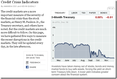
22 Dec 2008The NYT has an interactive chart that shows the Treasury rates, Libor, Ted Spread, commercial paper, and bond yields, updated daily.
Wall Street Compensation
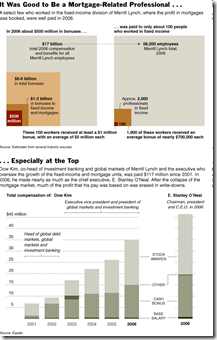
18 Dec 2008Related Article: http://www.nytimes.com/2008/12/18/business/18pay.html?_r=1
Show Me the Tarp Money
In: Bailout Finance Interactive Source: NYT Stock Market US Economy
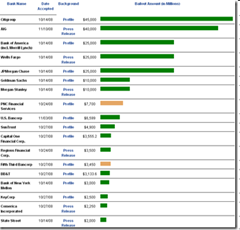
16 Dec 2008A regularly updated summary of what institutions are getting aid:
or, The NYT version: http://projects.nytimes.com/creditcrisis/recipients/table
Wall Street Rating Profits
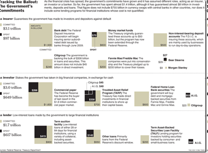
6 Dec 2008Bailout through November
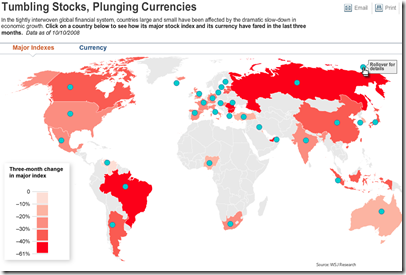
26 Nov 2008Global Equities and Currencies
13 Oct 2008Map of world currency and equity market declines (October data).
related article
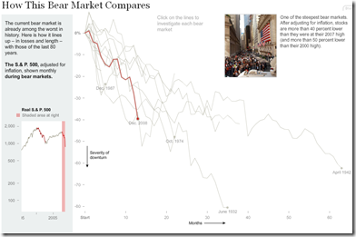
Past Equity Crises
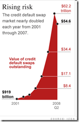
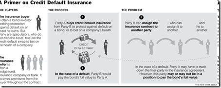
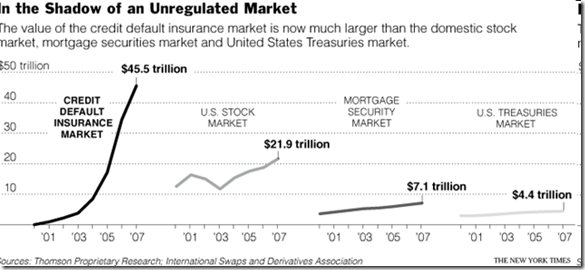
11 Oct 2008CDS Market Size
1 Sep 2008What is Chart Porn?
An addictive collection of beautiful charts, graphs, maps, and interactive data visualization toys -- on topics from around the world.
Categories
- Bailout (118)
- Chartporn Related (3)
- Commentary (21)
- Culture (669)
- Emerging Markets (66)
- Employment (245)
- Environment/weather (133)
- Finance (298)
- Food (92)
- Global Economy (373)
- Graphic Design (bad) (26)
- Graphic Design (general) (183)
- Graphic Tools (23)
- History (158)
- Housing (162)
- Humor (204)
- Innovative (183)
- Interactive (545)
- Internet/tech (97)
- Maps (578)
- News Media (34)
- Politics (329)
- Reference (97)
- Science (331)
- Source: Economist (101)
- Source: FT (92)
- Source: NYT (147)
- Source: Ritholtz (76)
- Source: USA Today (27)
- Source: Washington Post (90)
- Source: WSJ (135)
- Sports (58)
- Stock Market (74)
- Uncategorized (2)
- Updated regularly (76)
- US Economy (553)
- Video (22)
- Aram Korevaar: This chart is now being used as a projection in which countries such as China see themselves as in a [...]
- David: Welcome back Chart Porn! [...]
- J S: Thanks for the great story. Miss reading this blog. Hope to see you more active again. [...]
- jake: I lived in a DC row house for 6 years, and I'm writing this comment from my tiny 1 bedroom apartment [...]
- ronny pettersen: Hilarious and unfortunately accurate... ;-) [...]






Michael Lewis on Wall Street’s Screw-up
In: Commentary Finance Humor US Economy
11 Nov 2008A wonderful article explaining how things got so bad:
Michael Lewis: The End