Finance Archive:
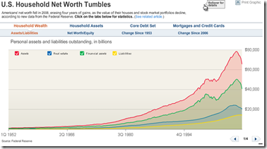
Household Net Worth down $11 trillion
13 Mar 2009Lots of good analyses here. click on the tabs for differ datasets and presentations. Related article.
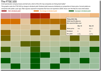
FTSE Dividends Heat Map
13 Mar 2009G20 Wishlist
In: Emerging Markets Finance Global Economy Interactive Source: FT
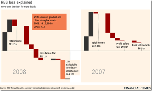
13 Mar 2009RBS Losses Explained
2 Mar 20092009 FDI Projections and IMF Loans
In: Emerging Markets Finance Global Economy Interactive Maps Source: FT
2 Mar 2009Net capital flows to emerging markets are set to drop to $165.3bn this year, down from $928.6bn in 2007, according to the Institute of International Finance. IMF loans are shown on the second tab.
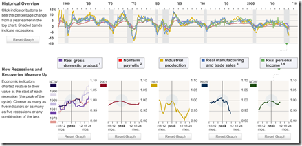
US Recession Comparison
In: Finance Interactive Source: WSJ Stock Market Updated regularly US Economy
2 Mar 2009This is a slightly complicated interactive way of viewing 5 different indicators across different recessions periods. It takes a minute to figure out how to work it, but it’s nifty once you do.
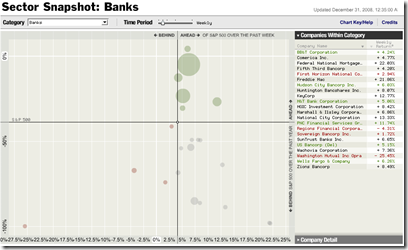
S&P Performance by Sector (updated daily)
In: Finance Interactive Reference Source: NYT Stock Market Updated regularly US Economy
25 Feb 2009Ok, someone obviously spent a lot of time designing this one, and it is very cool.
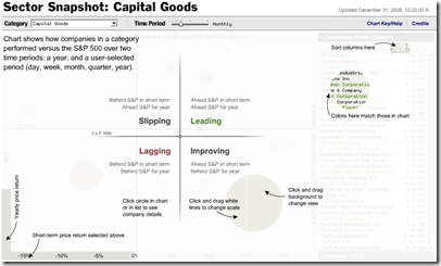
You select a sector (~30 are available) and the bubble chart shows how companies performed versus the short and long-term S&P 500. The bubble size shows market cap. You can easily change change the timeframe of the comparison (day, week, month, quarter, year) and scales, and drill down through company data.
example:
explanation:
What is Chart Porn?
An addictive collection of beautiful charts, graphs, maps, and interactive data visualization toys -- on topics from around the world.
Categories
- Bailout (118)
- Chartporn Related (3)
- Commentary (21)
- Culture (669)
- Emerging Markets (66)
- Employment (245)
- Environment/weather (133)
- Finance (298)
- Food (92)
- Global Economy (373)
- Graphic Design (bad) (26)
- Graphic Design (general) (183)
- Graphic Tools (23)
- History (158)
- Housing (162)
- Humor (204)
- Innovative (183)
- Interactive (545)
- Internet/tech (97)
- Maps (578)
- News Media (34)
- Politics (329)
- Reference (97)
- Science (331)
- Source: Economist (101)
- Source: FT (92)
- Source: NYT (147)
- Source: Ritholtz (76)
- Source: USA Today (27)
- Source: Washington Post (90)
- Source: WSJ (135)
- Sports (58)
- Stock Market (74)
- Uncategorized (2)
- Updated regularly (76)
- US Economy (553)
- Video (22)
- Aram Korevaar: This chart is now being used as a projection in which countries such as China see themselves as in a [...]
- David: Welcome back Chart Porn! [...]
- J S: Thanks for the great story. Miss reading this blog. Hope to see you more active again. [...]
- jake: I lived in a DC row house for 6 years, and I'm writing this comment from my tiny 1 bedroom apartment [...]
- ronny pettersen: Hilarious and unfortunately accurate... ;-) [...]








Frozen Assets: Michael Lewis on Iceland
In: Bailout Commentary Finance Global Economy
9 Mar 2009I know this is a chart blog, but I love Michael Lewis’ writing. Here’s a great article on how Iceland got in trouble.
Link: Lewis’s Dec 2008 article on the demise of Wall Street.